
I'm Kenney Mencher. I'm an artist who left a tenured professorship in 2016 to pursue making art full time. This blog is about art, art history, with a emphasis on human rights. I make homoerotic art featuring bears, otters & other gay wildlife.
Sunday
I thought this looked cool! Painting "Art Class" in Barbizon, France with Besharat Gallery
|
||||
|


Friday
How I make a painting. A tutorial.

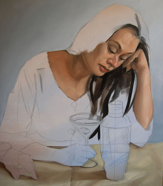
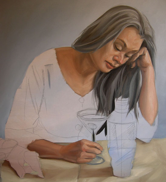
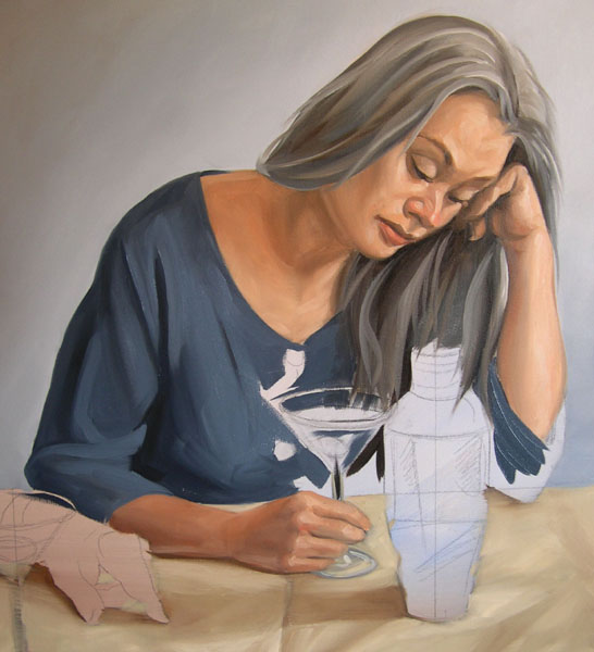
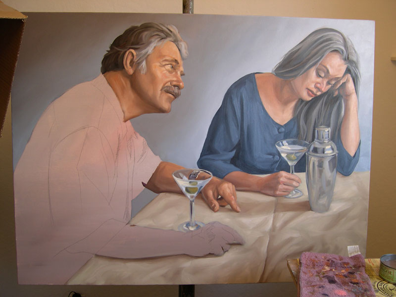
Kenney Mencher, In Martini Veritas, oil on canvas 36"x48" |
In Martini Veritas:
How to Plan, Photograph, Draw, and make a Painting Kenney Mencher Sure, I would love to work exclusively from live models but the reality is I cannot afford to have a model sit for the thirty to forty hours it takes for me to make a painting. For this reason, being an economically challenged painter sometimes means that you also need to learn how to be a photographer. If you do, you’re in good company, Eric Fischl, John Currin, Gerhard Richter, Anders Zorn and even Degas all use or used photography. Using photographs and especially digital photographs can even have unseen benefits both in terms of content and technique. |
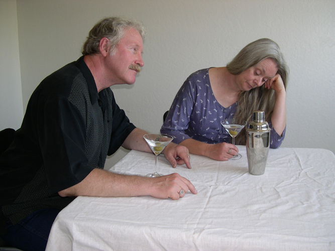
Photographed with a flash 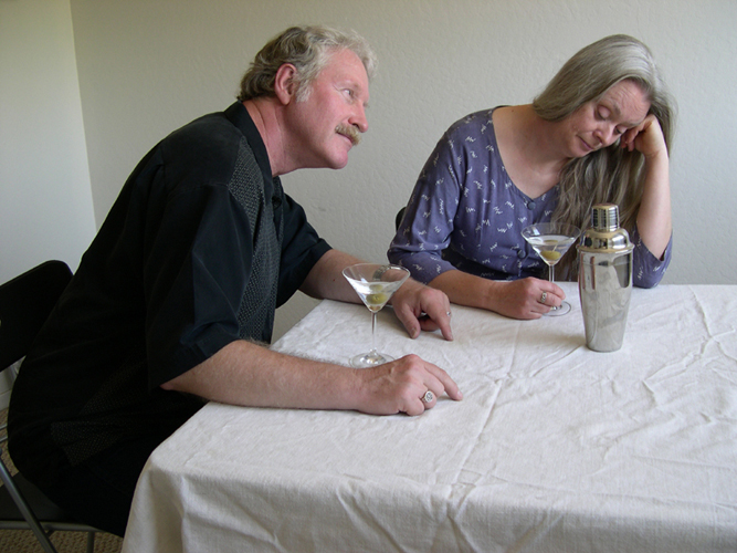
Photographed without a flash |
 |
Using Digital Photography
I keep a sketchbook with thumbnails and lists of ideas.
When I get enough ideas for paintings together and I have an idea of what
kinds of ideas will work with the models I have available I do a photo
shoot. In the shoot, I pose the models and take multiple versions
of the same pictures. I often will under expose and underexpose knowing
that each shot captures different things that the naked eye may automatically
be able to see. I will also take at least one shot with the flash
on for the same reason. By bracketing my exposures, I am able to
see more subtle variations in skin tone and value in both the darks and
lights. Manipulating these photos on my computer using Adobe Photoshop,
I am able to push the value structure even further and manipulate color
as well as value in the images I work from.
I actually work directly from the computer screen since the screen is more luminescent than an ink jet print. This also allows me the benefit of playing with exposures and magnifying sections of the image with out having to print out tons of extra copies. It saves money and time. |
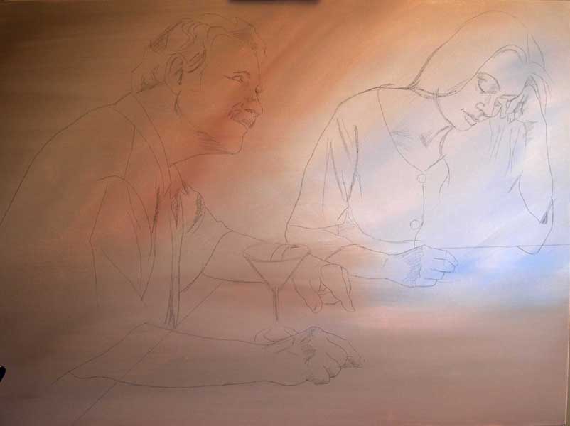 |
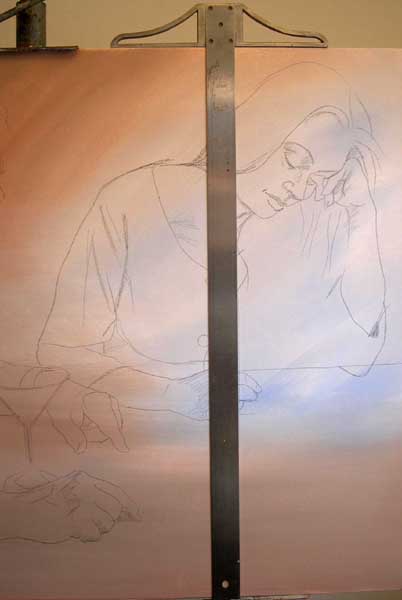
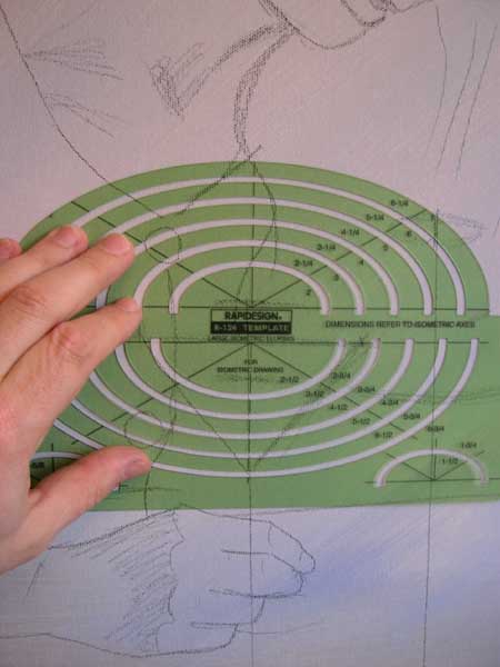
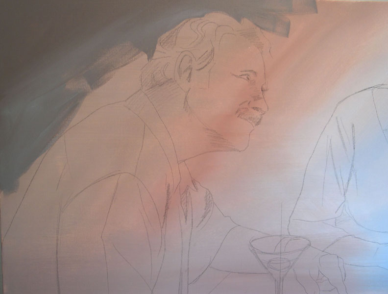
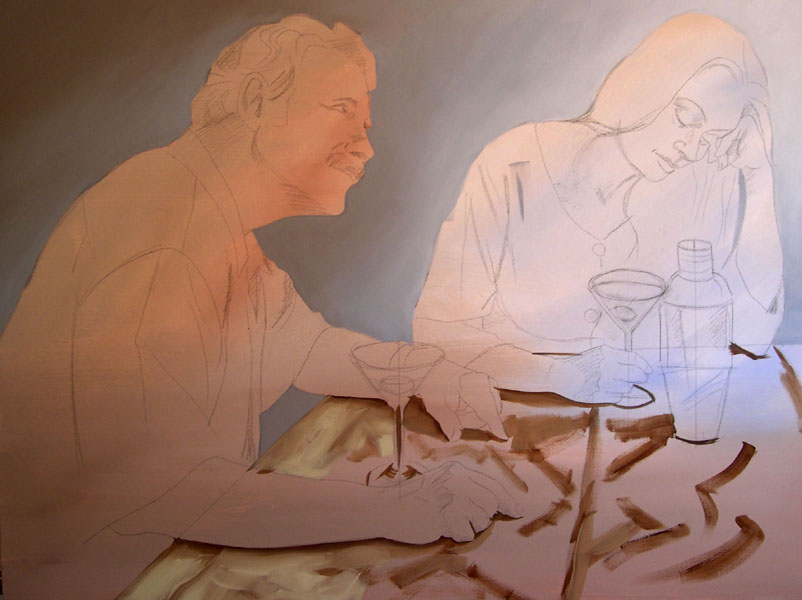
The canvas underpainted with colored acrylic. The drawing is done in charcoal pencil but is incomplete until I use tools such as T-squares and ellipse guides to draw the martini glasses. |
 |
 |
Preparing the Canvas and the Underdrawing
I prepare the canvas with tube acrylics mixed with acrylic
gesso for some tone and color. In this painting, my underpainting
of acrylic corresponds roughly to the colors of the painting I will be
putting on top of it. I then lightly sketch out the figures basic
shapes and where I think the light breaks across planes and drapery with
a charcoal pencil. I keep these outlines super light. I also
do some minor “plastic surgery” on the models to make the painting work
just a little bit better. For example, in the female figures I’ve
moved the hair a bit, strengthened the jaw line and changed the angle of
the shoulder. When I’ve finished sketching out the people and corrected
or distorted the anatomy of the figures so that they will work better in
a painting. Things that work in a photograph don’t always translate
into painting and drawings and so I find I cannot rely solely on how the
camera portrays some elements. This is why I chose to crop the image
the way I did and to discard the bend in the wall to the left of the two
characters.
The lens of a simple digital camera is often designed to be multipurpose. These “one size fits all” lenses tend to be a bit more distorting then regular analog cameras. The foreground to background size distortions are exaggerated by this. You can compensate for these scale distortions by photographing your initial set up shots from far away and then moving in for detail shots. I also rely on my knowledge of perspective or just redraw things by eye to be a more realistic scale than the camera depicts them. I’ve also found working from any photograph that the camera’s depiction of verticals and horizontals should be ignored. If you look at the bend in the wall to the left side of the two characters in the reference photo you may notice that vertical line where the two walls meet seems to lean towards the left. In a photograph, we don’t question this, in a painting it looks like a mistake. I square up the edges of these elements to correspond to established rules of perspective. The vertical and horizontal lines are drawn to parallel the edges of the picture plane. When I draw out things like doorways, bottles, and in th is case martini glasses and a martini shaker, essentially anything with a vertical line running through them, I straighten and check any vertical or horizontal lines with a tee square. I also like to use the tee square and ellipse guides to augment my drawing skills of ellipses. The funny thing is that although I use these guides in my under drawing I sometimes change them a bit as I paint them to get the right feel. Most of the battle for a good painting starts in the planning phases. If the foundational drawing is accurate and feels correct, I can usually pull of a good painting. Having a consistent working method and planning the colors is also something that will make the painting go more smoothly. |
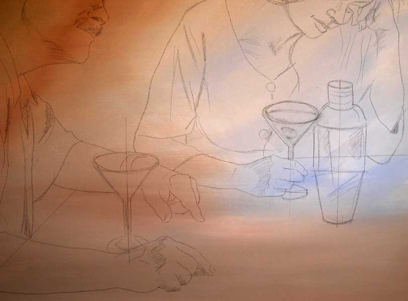 |
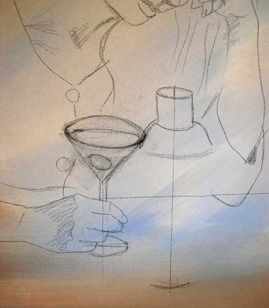
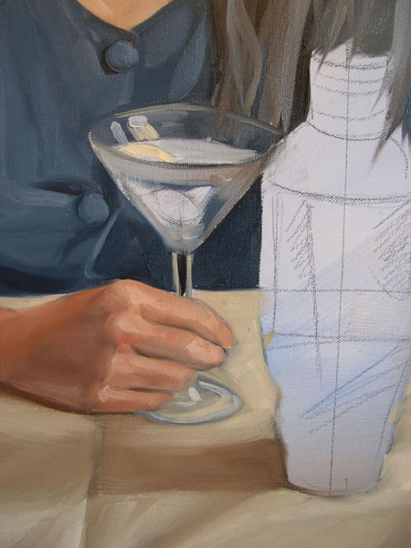
The completed martini glasses and shakers. |
 |
Materials, Tools, and Palette of Colors
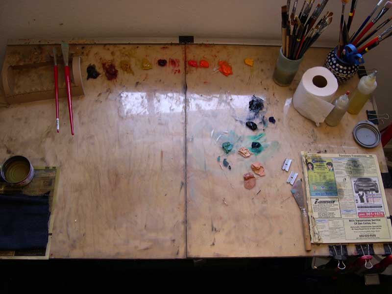
My worktable is made from to large tempered sheets of
glass laid across a piece of plywood. I use a tuna can for my odorless
solvent, a cloth rag, a phone book that I use to wipe brushes, knives on.
I use toilet paper for final clean up. I mix my colors with
large plaster knives.
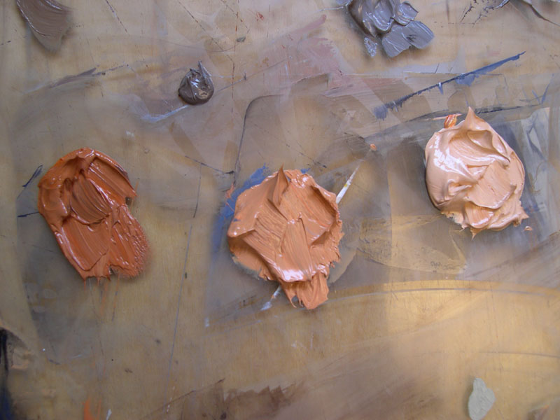
I use several different kinds of brushes. For the large areas and for blocking in I use large synthetic brights. Usually these large blocking in brushes is in the 12 and 8 sizes. I also use a large sable fan brush to smooth out things like backgrounds and large stretches of cloth or drapery although I do not use the fan brush to work on the figures or still life objects. For smaller areas, I use synthetic filberts to push the paint around and to block in areas, especially in still life and figures but then I use sable filberts in a variety of sizes to work out transitions and details. I use several mediums depending on what I am painting. For skin and still life I tend to use a medium mixed from one part dammar varnish, one part stand oil and four parts turpentine (not paint thinner). I use turpentine for mixing my medium because odorless paint thinner is not strong enough to dissolve the dammar in the mixture, however, I do use odorless paint thinner to clean my brushes. For rendering drapery, I use straight linseed oil or Gamblin’s galkyd painting medium. My mediums are kept and squeezed out of squeeze bottles I got from a beauty store. My palette of colors is consistent from painting to painting. I rarely add colors and I use every single color I have on my palette for every painting. I like to use Gamblin paints for the majority of my colors although occasionally I will substitute some other cheaper brands. I also use Winsor Newton’s soft mixing white because I’ve found that it really is softer and more pliable than some other whites I’ve tried. My palette is laid out in the following order. Burnt Umber, Burnt Sienna, Raw Sienna, Yellow Ochre, Alizarin, Scarlet, Cadmium Red, Cadmium Red Light, Orange, Cadmium Yellow, Lamp Black, Payne’s Grey, Since I’m a very systematic and planned painter I also like to mix a majority of the colors before I even begin painting an object or a figure. This kind of “paint by numbers” approach is a way in which I can manage my anxiety, experiment, and keep my palette consistent. In order to do this I also have to think and plan the color scheme and mixtures for the entire painting. |
 |


 |
A Plan of Attack
Before I begin working, I look at the color of the overall
light. I carefully observe the direction of the light and note the
warm and cool relationships of the colors of walls, drapery, objects and
skin. Using what I’ve observed for a moment I edit my plan of color
by intentionally redesigning the existing color scheme. I consciously
plan to exaggerate and caricature the colors from the photo since they
are just a touch washed out to me. I decide which colors I will intensify
and which warm cool relationships I will heighten to make these colors
more brilliant and interesting.
Painting the Background Next, I plan and rehearse the order that I will paint the things in the painting. I usually begin a painting also by working background to foreground. By this, I mean, I paint the stuff that is behind anything first and so that the edges of things are crisper as I move into overlapping items. For this painting, I started with the wall behind the figures. These photographs were shot with natural north light in my dining room. The light came in from the right hand side window and moved across the figure from right to left. North light is a little different from halogen or incandescent light sources because in the lights areas the light is cool and the shadows tend to be warm browns. That means that the colors I mixed from dark to light also needed to be warm shadows and cool highlights. For the darks, I mixed a combination of burnt umber, white, and a touch of lampblack. The middle tones consist of lamp black and white. The lights are white and a touch of Payne’s grey. I paint from dark to light and so I began painting the darks with a bit of my premixed medium to smooth them out and speed the drying time a bit. As I paint, I mix from my three existing blobs of colors and reblend the colors with my brush before transferring them to the canvas. Each step I add a bit more from the light blobs to the darker ones until I reach the lightest areas. I’m careful to check over the surface to make sure I’ve covered the background and overlapped the edges and contours of the outer shapes of the figures’ heads, faces, and drapery. I then go over the entire surface of the background with a sable fan brush to even the tones out. I do this also from dark to light. Occasionally I wipe the brush with a dry piece of toilet paper. Then I move on to thinking about the next background, which is, in this case, the table cloth on which that arms of the figures, glasses, and martini shaker overlap. |

 |

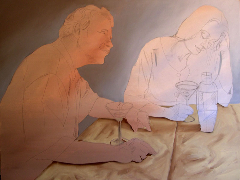 |
Painting the Tablecloth
The tablecloth, which is a washed out cream color in the
photo, is not enough of a color statement for me. I want it to be
much warmer so that the cool wall in the background recedes and the tablecloth
jumps forward more. In my rendition of the tablecloth, I chose
to make the dominant color a yellowish cream color rather than the neutral
one in the photo. Again, I work from dark to light.
The first thing I do is to lay down the areas of deepest shadows under the arms resting on the table and in the darkest folds. This darkest value is burnt umber and a touch white. This is laid in with a mixture of linseed oil and odorless paint thinner in a fairly thin or transparent wash. The second darkest values are laid into the shadowy area furthest away from the light source and then into some areas in the lighter part of the cloth. This is made from burnt sienna, yellow ochre, burnt umber, and white. The third tone, which is the majority of the body tone of the lighter areas of the cloth and for the highlights, consists of yellow ochre, with a touch of burnt umber, lamp black, and a lot of white. The lampblack adds a cooling effect leaning towards blueish north light. It’s about as cool as a yellow cream color can get. When I’ve completed painting the entire cloth, I go back over the surface and rework some of the value and tonal transitions with sable brushes and a sable fan brush. I used to think that using a fan brush was amateurish but I tried it one or twice and was able to get some really nice blended effects. As I did with the background, I make sure I save the left over colors that I’ve used to render the tablecloth because I know that I will be using these colors again in the glasses and the reflective martini shaker. The tablecloth will also reflect some of its color onto the skin of the models, especially the forearms where they meet the table. |
 |
The completed table cloth. |

 |
 |
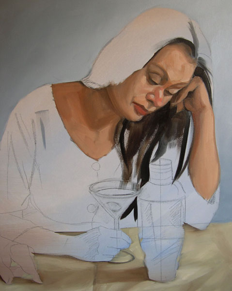
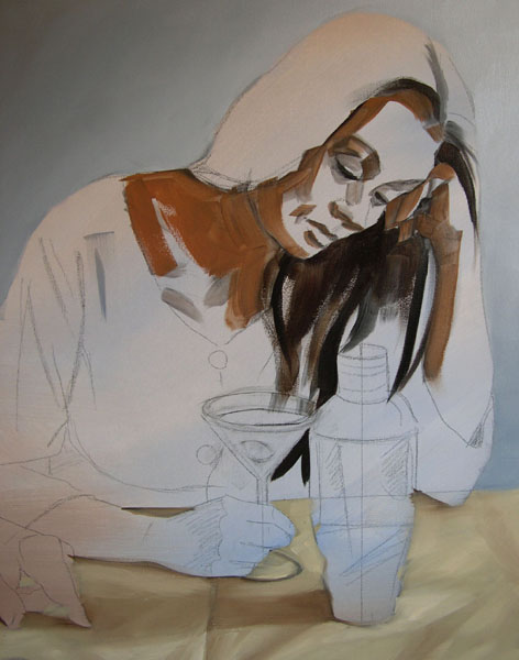
Painting the Figure’s Face
Human flesh tones, whether Caucasian, African, or Asian
are some sort of an orange. This orange is then mixed with either
browns or complimentary colors to cool or warm it/lighten or darken it.
I start painting human flesh by premixing three main large orange colors
that are also related to value. I change the formula based on how
pink or brown each person is. Since these two models are both fairly
pale and so as the flesh tones move into the north light of the lightest
areas the flesh tones will be cooler towards the light and warmer in the
shadowed areas.
 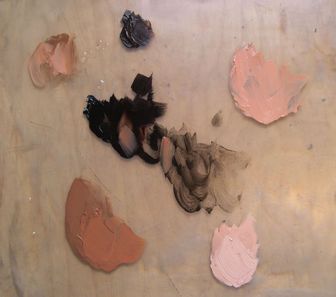
The darkest tone/hue is mixed from cadmium orange, burnt sienna, a touch of lampblack, white, and a little bit of raw ochre. The middle tone/hue is mixed from cadmium orange, burnt sienna, a touch of lampblack, a little bit of yellow ochre, and much more white. For the lightest tone, I use cadmium orange, lampblack, and a lot of white. The black cools off and neutralizes the orange slightly. I will also mix other colors into these main body colors to modify them for sections of the face and hands. For example, in the nose and cheeks I usually add a little bit of cadmium red light to pink them up a bit. If the person is excited or flushed, I may intensify this effect with other reds such as scarlet or even a touch of alizarin crimson. In male characters’ beard areas, I often use a touch of Payne’s grey to show the hair under the skin. In painting the female figure’s face, I start by thinking again about layering. The cheek of the figure overlaps the hair behind it. The darkest tones are a warm black, almost a purple. Using a number 8 synthetic bright, I start with a thin wash of medium, and lampblack, mixed with alizarin and scarlet for the darks. Using a small synthetic filbert, I also paint the darks of the face such as nostrils, eyelids and the crease in the lips with this wash tone. Most of these darks will be painted back over and I expect them to mix with the subsequent layers of colors. This gives the shadows a warm gray purplish tone and, almost randomly, tends to add a bit of variation in color to the lighter areas. Next, using a number 12 synthetic bright, I mix medium in to create a very liquid wash of the darkest tone/hue that was mixed from cadmium orange, burnt sienna, a touch of lampblack, white, and a little bit of raw ochre. I wash this in to all of the darkest areas of the face. Using the same brush and a lot of painting medium I then wash in the medium tones. Grabbing from the same piles of premixed color I then use a variety of brushes in varying sizes to ease and blend the tonal structure. To paint the lips and cheeks I mix the colors from the premixed blobs. While I’m working, I blow up areas of the photo on my computer to see specific areas and see subtle color variations in these areas. To modify tint and color I then add other colors to the flesh tones with a sable brush. For example, the lower lip is tinted with cadmium red medium. For the shadow of the upper lip I add a bit of burnt sienna. The cheeks and nose are pinked up a bit with the addition of a little bit of cadmium red light. I use these same formulas for the knuckles of the hands. Next, the hair is begun with a dark tone mixed from mainly lamp black but a touch of alizarin and scarlet are added. I mix two separate grays for the hair for cool and warm strands of hair. The warm grays of the hair are mixed from burnt umber and white. The cool grays are mixed from black and white. Because the paint is so fluid, the layers tend to mix together as I paint them creating variations in tone and color. Next, I move on to the other hand holding the martini glass. I paint this hand in a similar manner to the face, using the same premixed colors that I have already prepared. |
 |
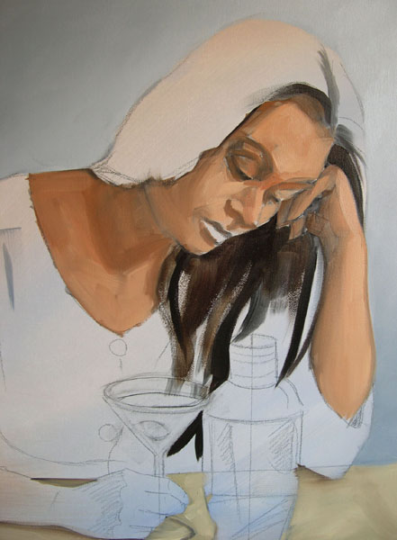
Hair face and hands completed! |
 |

 |
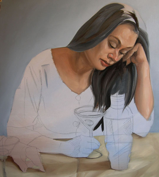
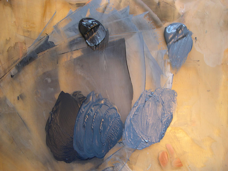
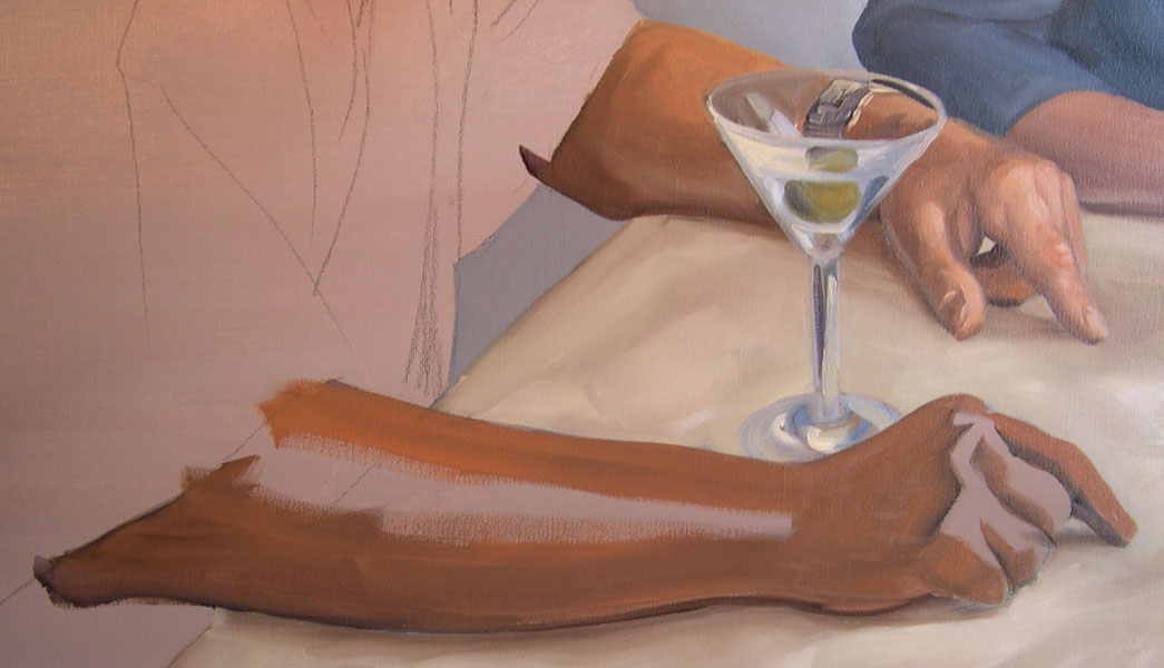
The Figure’s Dress
I think of the drapery in the same way that I paint the
flesh tones. In this instance, I’ve mixed two main batches of gray
blue color. The darker tones are Payne’s gray with a touch of, black,
white and burnt umber. The lighter tones are a similar mixture
with a higher proportion of the blue and white spectrum since this is painted
in North light I will want the dress highlights to be cooler and bluer.
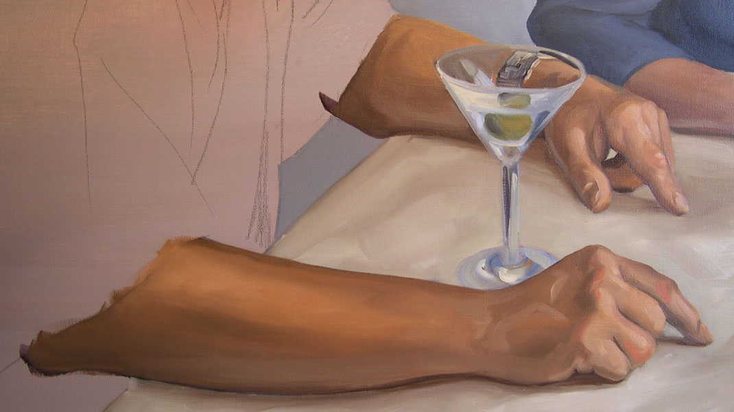
Using a number 12 synthetic bright, I mix medium in to create a very liquid wash of the darkest tone/hue. I use a different medium for painting cloth. Because I want the paint to tack up more slowly, I use straight linseed oil to thin the paint a bit. The darks of the dress are a thin washes of black mixed in with the darkest tone. I gradually add the next dark tone at the edges of the darkest creases. The middle tones are mixed from the lighter batch of color and are also thinned down a bit with straight linseed oil. I tend to go back in and blend the medium steps with a smaller synthetic or a sable brush as I work each area. While I’m working, I blow up areas of the photo on my computer to see specific areas of the drapery, looking for things like reflected light, and core shadows. The last step, after I’ve gotten the buttons painted in is to look for the highlights. Notice that at this point I’m beginning to anticipate the edge of the martini glass. I look for how the glass interferes and lightens the color passing through it. The dresses and glasses highlights are mixed out from the lightest tone with a touch more Payne’s gray and white. As you can see, my large glass palette is becoming filled up with the colors that I’ve used to paint the background, flesh, tablecloth and dress. I make sure I have saved the leftover colors I’ve mixed because I will need it to paint the martini glasses and the reflections in the martini shaker. 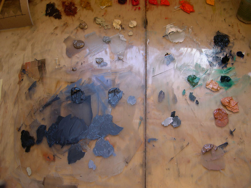
My palette so far. |
 |
 |
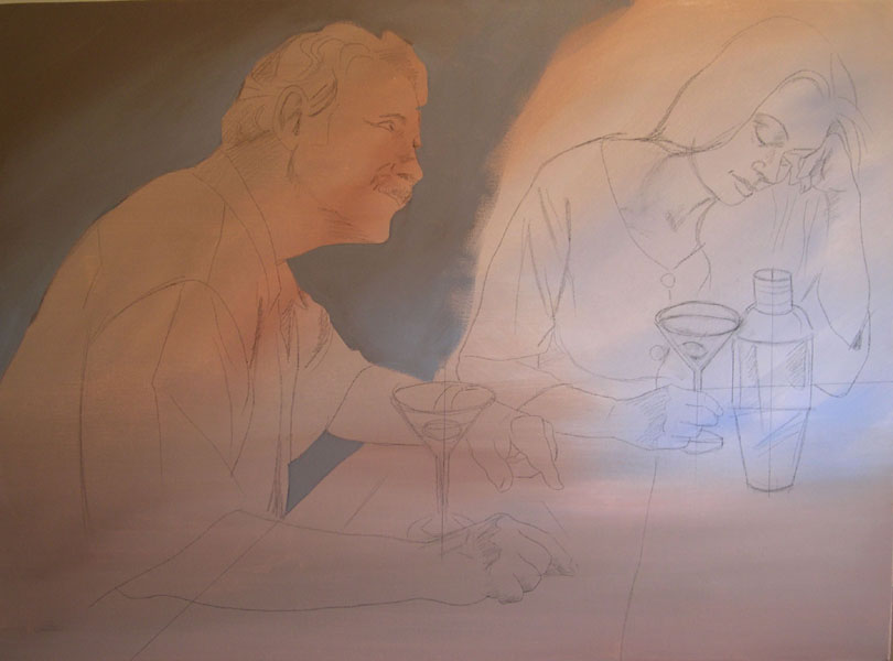
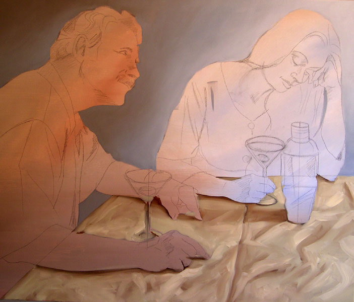
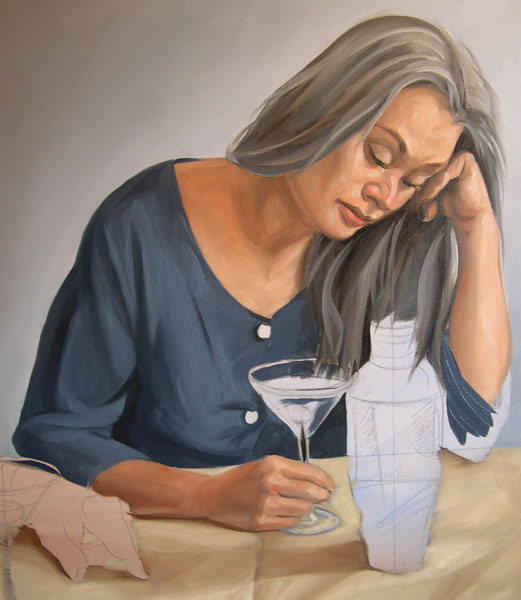
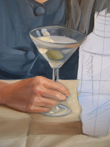
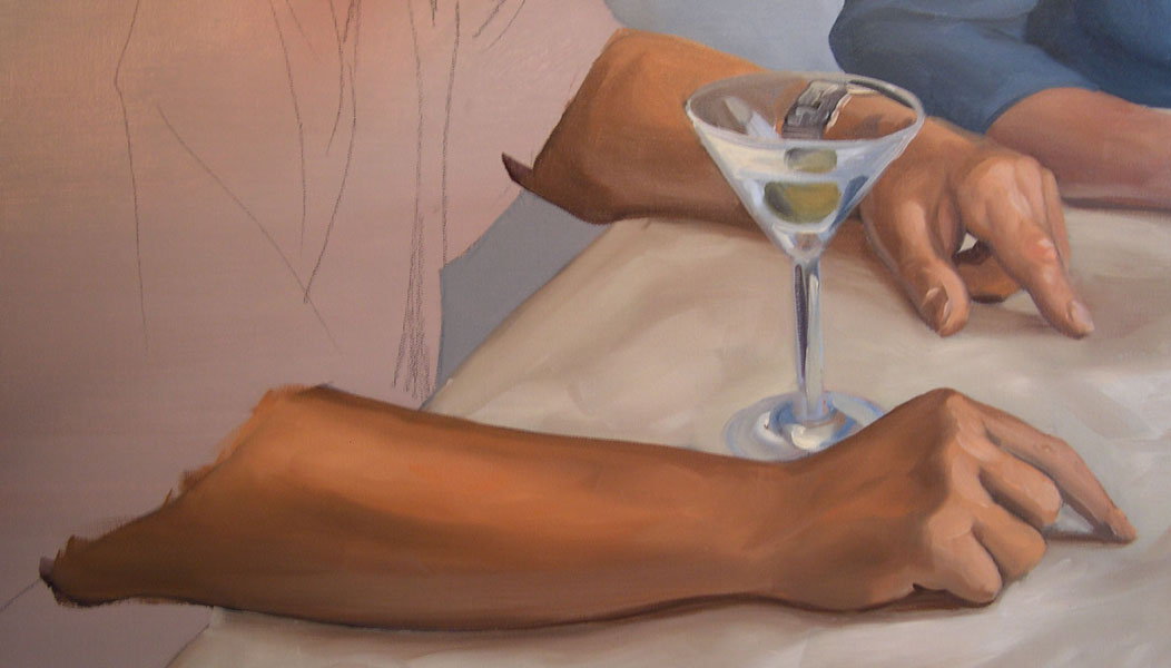
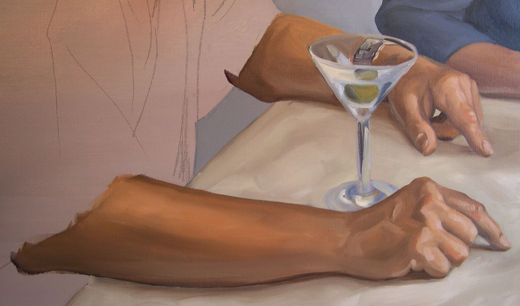
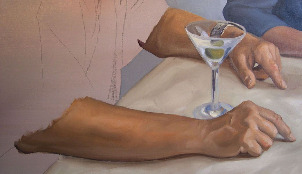
The Martini Glass and Shaker The secret to painting transparent and reflective surfaces such as glass and metal is to not look at the over all shape of the object but to look at the abstract shapes of colored areas created by refraction and reflection. For example, the background wall’s color is picked up in the top of the glass in the highlights of the rim and stem. This color is also reflected back in the liquid. Even some flesh tones are refracted throughout the glass, and that olive, mixed from white, Payne’s grey and yellow ochre, shows up in a bunch of different reflections in the glass. In the male figure’s glass, the color of the dress is also picked up in the right hand side of the glass. Notice that I actually had to paint the watch, arm, and hand, of the male figures first before I painted the martini glass to make sure that edges and reflections worked the way they should. |
 |
The painting so far. |

 |
 |
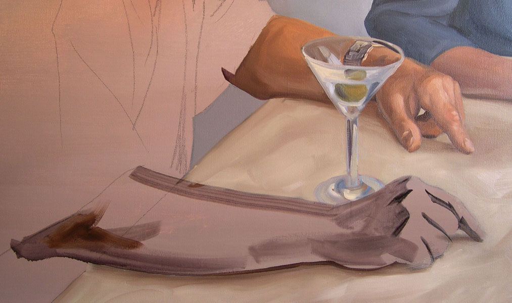
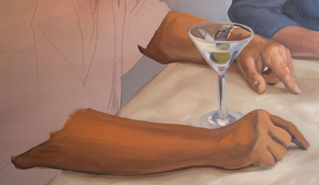
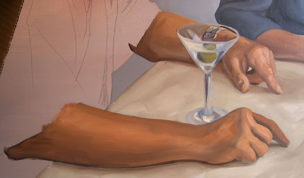
The Male Figure’s Arm and Hand in the Foreground
Much of this next section is a repetition of the female’s
face and hands but I thought it would be nice if I went over some of the
bony landmarks and problems that I encounter when painting a hand and fingers.
I use the same blobs of premixed flesh tones that I mixed for the female
but then remix them again with a bit more orange and burnt sienna to vary
the flesh tones between figures.
Using a number 12 synthetic bright, I start with a thin wash of medium, and lampblack, mixed with alizarin and scarlet for the darks. I pay special attention to the bony landmarks at the knuckles of the back of the hand where the first set of phalanges fold. I also try to visualize the radius and ulna under the skin at the wrist and especially the joint the makes up the elbow where the radius, ulna, and humorous, join. If you look at a skeleton, you’ll actually see that the bones over lap and turn over each other in an odd and unexpected manner. Visualizing these bony landmarks allows me to get the contours correct and to find the planes where the light breaks. Next, using a number 12 synthetic bright, I mix medium in to create a very liquid wash of the darkest tone/hue that was mixed from cadmium orange, burnt sienna, a touch of lampblack, white, and a little bit of raw ochre. I wash this in to all of the darkest areas of the face. Using the same brush and a lot of painting medium I then wash in the medium tones. The edge of the knuckles is accentuated to remind me of how the light breaks. I will smooth this transition out later. Grabbing from the same piles of premixed color I mix in a little bit of the tablecloth color into the dark part of the forearm to show the reflected light. The forearm and draker parts of the arm are warmer colors then the fingers that face the light. Again, I blow up areas such as knuckles and fingers of the photo on my computer to see specific areas and see subtle color variations in these areas. Look at all the grayish purple poking out under the layers in the core shadows of the knuckles and the forearm. The light highlights of the knuckles are exaggerated a bit with a touch of white mixed with black. Using smaller sable brushes the rest of the hand is a series of small refinements using many of the colors I’ve mixed on the palette. I refine the veins in the back of the hand, look for the tendons and bone ridges on the front of the fingers, and then reestablish some highlights created by striations in the skin running in horizontal bands. |
|
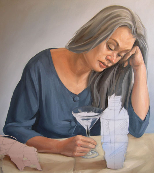
Kenney Mencher, In Martini Veritas, oil on canvas 36"x48" |
The Black Shirt I painted the black shirt last so that I would get a crisp edge to the sleeve where it fell over the forearm. Again, I made sure I planned the layering to create crisp and rational edges to the overlapping forms. For example, I painted the background sleeve first, then the blue gray panel on the front of the shirt and then the foreground sleeve. I’ve been calling it a “black shirt” but this may be a misnomer. This shirt is not “black” rather it is a series of warm and cool grays. The front panel is a lighter and cooler gray that is mixed from, Payne’s gray, black, a touch of umber, and white. The back and darkest areas of the shirt are alizarin and lamp black. The light areas of the sleeve are mixed from alizarin and lamp black and white making a different and warmer gray then the bluish gray panel on the front of the shirt. Voila! Finished! Kenney Mencher |
Subscribe to:
Posts (Atom)