- http://www.kenneymencher.com/
2015/03/a-chronological- listing-of-most-of-my.html - https://www.facebook.com/
groups/SurveyArtHistory/ - http://kenney-mencher.
blogspot.com/2014/06/art- appreciation-basic-concepts- and.html - http://www.kenneymencher.com/
2015/03/art-history-classical- world-of-greece.html - http://www.kenneymencher.com/
2014/08/art-history-and-art- appreciation_26.html - http://kenney-mencher.
blogspot.com/2014/06/art- appreciation-roman-art-and. html - http://kenney-mencher.
blogspot.com/2014/06/art- appreciation-italian- renaissance.html - http://kenney-mencher.
blogspot.com/2014/02/ renaissance-architecture-and- sculpture.html - http://kenney-mencher.
blogspot.com/2014/02/art- history-everyone-should-know- how.html - http://kenney-mencher.
blogspot.com/2014/03/art- history-everyone-should-know- how.html - http://kenney-mencher.
blogspot.com/2014/06/art- appreciation-michelangelo.html - http://kenney-mencher.
blogspot.com/2014/06/art- appreciation-italian- renaissance.html - http://kenney-mencher.
blogspot.com/2014/06/art- appreciation-leonardo.html - http://kenney-mencher.
blogspot.com/2014/06/art- appreciation-raphael.html - http://kenney-mencher.
blogspot.com/2014/06/art- appreciation-italy-part-2.html - http://kenney-mencher.
blogspot.com/2014/06/art- appreciation-italy-depictions- of.html - http://kenney-mencher.
blogspot.com/2014/06/art- appreciation-last-judgment- scenes.html - http://kenney-mencher.
blogspot.com/2014/06/art- appreciation-renaissance-in. html - http://kenney-mencher.
blogspot.com/2014/06/art- appreciation-caravaggio.html - http://kenney-mencher.
blogspot.com/2014/06/art- appreciation-velasquez.html - http://kenney-mencher.
blogspot.com/2014/06/art- appreciation-late-french- baroque.html - http://kenney-mencher.
blogspot.com/2014/07/art- appreciation-rubens-and- rembrandt.html - http://kenney-mencher.
blogspot.com/2014/07/art- appreciation-rococo-and.html - http://kenney-mencher.
blogspot.com/2014/07/art- appreciation-chardin-and- greuze.html - http://kenney-mencher.
blogspot.com/2014/07/art- appreciation-vermeer.html - http://kenney-mencher.
blogspot.com/2014/07/art- appreciation-flemish-and.html

I'm Kenney Mencher. I'm an artist who left a tenured professorship in 2016 to pursue making art full time. This blog is about art, art history, with a emphasis on human rights. I make homoerotic art featuring bears, otters & other gay wildlife.
Sunday
A Chronological Directory of My Art Appreciation Blog Posts and Videos
For my students who will be taking Art Appreciation This Summer
What is it and why do we study Art Appreciation? What kind of stuff will we be studying?
Lots and lots of pictures of stuff. Musical instruments, housewares (cups, saucers, plates, and fabrics), posters, buildings (private homes, churches, temples, and tombs) and even movies!
What is it and what is it good for?
For me Art History and Art Appreciation are important because these classes combine all of the other classes I had as an undergraduate. For each subject or idea I studied in a history, literature and even language and math, I found an idea that was illustrated or elaborated on in my study of the pictures in my Art History textbooks.
What goes good with it?
Any one of the classes you see below is a good partner to Art History.What I did as an undergraduate was to take classes that were roughly studying the same time periods or subjects and write the same paper for all of my classes. For example, one semester I took:
HIST-104A Western Civilization (Art 103A)
HIST-104B Western Civilization (Art 103B)
GEOG-102-01 (012485) Cultural Geography
GEOG-104-01 (012486) The World's Nations
Almost All English Classes
PHIL-101-03 (012984) Ancient Philosophy (Art 103 A)
PHIL-102-03 (015572) Modern Philosophy (Art 103B)
PHIL-110-01 (012992) Intro to Asian Religions
PHIL-114-01 (012993) Intro to Islam (Art 103A)
History of Greece
Greek Tragic Theatre
Art History 1 (Prehistory through 1300 AD)
Philosophy
and Italian
I was able to write a paper about the influence of Greek Theatre and Philosophy on the Re-Building of Athens's Acropolis. I even was able to throw in some language stuff about Greek and Latin because of my Italian stuff!
Another semester I took:
Napoleon and the French Revolution
18th and 19th Century Art
Literature (War and Peace by Tolstoy)
For that semester I wrote a paper on the French Revolutionary artist Jacques Louis David and how he was the main propagandist (advertising guy) for the French revolution. I was able to include some of the works of literature I was reading in my literature class because it covered another perspective of the wars!
I will always encourage you to integrate many different subjects and ideas into your study of Art History!!
How to use the Web site and the Textbook and how to fill in a worksheets.
(Stokstad has a similar "starter kit" on pages 17-41 make sure you know the terms on page 20.)
Step #1 Reading the paper texts and online texts before lecture. If you are in the online class, read Stokstad before you read the on-line stuff.
| The white section at the left is a page like the ones you may find in the Stokstad's "Art History." If you look at it you will see it has a picture of a man standing with his arm raised. This is sometimes referred to as a plate, picture, image or figure. The words directly beneath the image are a description of what it is. This description is called a caption. It contains information which you may not understand. Here is a color coded diagram to explain how the caption works.
Beneath the body copy or text in the lower right hand corner is the name of the period and or culture you are studying. On the worksheets and tests this information is important. If you are confused about what period or culture you are studying look at this. |
Many of the terms that are used above also apply to the identification of art works both in general, and in terms of how I want you to identify them on the worksheets. When asked about these terms, you will need to explain them completely in your won words and possibly to provide an example. Some of the terms we just used above are Title- This refers to the name of the work. Sometimes a title can include its location now or where is was found or even who found it.
BCE- Means "before the common era." In older books the term is BC, which means before the birth of Christ. We use BCE instead of CE in this class probably because we have a newer version of text book that uses BCE instead of CE and because of religious/cultural reasons. Since we are all not Christians, some people might be offended by the use of the term “Before Christ.”
CE- Means "common era." Older books will have AD "anno domini", which means "in the year of our lord."
Date- This is usually the time it was found. Sometimes historians aren't sure so we give a "range" of dates.
For example 1st century CE (perhaps a copy of a bronze statue of c.20 BCE.)Location or Region- Where the work of art can be found or was originally created. For this class, make sure that you use the place where the work was created as the region, rather than the museum or country it is exhibited in now. This is importnat because it will come up on the work sheets. style-
or
1000 BCE - 900 BCE
Webster's dictionary defines,
However, this definition is not quite right for the study of art.¹style n 1: designation, title 2 a: a distinctive manner of expression (as in writing or speech)
Style is influenced by culture, civilization and trends. A style in art usually defines how a work will look. A style is defined by a series of shared physical or formal characteristics. The name "style" on work sheets is often synonymous with a work's culture or civilization. For example, the Anasazi culture's style of representation is usually very linear, geometric, and unrealistic. The colors they use in paintings and pottery are made of subdued earth tones. culture- A culture is a group of people who share a similar way of life. Often they share the same religious beliefs and political opinions, dress similarly and even eat similar foods. They also share a way of seeing and representing things. Sometimes a culture is part of a civilization however a civilization is usually tied to a specific geographic region. (Make sure you do not copy this exact definition on the worksheets.)
civilization- Civilization is a broader terms including several cultures or periods of time. But, it can also be used as a specific reference to specific periods or segments of time, within a specific geographic location or region.
For example, the Greek civilization was found in the Mediterranean, where the modern country of Greece is now located. In general, they were unified by a similar culture although they spoke several dialects of Greek and there art went through several distinct styles and periods.
800-700 B.C.= Oriental Influence
700-500 B.C.= Archaic Period
480-350 B.C. = Classic Age
350-100 B.C.= Hellenism (Hellenistic Art) also called the Late Hellenistic.
period- The term "period," for art historians is often interchangeable with style, culture, and/or civilization. There are exceptions to this rule. Usually a period is the name given to a specific kind of style that is also linked to a time segment. Different developments of art forms in some cultures lead art historians to define a new time segment in which a new style emerges. In the case of Chinese and Egyptian art, these changes are referred to as dynasties.
In short, art historians pick a general name that defines a specific kind of art and they usually choose from among those names according to the term they think is the most descriptive.
The online textbook has a similar format to Stokstad but the captions are a little bit different.
Below is an excerpt from the online textbook which can be found at by following this link.
Augustus looks a lot like the Doryphoros but is from a region in Italy and comes from a much later time. Therefore Augustus comes from a different civilization that shared a lot of stylistic qualities with Ancient Greece. Threrefore, the main difference between period and civilization is that period is a kind of style that is a subset of a civilization. Civilizations go through many periods of development and a civilization is located in one geographic region and spans a longer time.

Kouros from Attica
(the region surrounding
Athens, Greece)
c600 BCE 6' 4" marble
polychrome, encaustic
Metropolitan Museum
of Art, NY
Archaic
Doryphoros (Spear Bearer)
(also called "the Canon")
by Polykleitos c450-440 BC
Roman copy after a bronze
original marble height 6'6"
tree stump and leg brace
are later
Roman additions
Classic, Greek6-30. Augustus of Primaporta.
Early 1st century CE
(perhaps a copy of a bronze
statue of c.20 BCE.)
Marble, height 6'8" (2.03m).
Musei Vaticani, Braccio Nuovo, RomeAll of these works of art come from ancient civilizations. Even though we use the term "ancient" what we are saying is that these civilization occurred a long time ago. The Kouros from Attica and the Doryphoros come from the Ancient Greek civilization while the Augustus of Primaporta come from the Ancient Roman civilization.
The Ancient Greek civilization, is tied to the region of land we now call Greece. The civilization lasted between circa (approximately) 1000 BCE to about 100 BCE but we divide the Greek civilization into various periods that are defined by the style of art they produced. For example, the Kouros from Attica, comes from a period we refer to as the Archaic period, which lasted from around 600-480 BCE. The style associated with this Archaic period is that the sculpture is a bit unrealistic and slightly stylized in a geometric way. This means that the style of the Archaic period was to make the sculptures look kind of "blocky" and unrealistic.
A later "period" that occurs during the Ancient Greek civilization is the "Classic Period" which lasted from circa 500 BCE -350 BCE. The main characteristics are that the sculptures look life-like or realistic. So both the Greek works "periods" belong to the Ancient Greek Civilization. However, something happens when geographic location changes.
 Kiva painting from Kuana Pueblo Bonito 1300 CE - 1500 CE SW United States Anasazi Culture, Classic Period | Form: This painting is very one dimensional and no created sense of space. The depictions of the animals and human figures are diagrammatic, flat, and without shading. The forms tend to be depicted in a geometric fashion. The colors are muted and generally in shades of brown because the pigments used to color the murals were created from minerals and naturally occurring dyes found in their environment. Iconography: There is no standard or accepted interpretation of the mural's iconography. Interpretations based on contemporary Navajo symbols indicate that the central large figure may represent a thunder god or a person praying or performing a ritual. In the figures right hand is a figure that looks very similar to the yei figures from the Navajo "Whirling Logs" blanket shown below. The figure is also holding a prayer stick similar to the yei figures. A bird, perhaps an eagle, descends from the right with water, a god may have sent him or he may be a god. The eagle on the right has seeds, arrows, and a rainbow coming out of his mouth. This bird, along with the fish between these two figures represent the desire of the Anasazi for fertile earth by representing its two distinct elements of land and water. Context: The murals in kivas were painted over at various times and this layering presents a time table for art historians. These paintings may suggest a culture preoccupied with irrigation systems and agriculture. The murals serve several purposes. The murals are didactic. They instruct, indoctrinate, and educate the worshippers in the stories and symbols used in the Anasazi religion. The creation of the mural may have been a form of worship as well. Many cultures throughout the globe use religious art for the same reasons. |
| Kiva painting from Kuana Pueblo Bonito 1300 CE - 1500 CE SW United States Anasazi Culture Classic Period | Title- The name of the work, sometimes includes extra information Date- Sometimes historians aren't sure so we give a "range" of dates. Location or Region- Where the work of art was originally from. Not where it is now unless it hasn't been moved. Style, Civilization, Culture, & Period - Art historians pick a general name that defines a specific kind of art and they usually choose from among those names according to the term they think is the most descriptive. Usually it is a group of people who have lived during a specific period and share a way of life. Often I use these terms interchangeably, but they are slightly different. |
Step #2 Look up terms in the glossary and write definitions in margins of your text book. As you are reading you will encounter a lot of words you do not understand. In the back of Stokstad is a "glossary." This is a useful tool for clarifying any terms you may not have seen before.
This is what Stokstad's Glossary looks like.
contextualism A methodological approach in art history which focuses on the cultural back ground of an art object. Unlike connoirsseurship, contextualism utilizes the literature, history, economics, and social developments (among others) of a period, as well as the object itself, to explain the meaning of an artwork. See also connoirsseurship. |
There is also a glossary (which is less reliable) at the bottom of the pages of the online text. Below is a recreation of Stokstad, on the left and right hand sides of the pages in the margins are the kinds of notes and definitions that you should be writing in your textbook.
|
Step #3 After your lecture and or after you've read the online textbook, place more notes in the margins.
See below.
|
How do I use this stuff for a work sheet? The online worksheets look very similar to this one which you can print off the internet. The slots or places you fill in are self explanatory; however there are some concepts you should pay attention to.
Here are a couple of ideas or requirements that I would like to see you guys follow when composing your short answers.
First, write in complete and grammatical sentences. Check you spelling before you hit the submit button. You can be marked off for bad grammar and spelling!!!
Second, the short essay questions are your chance to show me how you think and how deep your understanding is of a specific term. Make sure you elaborate. In applying it to the art work please make sure that your application of the term explains what it means. Make sure you expand your explanation by using ideas and facts from all the primary texts, lectures and readings.
REMEMBER: When writing an essay for a worksheet you are NEVER allowed to copy straight from the textbook, primary texts or the online textbook. I will notice if something is not in your own words and you will automatically fail the assignment.
Name I.P. Daily WS#2 Art 103A
Write a short paragraph, in complete sentences, comparing and contrasting the two works. |
What are some suggestions, besides taking good notes, for remembering all of this material? I realize that I expect a lot from you, but I am confident that if you take detailed notes and do all of the reading, this material should come very easily to you. Here are some tips for keeping all of the information in your head:cir.ca prep [L, fr. circum around--more at circum-] (1861): at, in, or of approximately--used esp. with datesme.di.um n, pl mediums or me.dia [L, fr. neuter of medius middle--more at mid] (1593) (1): a channel or system of communication, information, or entertainment--compare mass medium (2): a publication or broadcast that carries advertising (3): a mode of artistic expression or communication (4): something (as a magnetic disk) on which information may be stored c: go-between, intermediary d pl mediums: an individual held to be a channel of communication between the earthly world and a world of spirits e: material or technical means of artistic expression 3 a: a condition or environment in which something may function or flourish b pl media (1): a nutrient system for the artificial cultivation of cells or organisms and esp. bacteria (2): a fluid or solid in which organic structures are placed (as for preservation or mounting) c: a liquid with which pigment is mixed by a painter
1) Keep a timeline!!! Mark it with two columns labeled "HISTORY" and "ART HISTORY". This way you will be able to track all of the events throughout time and begin to see new trends in art as events pass.GOOD LUCK WITH THE COURSE!!!!
2) Keep a list of trends!!! When you come across a new trends in art, write it down with a range of dates that mark when it emerged. This can help you follow new trends and how art can move along.
3) Keep a list of words!!! If you need to look up a word in the glossary or ask in class, write it down next to a definition. Such a list can help you memorize key concept that you may have had trouble with.
Key Concepts and Terms REMEMBER: When writing an essay for a worksheet you are NEVER allowed to copy straight from the textbook, primary texts or the online textbook. I will notice if something is not in your own words and you will automatically fail the assignment.
Text
A text, as in a textbook, is something you read. A work of art, like a book, is also something that can be read. The first step in reading a book is looking at it -- not reading the book in the traditional sense but actually looking at the physical properties of the book. How big is the book? What is depicted on the cover? How many pages does it have? Are there illustrations? Take the book down off the shelf, crack it open, and you begin to read the book for its style. The first thing you may notice is the book's form. Are the sentences long and complicated? How is the book organized? Does the book follow a chronological or alphabetical sequence? Reading deeper into the book you discover its content. You are now analyzing the meaning of the book and what the book is about becomes important. You may find that as the book progresses that the way in which the plot elements and characters relate to each other means something more than you first realized. The overall meaning becomes clearer as you analyze the symbolism of the book's plot and characters. This means that you have placed the work within a contextual framework. When we look at a work of art, the same concepts apply to reading a work of art as if it were a written text.
How do you analyze and appreciate a text as a work of art or a work of art as a text?
Formal Analysis
form
(1) : orderly method of arrangement (as in the presentation of ideas) : manner of coordinating elements (as of an artistic production or course of reasoning)
(2) : a particular kind or instance of such arrangement
b : PATTERN, SCHEMA(3) The literal shape and mass of an object or figure. (4) More general, the materials used to make a work of art, the ways in which these materials are used utilized in terms of the formal elements (medium, texture, rhythm, tempo, dynamic contrast, melody, line, light/contrast/value structure, color, texture, size and composition.)c : the structural element, plan, or design of a work of art -- visible and measurable unit defined by a contour : a bounded surface or volume

6-30. Augustus of Primaporta. Early 1st century CE
(perhaps a copy of a bronze statue of c.20 BCE.)
Marble, height 6'8" (2.03m).
Musei Vaticani, Braccio Nuovo, RomeForm consists of the physical properties of the work. Whether we look at a sculpture's size, mass, color, and texture or a poem's order of elements and composition, all are part of the work's form. When you are doing a formal analysis, you describe the way that the work looks, feels, and is organized. The next passage is a formal analysis of a work of art; the Augustus of Primaporta is a statue from the first century BCE.
The statue stands six feet eight inches tall and is made of white marble. It depicts a male figure wearing armor and some drapery, with his right arm raised. The figure carries a bronze spear or staff in his left hand. The texture of the hair and skin mimic the texture of real hair and skin. Augustus stands in contrapposto, appearing to be stepping forward with most of his weight resting on his right hip. Attached to his right leg is a small dolphin with a winged baby on its back.


Whirling Logs
Navajo Sandpainting Textile
Contemporary Navajo Carpet 1990'sOne of the more important elements concerning form is the idea of composition. Composition can include how things are laid out in two dimensional space or how the picture plane is organized. For example, the top two images in this illustration are asymmetrical. The blue circles are not evenly distributed through out each rectangle.
The bottom two most images are symmetrical. There are balancing elements on each side of the blue sphere in the lower left hand image. Even though one of the objects is a square and the other a circle, they take up about the same amount of space and have the same visual weight.
The boxes on either side of the tall white rectangle are mirror images of each other and this can be referred to as symmetrical too. Since you could draw a vertical line down the center of the center rectangle and on each side of this imaginary line it would be a mirror image, this is called bilateral symmetry.
The "Whirling Logs" textile on the left is arranged in a bilaterally symmetrical fashion because we could draw cut the design in half and the left and right sides are nearly a mirror image of each other. Nevertheless, for all its symmetry, this textile appears kind of flat looking.These two pictures demonstrate this idea. If you look at the one on the left, there is very little overlapping in the picture plane and the figures seem to be pressed against this imaginary window. While the one on the right has some overlapping and we can tell that some figures are in front of others. This overlapping gives us a sense of space.
Composition also has to do with the creation of the illusion of space. When we look at pictures (as opposed to sculptures as the Augustus above) we often think of the picture as an imaginary window. The front of the window, or the glass, is the picture plane that we look through. In order to create space artists conceive of the picture plane as having three planes that recede back. In order to create space in the picture plane and the appearance of a foreground, middleground and background we can overlap objects to give this illusion. If there is nothing overlapped then we can say that there is no real illusion of space in the picture.

| Whirling Logs Navajo Sandpainting Textile Contemporary Navajo Carpet 1990's |  |
These two sculptural friezes demonstrate these ideas in a three dimensional form. If you look at the one on the left, there is very little overlapping in the picture plane and the figures seem to be pressed against this imaginary window. While the one on the right has some overlapping and we can tell that some figures are in front of others. This overlapping gives us a sense of space.
 The "Panathanaic Frieze" from the Parthenon sculpted by Pheidias and his assistant, c.440 BCE, Athens, Greece, Classical Greek |  Frieze from the Ara Pacis Augustae representing a prosession of Roman citizens, c139 BCE, Rome, Italy, Roman |
Here is an example of a formal analysis of the Greek tragedy The Bacchae written by Euripides in 406 BCE. You can use a similar format of analysis when examining a work of art.
The Bacchae is play written in a chant form called dithyramb. Musical instruments, especially the drum, were used to keep time in the performance of the play. Approximately eighty percent of the play is dialogue while only a small portion is devoted to action on the stage. The order of the narrative is predictable and therefore symmetrical because there is a continuous cycle of basic components that are repeated throughout the play. These components are known as the prologos, parados, episode, stasimon, and exodos. The repeated sections are the three central components of the parados, episode, and stasimon, which are retold in predictable form as many as five times in the typical Greek tragedy.
- The prologos (prologue) is the opening scene in which an introductory monologue or dialogue is presented. This establishes the background information of the play and also introduces the "problem," or outlines the events that are to follow.
- The parados is the next section in which the chorus, in chant form, introduces some of the characters. They also tend to predict certain events and comment on the action that will follow in the episode. The chorus is also a useful tool for explaining to the audience some confusing parts of the story line.
- The episode is the main action of the play in which the central characters interact, to form a constant story line, in the center of the stage.
- The stasimon follows the episode. In this section the chorus summarizes and comments on the action that took place during the episode. The play ends with the exodos.
- The exodos is actually the last stasimon of the play and concludes the action with a ceremonial exit of the actors from the stage.
"Content includes subject matter, which is quite simply is what is represented, even when that consists strictly of lines and formal elements-lines and color without recognizable subject matter, for example." "The study of the "what" of subject matter is iconography. Iconology has come to mean the study of the "why" of subject matter."Icon comes from the Greek word Ikon which means image. Originally, the term icon was associated with images of Jesus or the Virgin Mary. In our culture we sometimes refer to people as cultural icons such Marilyn Monroe. Art historians have transformed the term to be synonymous with the term symbol. Therefore an icon can be an image of saint or animal or it can be a symbol such as a crucifix or a flag. Iconography is the interpretation of a series of icons within a work of art or literature. For this class, an iconographic analysis is the analysis of the symbols used in a work of art.
 6-30. Augustus of Primaporta. Early 1st century CE (perhaps a copy of a bronze statue of c.20 BCE.) Marble, height 6'8" (2.03m). Musei Vaticani, Braccio Nuovo, Rome | The next passage contains an iconographic analysis of the sculpture Augustus of Primaporta. The unnatural height of the statue is symbolic of the god-like status of Augustus. The figure's armor is a symbol of his role as a military leader. His raised right arm with an extended index finger appears as if he is gesturing or lecturing and maintains his position as a powerful leader. The bronze staff in his left hand is an icon that signifies his status as a leader as he uses it to help dictate his proposed actions. The statue appears to be stepping forward and most of the weight appears to be resting on his right hip. This pose, referred to as contrapposto, was first developed in classical Greece and represents a legacy inherited from this past culture. Engaged against the right leg is a small dolphin with a winged baby on its back. The dolphin is a maritime reference and the small winged figure on its back may represent winged victory. The two icons, when juxtaposed against one another, may represent victory at sea. However, some interpretations of this iconography have suggested that the winged figure is Cupid and therefore represents Augustus' relationship as a descendent of the gods with Cupid acting as his kin. |
|

Some interesting ideas that might help you to understand the terms "civilization" and "period" occur when studying the concept of "schema and correction." Both of these works of art come from the Ancient Greek civilization. Even though we use the term "ancient" what we are saying is that the Greek civilization occurred a long time ago. Within the Ancient Greek civilization, is tied to the region of land we now call Greece. The civilization lasted between circa (approximately) 1000 BCE to about 100 BCE but we divide the Greek civilization into various periods that are defined by the style of art they produced. For example, the Kouros from Attica, comes from a period we refer to as the Archaic period, which lasted from around 600-480 BCE. The style associated with this Archaic period is that the sculpture is a bit unrealistic and slightly stylized in a geometric way. This means that the style of the Archaic period was to make the sculptures look kind of "blocky" and unrealistic. A later period that occurred during the Ancient Greek civilization is the "Classic Period" which lasted from circa 500 BCE -350 BCE. The main characteristics are that the sculptures look lifelike or realistic. So both the "periods" belong to the Ancient Greek Civilization. The main difference between period and civilization is that period is a kind of style that is a subset of a civilization. Civilizations go through many periods of development and a civilization is located in one geographic region and spans a longer time.
| 6-30. Augustus of Primaporta. Early 1st century CE (perhaps a copy of a bronze statue of c.20 BCE.) Marble, height 6'8" (2.03m). Musei Vaticani, Braccio Nuovo, Rome |  Aulus Metellus 1C BCE Etruscan | The next passage is a contextual analysis of the Augustus of Primaporta. The portrait of Augustus of Primaporta is work of political propaganda. Augustus waged an extremely profitable series of wars and was able to extend the Roman Empire's borders. His ability to control the Senate maintained his status of unchallenged power within the Roman city as well. The unnaturally tall height of the statue is symbolic of the god-like status of Augustus because the average height was around five feet. The statue of Augustus is a correction of an even earlier sculpture called the Aulus Metellus. Augustus's raised right arm symbolic of his abilities as a master orator and refers and builds on the iconography of Etruscan portrayals of great statesman such as depicted by the Aulus Metellus. The raised arm, a symbol of rhetorical power as a speaker is combined with the bronze staff and armor are references to the abilities that any Roman leader should possess. In some ways, this is the originating idea of our conception of the "Renaissance Man" of the 1500's. The references to the Aulus Metellus statue, the contrapposto pose (invented by the classical Greek culture) and the Cupid (representing Augustus as a descendent of the gods) grant both the Augustus Primaporta, and Augustus himself, an authority based in time honored traditions. |
Saturday
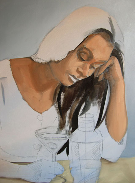
How I plan, draw, layout then render a large 36"x48" canvas

First step for me was to lay out the drawing of the image with a charcoal pencil on this large canvas.

I then painted everything in roughly in
acrylic paint with white acrylic gesso as the white paint. I always
paint background to foreground if I can. Sometimes I need to paint the
whole thing at a time but I find I get nicer edges if I think back to
front.

After painting the background and the
table and glass in acrylic, I switched to oil paint. I use the same
palette of colors in acrylic that I use in oil paint. With oil paint I
also make sure that I premix large batches of colors so that they are
more or less consistent in terms of hue and value structure (shading.)
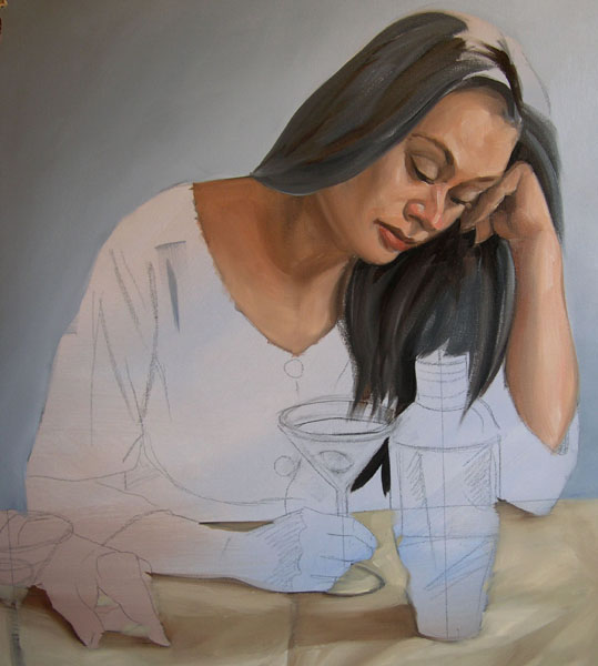
Go to this link to see detailed step by step of how I painted a clear vessel of water. It's the glass in this painting.

With the glass of water done I move on
to paint the shirts in oil too. I can see how it might look a little
paint by numbers here but in this case, I premixed and painted each
section individually so that the shirt parts would remain consistent.

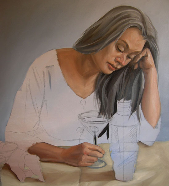
Letting the wet paint dry before I move on to the faces.

I do not underpaint the faces in
acrylic. For faces I paint directly in oil. I have a really in depth
article on color mixing and portrait painting on my site if you want to
know my method for painting portraits and my color scheme for portrait painting.
Buoy oil on canvas 36"x48"

More "How to" Articles and Tutorials
- Demonstration Drawing the Sphere
- Demonstration Drawing the Cube
- Demonstration Video: How to Paint the Shapes Monochromatically
How to draw a portrait
- Demonstration Video: How to draw the head in pencil
- Demonstration Video: Sketching the Head and Face in wash media
- Demonstration Single Portrait (Joy Anne Delight))
- Demo Portraits (Two Figures)
- Demonstration: How I make a painting (In Martini Vertas)
- Demonstration: How I make a painting (Hat in Hand)
- Demonstration: How I revise and work out problems in my paintings.
- Demonstration: How I make a painting "Buoy"
Friday


Wednesday
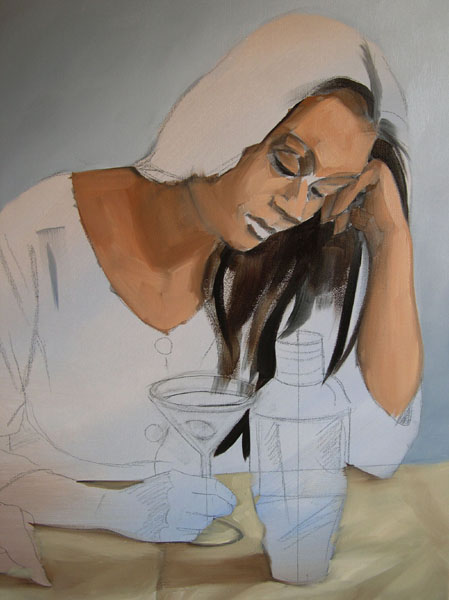
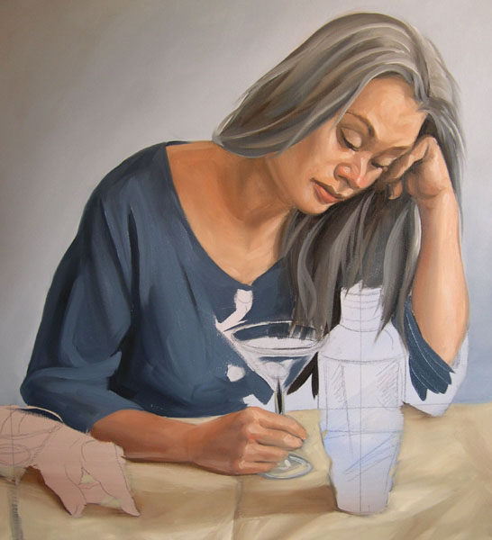
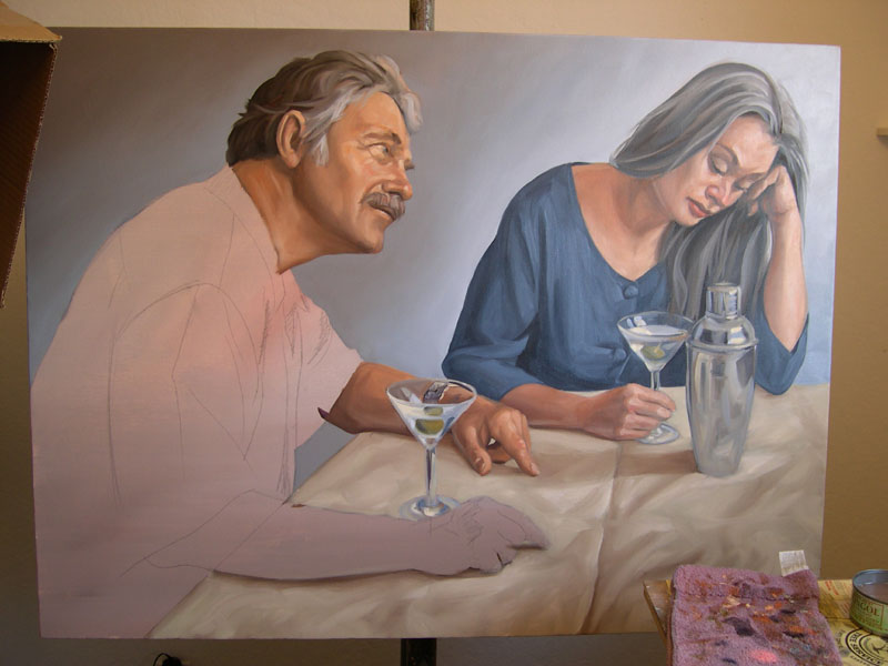
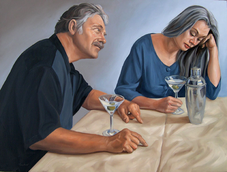 Kenney Mencher, In Martini Veritas, oil on canvas 36"x48" | In Martini Veritas: How to Plan, Photograph, Draw, and make a Painting Kenney Mencher Sure, I would love to work exclusively from live models but the reality is I cannot afford to have a model sit for the thirty to forty hours it takes for me to make a painting. For this reason, being an economically challenged painter sometimes means that you also need to learn how to be a photographer. If you do, you’re in good company, Eric Fischl, John Currin, Gerhard Richter, Anders Zorn and even Degas all use or used photography. Using photographs and especially digital photographs can even have unseen benefits both in terms of content and technique. |
 Photographed with a flash 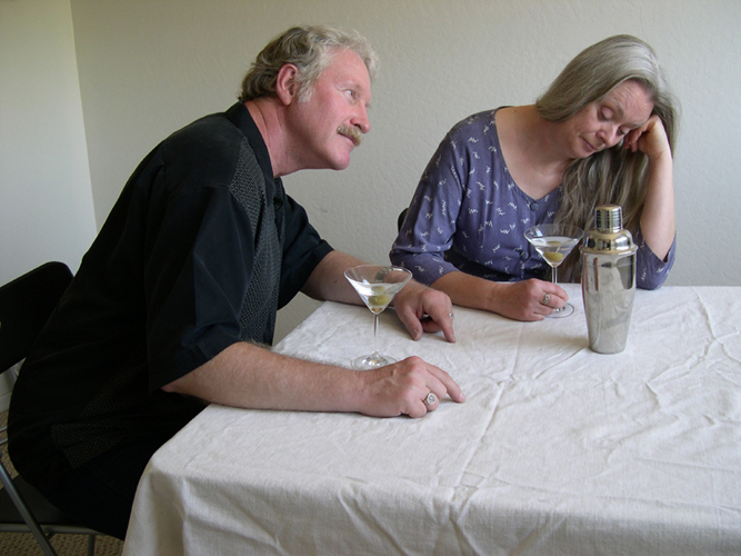 Photographed without a flash | 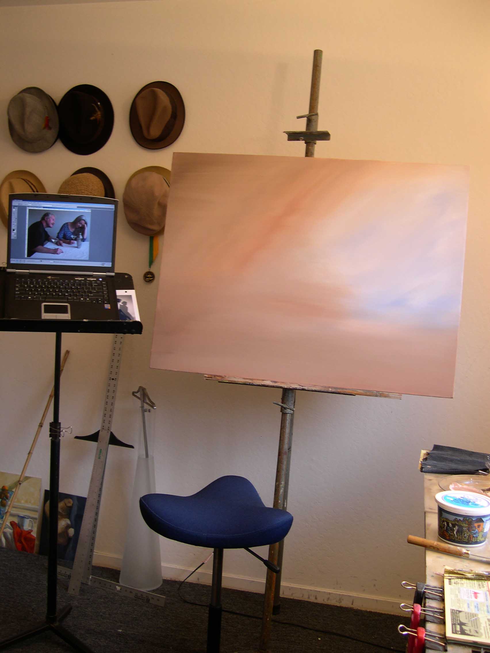 | Using Digital Photography I keep a sketchbook with thumbnails and lists of ideas. When I get enough ideas for paintings together and I have an idea of what kinds of ideas will work with the models I have available I do a photo shoot. In the shoot, I pose the models and take multiple versions of the same pictures. I often will under expose and underexpose knowing that each shot captures different things that the naked eye may automatically be able to see. I will also take at least one shot with the flash on for the same reason. By bracketing my exposures, I am able to see more subtle variations in skin tone and value in both the darks and lights. Manipulating these photos on my computer using Adobe Photoshop, I am able to push the value structure even further and manipulate color as well as value in the images I work from. I actually work directly from the computer screen since the screen is more luminescent than an ink jet print. This also allows me the benefit of playing with exposures and magnifying sections of the image with out having to print out tons of extra copies. It saves money and time. |
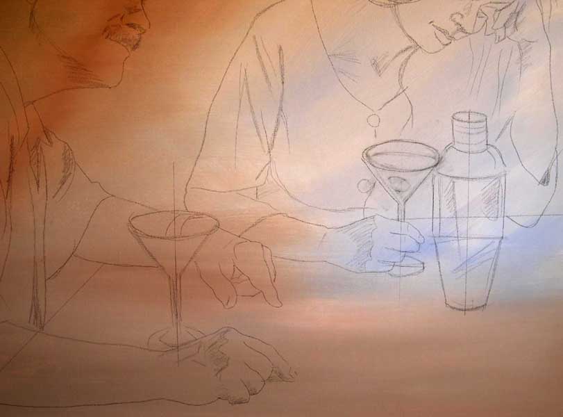
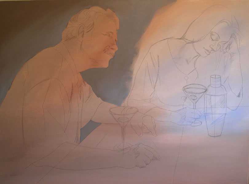
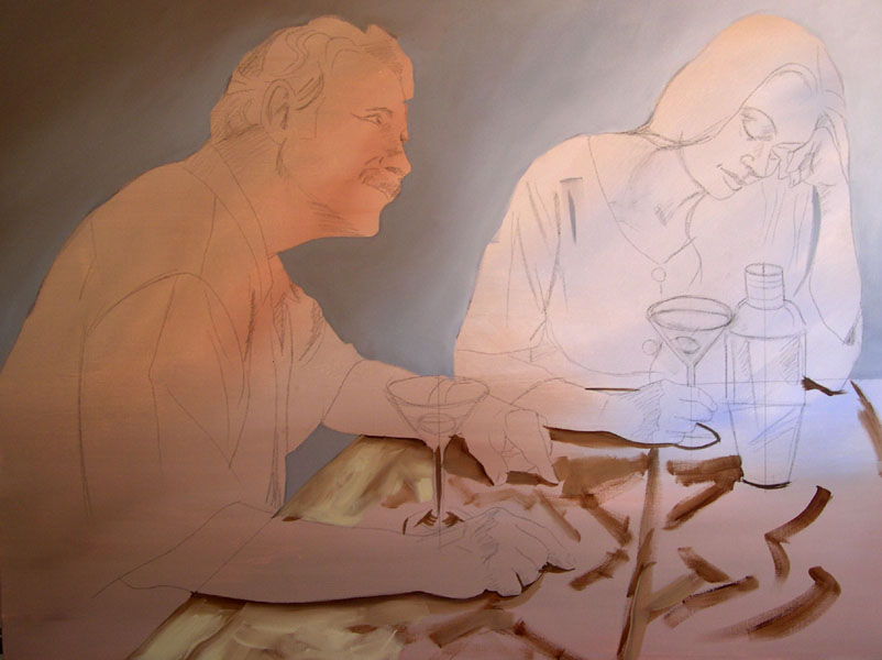
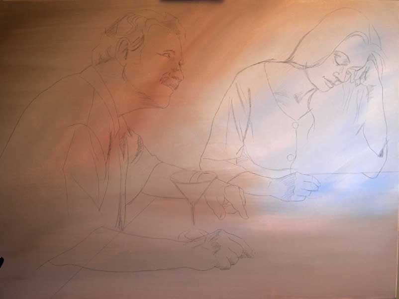 | The canvas underpainted with colored acrylic. The drawing is done in charcoal pencil but is incomplete until I use tools such as T-squares and ellipse guides to draw the martini glasses. |
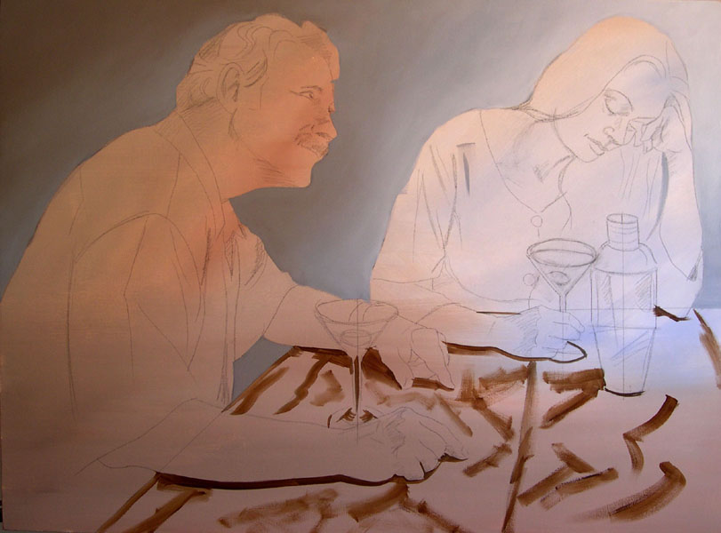
 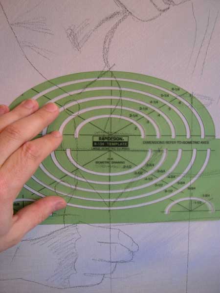 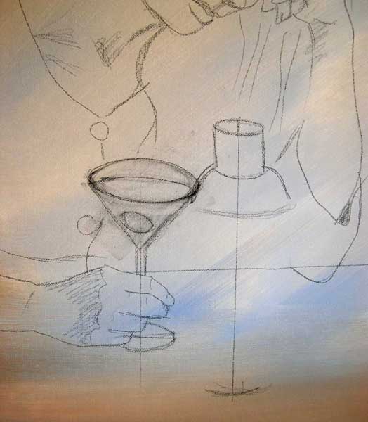 | 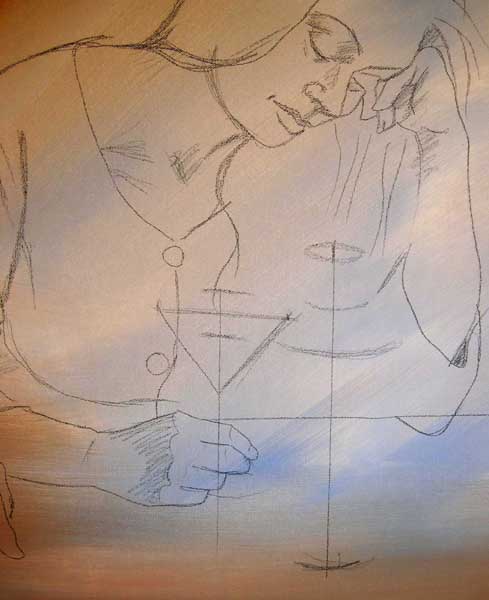 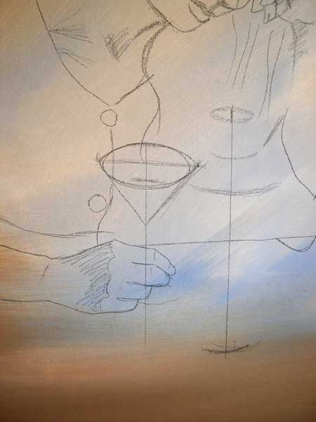 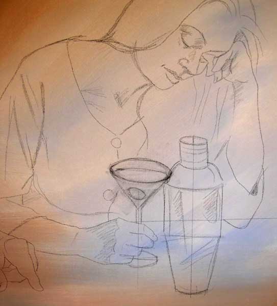 | Preparing the Canvas and the Underdrawing I prepare the canvas with tube acrylics mixed with acrylic gesso for some tone and color. In this painting, my underpainting of acrylic corresponds roughly to the colors of the painting I will be putting on top of it. I then lightly sketch out the figures basic shapes and where I think the light breaks across planes and drapery with a charcoal pencil. I keep these outlines super light. I also do some minor “plastic surgery” on the models to make the painting work just a little bit better. For example, in the female figures I’ve moved the hair a bit, strengthened the jaw line and changed the angle of the shoulder. When I’ve finished sketching out the people and corrected or distorted the anatomy of the figures so that they will work better in a painting. Things that work in a photograph don’t always translate into painting and drawings and so I find I cannot rely solely on how the camera portrays some elements. This is why I chose to crop the image the way I did and to discard the bend in the wall to the left of the two characters. The lens of a simple digital camera is often designed to be multipurpose. These “one size fits all” lenses tend to be a bit more distorting then regular analog cameras. The foreground to background size distortions are exaggerated by this. You can compensate for these scale distortions by photographing your initial set up shots from far away and then moving in for detail shots. I also rely on my knowledge of perspective or just redraw things by eye to be a more realistic scale than the camera depicts them. I’ve also found working from any photograph that the camera’s depiction of verticals and horizontals should be ignored. If you look at the bend in the wall to the left side of the two characters in the reference photo you may notice that vertical line where the two walls meet seems to lean towards the left. In a photograph, we don’t question this, in a painting it looks like a mistake. I square up the edges of these elements to correspond to established rules of perspective. The vertical and horizontal lines are drawn to parallel the edges of the picture plane. When I draw out things like doorways, bottles, and in th is case martini glasses and a martini shaker, essentially anything with a vertical line running through them, I straighten and check any vertical or horizontal lines with a tee square. I also like to use the tee square and ellipse guides to augment my drawing skills of ellipses. The funny thing is that although I use these guides in my under drawing I sometimes change them a bit as I paint them to get the right feel. Most of the battle for a good painting starts in the planning phases. If the foundational drawing is accurate and feels correct, I can usually pull of a good painting. Having a consistent working method and planning the colors is also something that will make the painting go more smoothly. |
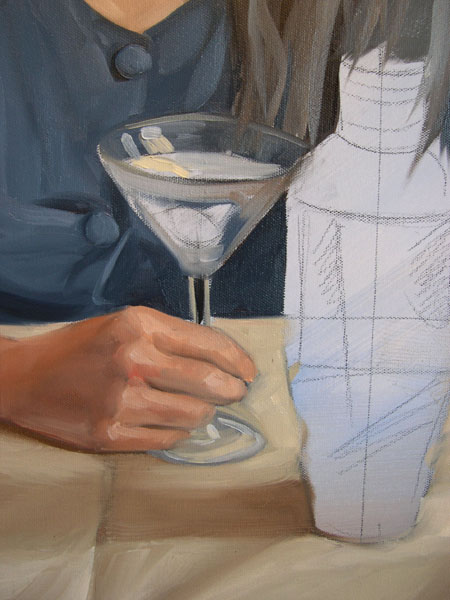
 | The completed martini glasses and shakers. |
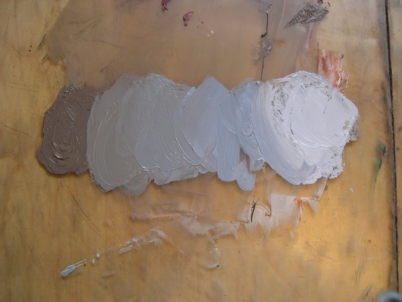
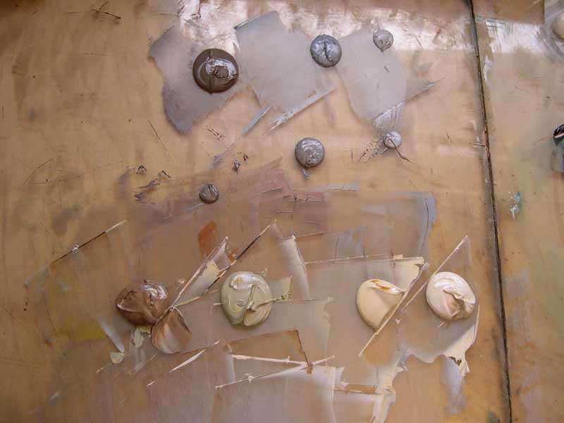
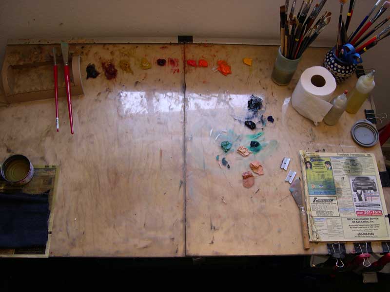  | Materials, Tools, and Palette of Colors My worktable is made from to large tempered sheets of glass laid across a piece of plywood. I use a tuna can for my odorless solvent, a cloth rag, a phone book that I use to wipe brushes, knives on. I use toilet paper for final clean up. I mix my colors with large plaster knives. I use several different kinds of brushes. For the large areas and for blocking in I use large synthetic brights. Usually these large blocking in brushes is in the 12 and 8 sizes. I also use a large sable fan brush to smooth out things like backgrounds and large stretches of cloth or drapery although I do not use the fan brush to work on the figures or still life objects. For smaller areas, I use synthetic filberts to push the paint around and to block in areas, especially in still life and figures but then I use sable filberts in a variety of sizes to work out transitions and details. I use several mediums depending on what I am painting. For skin and still life I tend to use a medium mixed from one part dammar varnish, one part stand oil and four parts turpentine (not paint thinner). I use turpentine for mixing my medium because odorless paint thinner is not strong enough to dissolve the dammar in the mixture, however, I do use odorless paint thinner to clean my brushes. For rendering drapery, I use straight linseed oil or Gamblin’s galkyd painting medium. My mediums are kept and squeezed out of squeeze bottles I got from a beauty store. My palette of colors is consistent from painting to painting. I rarely add colors and I use every single color I have on my palette for every painting. I like to use Gamblin paints for the majority of my colors although occasionally I will substitute some other cheaper brands. I also use Winsor Newton’s soft mixing white because I’ve found that it really is softer and more pliable than some other whites I’ve tried. My palette is laid out in the following order. Burnt Umber, Burnt Sienna, Raw Sienna, Yellow Ochre, Alizarin, Scarlet, Cadmium Red, Cadmium Red Light, Orange, Cadmium Yellow, Lamp Black, Payne’s Grey, Since I’m a very systematic and planned painter I also like to mix a majority of the colors before I even begin painting an object or a figure. This kind of “paint by numbers” approach is a way in which I can manage my anxiety, experiment, and keep my palette consistent. In order to do this I also have to think and plan the color scheme and mixtures for the entire painting. |
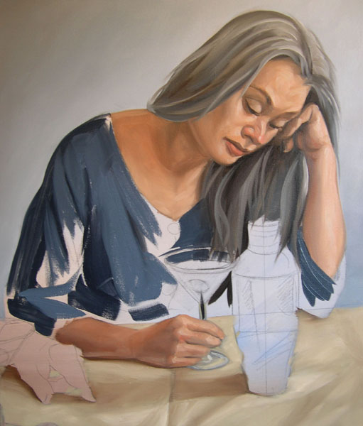
  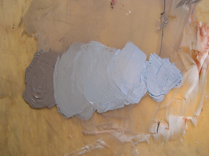  |    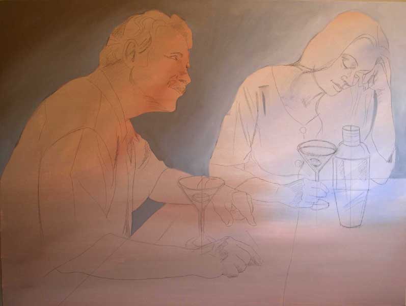 | A Plan of Attack Before I begin working, I look at the color of the overall light. I carefully observe the direction of the light and note the warm and cool relationships of the colors of walls, drapery, objects and skin. Using what I’ve observed for a moment I edit my plan of color by intentionally redesigning the existing color scheme. I consciously plan to exaggerate and caricature the colors from the photo since they are just a touch washed out to me. I decide which colors I will intensify and which warm cool relationships I will heighten to make these colors more brilliant and interesting. Painting the Background Next, I plan and rehearse the order that I will paint the things in the painting. I usually begin a painting also by working background to foreground. By this, I mean, I paint the stuff that is behind anything first and so that the edges of things are crisper as I move into overlapping items. For this painting, I started with the wall behind the figures. These photographs were shot with natural north light in my dining room. The light came in from the right hand side window and moved across the figure from right to left. North light is a little different from halogen or incandescent light sources because in the lights areas the light is cool and the shadows tend to be warm browns. That means that the colors I mixed from dark to light also needed to be warm shadows and cool highlights. For the darks, I mixed a combination of burnt umber, white, and a touch of lampblack. The middle tones consist of lamp black and white. The lights are white and a touch of Payne’s grey. I paint from dark to light and so I began painting the darks with a bit of my premixed medium to smooth them out and speed the drying time a bit. As I paint, I mix from my three existing blobs of colors and reblend the colors with my brush before transferring them to the canvas. Each step I add a bit more from the light blobs to the darker ones until I reach the lightest areas. I’m careful to check over the surface to make sure I’ve covered the background and overlapped the edges and contours of the outer shapes of the figures’ heads, faces, and drapery. I then go over the entire surface of the background with a sable fan brush to even the tones out. I do this also from dark to light. Occasionally I wipe the brush with a dry piece of toilet paper. Then I move on to thinking about the next background, which is, in this case, the table cloth on which that arms of the figures, glasses, and martini shaker overlap. |
  |  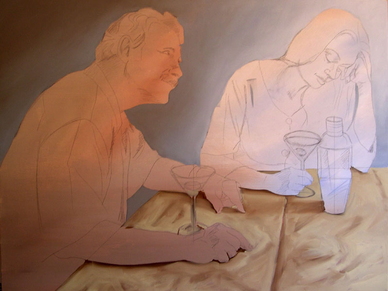 | Painting the Tablecloth The tablecloth, which is a washed out cream color in the photo, is not enough of a color statement for me. I want it to be much warmer so that the cool wall in the background recedes and the tablecloth jumps forward more. In my rendition of the tablecloth, I chose to make the dominant color a yellowish cream color rather than the neutral one in the photo. Again, I work from dark to light. The first thing I do is to lay down the areas of deepest shadows under the arms resting on the table and in the darkest folds. This darkest value is burnt umber and a touch white. This is laid in with a mixture of linseed oil and odorless paint thinner in a fairly thin or transparent wash. The second darkest values are laid into the shadowy area furthest away from the light source and then into some areas in the lighter part of the cloth. This is made from burnt sienna, yellow ochre, burnt umber, and white. The third tone, which is the majority of the body tone of the lighter areas of the cloth and for the highlights, consists of yellow ochre, with a touch of burnt umber, lamp black, and a lot of white. The lampblack adds a cooling effect leaning towards blueish north light. It’s about as cool as a yellow cream color can get. When I’ve completed painting the entire cloth, I go back over the surface and rework some of the value and tonal transitions with sable brushes and a sable fan brush. I used to think that using a fan brush was amateurish but I tried it one or twice and was able to get some really nice blended effects. As I did with the background, I make sure I save the left over colors that I’ve used to render the tablecloth because I know that I will be using these colors again in the glasses and the reflective martini shaker. The tablecloth will also reflect some of its color onto the skin of the models, especially the forearms where they meet the table. |
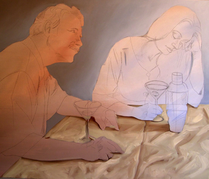 | The completed table cloth. |
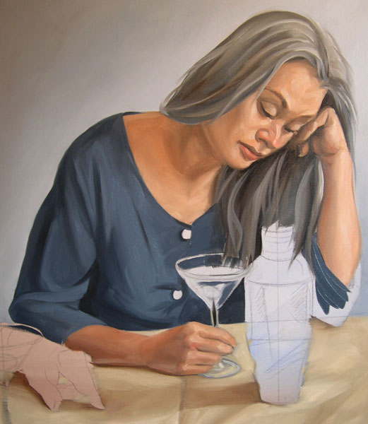
 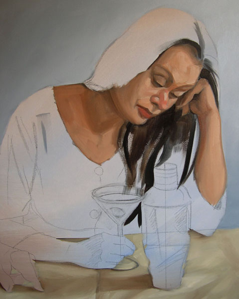   |     | Painting the Figure’s Face Human flesh tones, whether Caucasian, African, or Asian are some sort of an orange. This orange is then mixed with either browns or complimentary colors to cool or warm it/lighten or darken it. I start painting human flesh by premixing three main large orange colors that are also related to value. I change the formula based on how pink or brown each person is. Since these two models are both fairly pale and so as the flesh tones move into the north light of the lightest areas the flesh tones will be cooler towards the light and warmer in the shadowed areas. 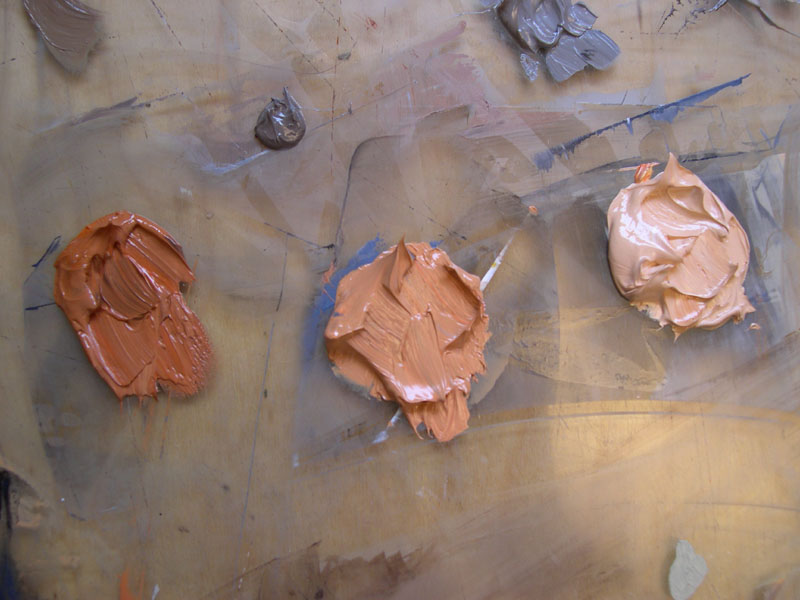  The darkest tone/hue is mixed from cadmium orange, burnt sienna, a touch of lampblack, white, and a little bit of raw ochre. The middle tone/hue is mixed from cadmium orange, burnt sienna, a touch of lampblack, a little bit of yellow ochre, and much more white. For the lightest tone, I use cadmium orange, lampblack, and a lot of white. The black cools off and neutralizes the orange slightly. I will also mix other colors into these main body colors to modify them for sections of the face and hands. For example, in the nose and cheeks I usually add a little bit of cadmium red light to pink them up a bit. If the person is excited or flushed, I may intensify this effect with other reds such as scarlet or even a touch of alizarin crimson. In male characters’ beard areas, I often use a touch of Payne’s grey to show the hair under the skin. In painting the female figure’s face, I start by thinking again about layering. The cheek of the figure overlaps the hair behind it. The darkest tones are a warm black, almost a purple. Using a number 8 synthetic bright, I start with a thin wash of medium, and lampblack, mixed with alizarin and scarlet for the darks. Using a small synthetic filbert, I also paint the darks of the face such as nostrils, eyelids and the crease in the lips with this wash tone. Most of these darks will be painted back over and I expect them to mix with the subsequent layers of colors. This gives the shadows a warm gray purplish tone and, almost randomly, tends to add a bit of variation in color to the lighter areas. Next, using a number 12 synthetic bright, I mix medium in to create a very liquid wash of the darkest tone/hue that was mixed from cadmium orange, burnt sienna, a touch of lampblack, white, and a little bit of raw ochre. I wash this in to all of the darkest areas of the face. Using the same brush and a lot of painting medium I then wash in the medium tones. Grabbing from the same piles of premixed color I then use a variety of brushes in varying sizes to ease and blend the tonal structure. To paint the lips and cheeks I mix the colors from the premixed blobs. While I’m working, I blow up areas of the photo on my computer to see specific areas and see subtle color variations in these areas. To modify tint and color I then add other colors to the flesh tones with a sable brush. For example, the lower lip is tinted with cadmium red medium. For the shadow of the upper lip I add a bit of burnt sienna. The cheeks and nose are pinked up a bit with the addition of a little bit of cadmium red light. I use these same formulas for the knuckles of the hands. Next, the hair is begun with a dark tone mixed from mainly lamp black but a touch of alizarin and scarlet are added. I mix two separate grays for the hair for cool and warm strands of hair. The warm grays of the hair are mixed from burnt umber and white. The cool grays are mixed from black and white. Because the paint is so fluid, the layers tend to mix together as I paint them creating variations in tone and color. Next, I move on to the other hand holding the martini glass. I paint this hand in a similar manner to the face, using the same premixed colors that I have already prepared. |
 | Hair face and hands completed! |
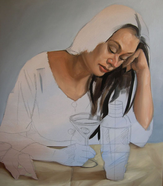
  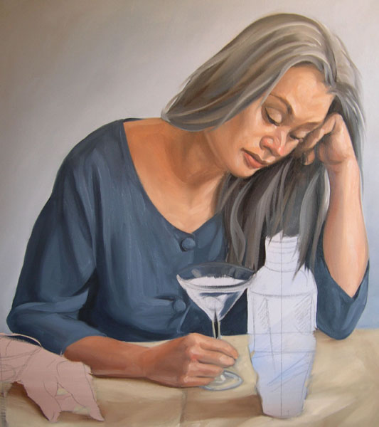 |    | The Figure’s Dress I think of the drapery in the same way that I paint the flesh tones. In this instance, I’ve mixed two main batches of gray blue color. The darker tones are Payne’s gray with a touch of, black, white and burnt umber. The lighter tones are a similar mixture with a higher proportion of the blue and white spectrum since this is painted in North light I will want the dress highlights to be cooler and bluer. Using a number 12 synthetic bright, I mix medium in to create a very liquid wash of the darkest tone/hue. I use a different medium for painting cloth. Because I want the paint to tack up more slowly, I use straight linseed oil to thin the paint a bit. The darks of the dress are a thin washes of black mixed in with the darkest tone. I gradually add the next dark tone at the edges of the darkest creases. The middle tones are mixed from the lighter batch of color and are also thinned down a bit with straight linseed oil. I tend to go back in and blend the medium steps with a smaller synthetic or a sable brush as I work each area. While I’m working, I blow up areas of the photo on my computer to see specific areas of the drapery, looking for things like reflected light, and core shadows. The last step, after I’ve gotten the buttons painted in is to look for the highlights. Notice that at this point I’m beginning to anticipate the edge of the martini glass. I look for how the glass interferes and lightens the color passing through it. The dresses and glasses highlights are mixed out from the lightest tone with a touch more Payne’s gray and white. As you can see, my large glass palette is becoming filled up with the colors that I’ve used to paint the background, flesh, tablecloth and dress. I make sure I have saved the leftover colors I’ve mixed because I will need it to paint the martini glasses and the reflections in the martini shaker. 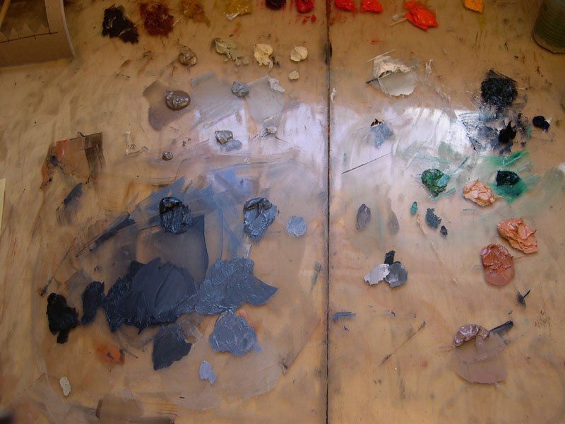 My palette so far. |
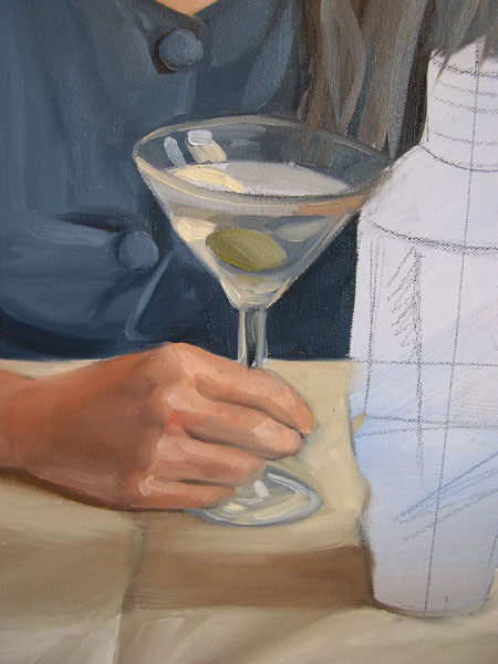 |  | The Martini Glass and Shaker The secret to painting transparent and reflective surfaces such as glass and metal is to not look at the over all shape of the object but to look at the abstract shapes of colored areas created by refraction and reflection. For example, the background wall’s color is picked up in the top of the glass in the highlights of the rim and stem. This color is also reflected back in the liquid. Even some flesh tones are refracted throughout the glass, and that olive, mixed from white, Payne’s grey and yellow ochre, shows up in a bunch of different reflections in the glass. In the male figure’s glass, the color of the dress is also picked up in the right hand side of the glass. Notice that I actually had to paint the watch, arm, and hand, of the male figures first before I painted the martini glass to make sure that edges and reflections worked the way they should. |
 | The painting so far. |
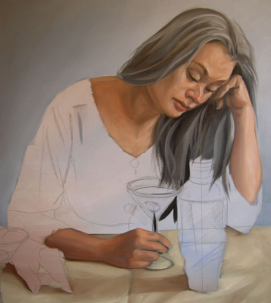
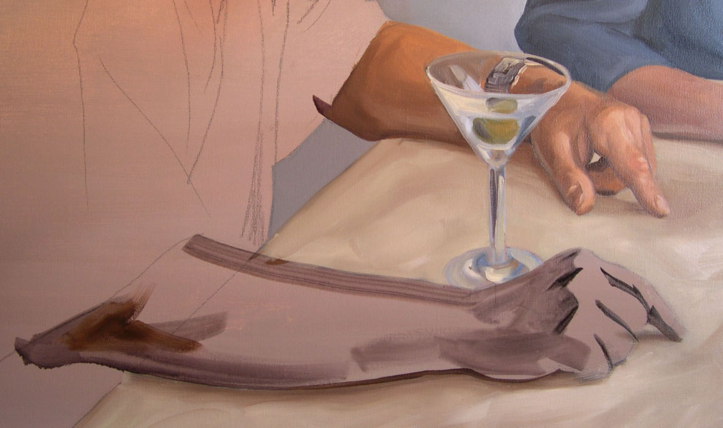  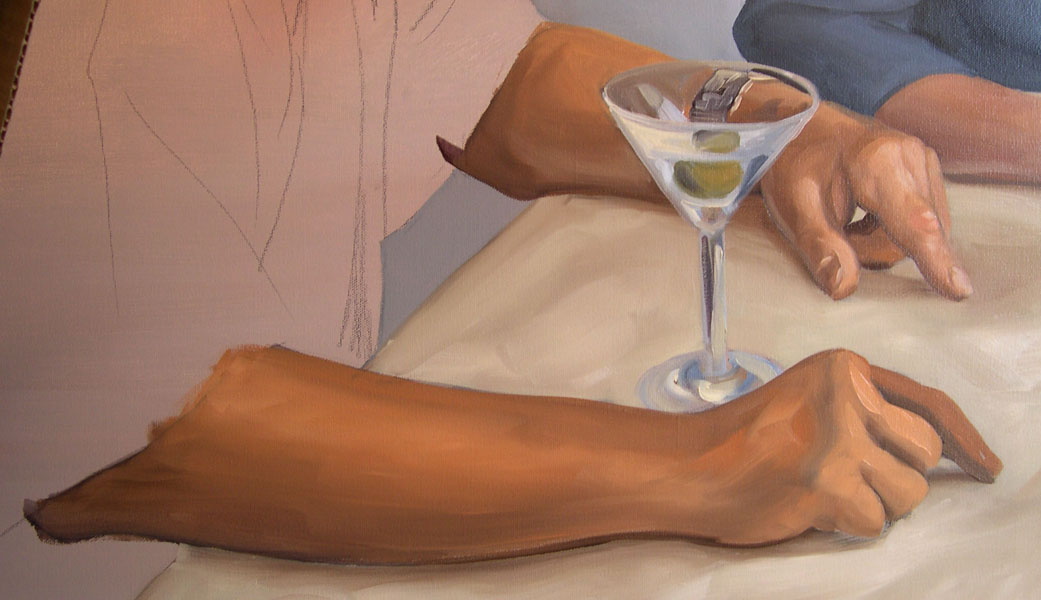 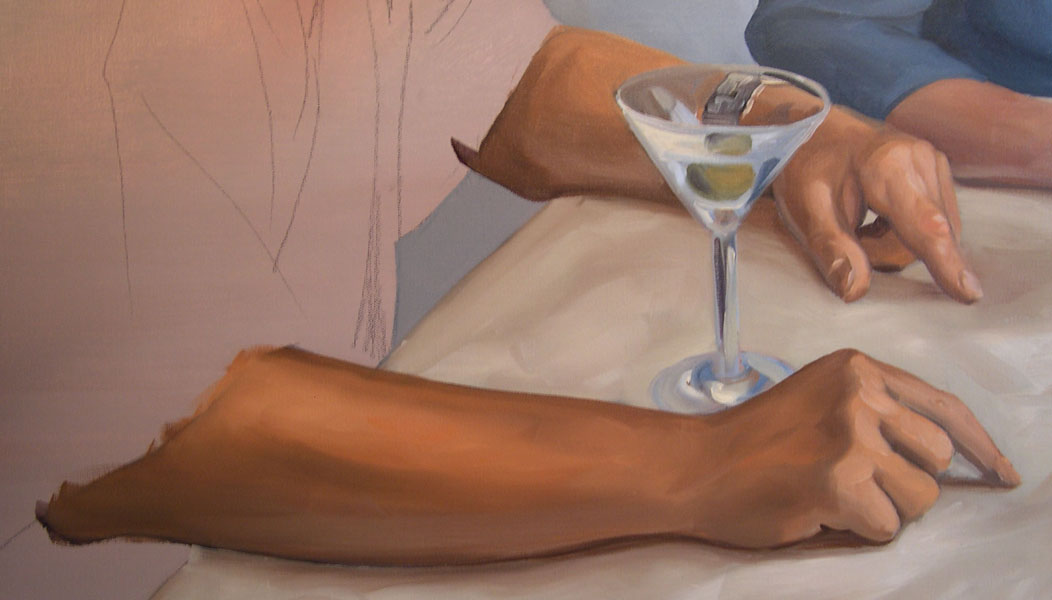  | 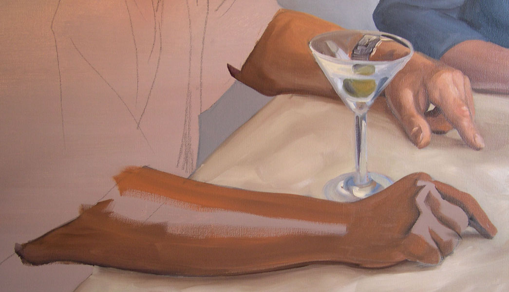 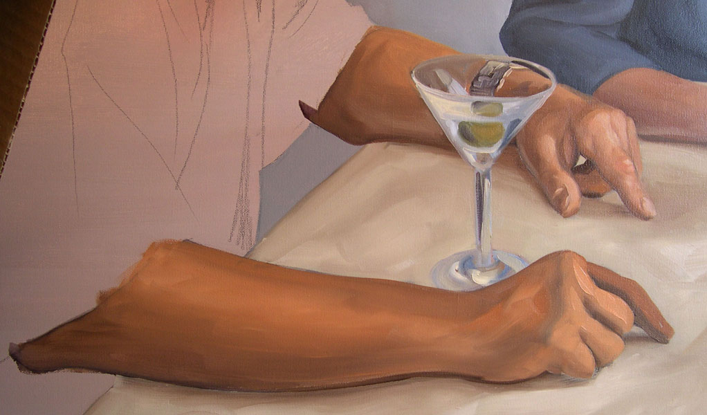 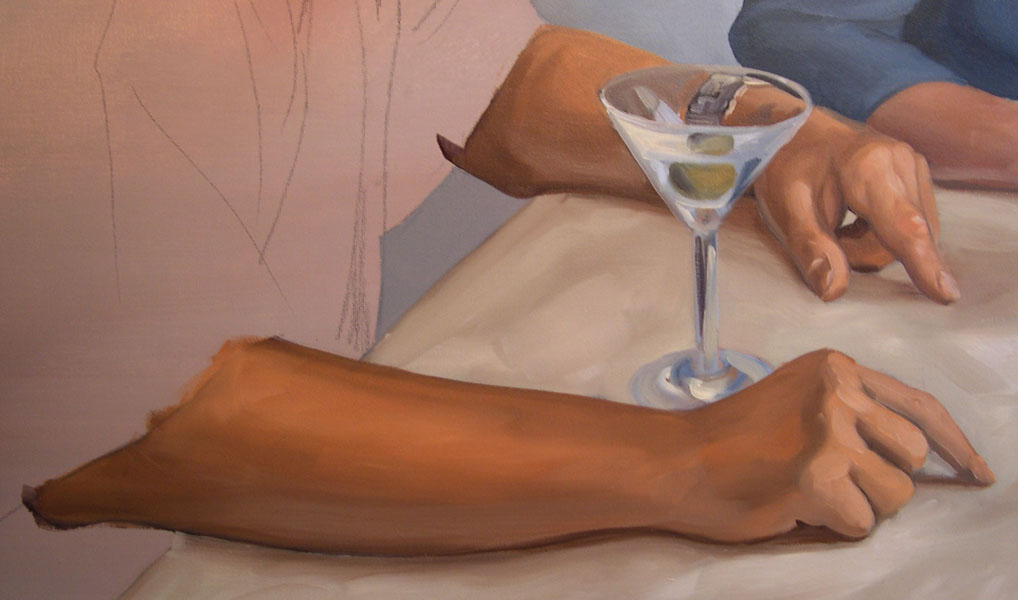 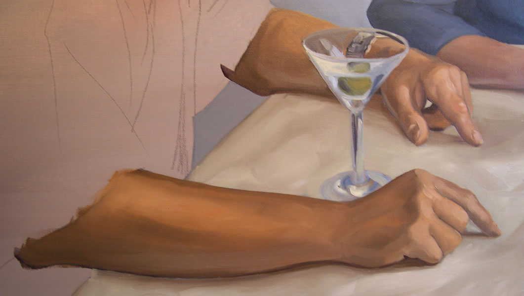 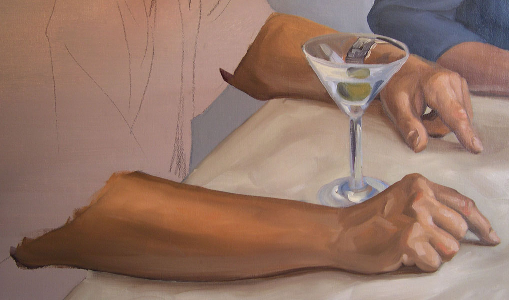 | The Male Figure’s Arm and Hand in the Foreground Much of this next section is a repetition of the female’s face and hands but I thought it would be nice if I went over some of the bony landmarks and problems that I encounter when painting a hand and fingers. I use the same blobs of premixed flesh tones that I mixed for the female but then remix them again with a bit more orange and burnt sienna to vary the flesh tones between figures. Using a number 12 synthetic bright, I start with a thin wash of medium, and lampblack, mixed with alizarin and scarlet for the darks. I pay special attention to the bony landmarks at the knuckles of the back of the hand where the first set of phalanges fold. I also try to visualize the radius and ulna under the skin at the wrist and especially the joint the makes up the elbow where the radius, ulna, and humorous, join. If you look at a skeleton, you’ll actually see that the bones over lap and turn over each other in an odd and unexpected manner. Visualizing these bony landmarks allows me to get the contours correct and to find the planes where the light breaks. Next, using a number 12 synthetic bright, I mix medium in to create a very liquid wash of the darkest tone/hue that was mixed from cadmium orange, burnt sienna, a touch of lampblack, white, and a little bit of raw ochre. I wash this in to all of the darkest areas of the face. Using the same brush and a lot of painting medium I then wash in the medium tones. The edge of the knuckles is accentuated to remind me of how the light breaks. I will smooth this transition out later. Grabbing from the same piles of premixed color I mix in a little bit of the tablecloth color into the dark part of the forearm to show the reflected light. The forearm and draker parts of the arm are warmer colors then the fingers that face the light. Again, I blow up areas such as knuckles and fingers of the photo on my computer to see specific areas and see subtle color variations in these areas. Look at all the grayish purple poking out under the layers in the core shadows of the knuckles and the forearm. The light highlights of the knuckles are exaggerated a bit with a touch of white mixed with black. Using smaller sable brushes the rest of the hand is a series of small refinements using many of the colors I’ve mixed on the palette. I refine the veins in the back of the hand, look for the tendons and bone ridges on the front of the fingers, and then reestablish some highlights created by striations in the skin running in horizontal bands. |

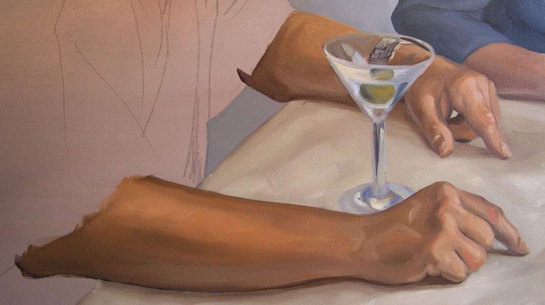
| Kenney Mencher, In Martini Veritas, oil on canvas 36"x48" | The Black Shirt I painted the black shirt last so that I would get a crisp edge to the sleeve where it fell over the forearm. Again, I made sure I planned the layering to create crisp and rational edges to the overlapping forms. For example, I painted the background sleeve first, then the blue gray panel on the front of the shirt and then the foreground sleeve. I’ve been calling it a “black shirt” but this may be a misnomer. This shirt is not “black” rather it is a series of warm and cool grays. The front panel is a lighter and cooler gray that is mixed from, Payne’s gray, black, a touch of umber, and white. The back and darkest areas of the shirt are alizarin and lamp black. The light areas of the sleeve are mixed from alizarin and lamp black and white making a different and warmer gray then the bluish gray panel on the front of the shirt. Voila! Finished! Kenney Mencher |
Subscribe to:
Posts (Atom)