
Prehistory is divided up into several different periods and geographic locations. This is kind of a problem when you're studying it another classes and art historians have different time periods. Although these are before the common era. Let's define the names.
For all the videos in order with a textbook and study guides please visit:
Pa•leo•lith•ic \"pā-lē-ə-'li-thik, esp Brit "pa-\ adj [ISV] (1865) : of or relating to the earliest period of the Stone Age characterized by rough or chipped stone implements
The word, “prehistoric” just means before the historic era (before we started recording history). The term paleolithic means paleo (paleo is Latin for old) and lithos or lithic means stone in Latin. Therefore the combination of the two words, Paleolithic translates as old Stone Age. The Old Stone Age dates vary widely. The range of dates for the Old Stone are sometimes 600,000 to 10,000 or 35,000 to 7000 depending on who you're studying with and what geographic region you're looking at.
Me•so•lith•ic \"me-zə-'li-thik\ adj [ISV] (1866) : of, relating to, or being a transitional period of the Stone Age between the Paleolithic and the Neolithic
They range of dates from 600,000 to 7000 BCE of the Mesolithic era is different depending on where you study it and what region of the globe. In the Near East (Iran and Mesopotamia) the is from 7000-6000 and the in Europe it goes from 7000-4000.
neo•lith•ic \"nē-ə-'li-thik\ adj (1865)
1 cap: of or relating to the latest period of the Stone Age characterized by polished stone implements
2 : belonging to an earlier age and now outmoded
The word, Neo is like the character’s name from the movie the Matrix, “neo” means “new” and that's the name of the New Stone Age in Europe. goes from about 4000 BCE to about 1500 BCE and the Neolithic era in the Near East (Modern day Turkey, Iraq and Iran) starts a little bit earlier at 6000 BCE. Neolithic means that they have Stone Age technology they don’t use metal tools they use stone and wood. Textiles and clothing are made from wool, grass, hemp and straw. Just keep that in mind when you're studying that this doesn't mean that they were stupid. It doesn't mean that they were unintelligent. It doesn't mean that they wouldn't have been able to use the tools that we have or were the stereotypical caveman we see in Geico commercials.
Need more info? Would you like it in video form?
For a set of videos in order with a textbook and study guides please visit:
Vocabulary You Will Need
The word “form” is synonymous for this class the word “physical.” Literally it’s a physical description of the object and this can include, size, what it’s made of, color, how it’s put together, lines used in it, weight. When you describe the work of art in terms of its physical form it’s almost like you’re giving the police a physical description of someone who might have mugged you. You don’t know who that person is and you don’t know their name but you sure know what they look like. A formal description would include how something looks like and would not include anything about the interpretation or meaning of that object or work of art.
For example, we’ll do formal analysis of what is depicted in the photograph above.
This is a painting of several horse heads on a stone wall and painted approximately 5 ½ feet from the floor of the cave. There are other animals also painted and all the animals overlap each other. The horse heads on top are about 12 inches tall and 12 inches across. The rhino located in the left-hand side of the picture is about 15 inches long and about 12 inches high. The animals are painted with outlines and what looks like a little bit of shading or color to describe the hair and light. It’s not clear if the color is used to describe light or just hair.
Another element of formal analysis is to describe what to make it. In this wall painting on stone you would describe what the painting was painted on as the “support” which is actually the surface on which it’s painted. Another example of this is paper is the support that is used for drawing. So stone is the surface or support on which this is painted. Another word for paint is pigment. The paint or pigment used to paint the surface of the rock is also referred to as the medium. A “medium” is actually a mixture of the pigment and binder or glue combined with the support. Sometimes it’s a very familiar phrase to us, for example, most painters paint oil on canvas. Oil paint is made from linseed oil and ground-up minerals. The minerals colorants are glued to the surface of the canvas with the oil that eventually evaporates and hardens holding the pigment particles in place.
In this case, the paint used by the artist to create these images is probably animal fat or possibly water mixed with some natural earth colors, in this case he would be some sort of charcoal or ocher which is brown, and then apply to the wall with some sort of brush. So the medium here is naturally found pigments applied to the wall with animal fat or water.
 Another part of a formal or physical analysis is a description of how the forms or things in the painting are rendered. In these wall paintings all of the animals are rendered in a profile form. This makes it easier to draw as well as recognize the animal. Profiles are an easy diagrammatic way of depicting something in a recognizable way. These animals are rendered or drawn in a fairly realistic or naturalistic way. The artist does have a style and the style to outline forms and then fill in the center with different colors. The lines, something you need to describe in a formal analysis, are often long and flowing and go from thin to thick and often incorporate realistic curves that define the anatomy of the animals. The anatomy of the animals seems proportional and accurate and this is part of formal analysis. They actually look like real animals from profile view.

In the next section were going to be talking about what is represented in the paintings and what they mean. One of the ways in which we give meaning to something is that we have to look at where they were found. Sometimes the location of something, where it was found and where it was made, can add some valuable clues as to the meaning of the paintings. This of course would be combined with the analysis we did above.
An analysis of the history, location, and environment of a work of art is referred to as a “contextual analysis.” We’re going to look at the context in which these cave paintings were made.
 Contextual Analysis
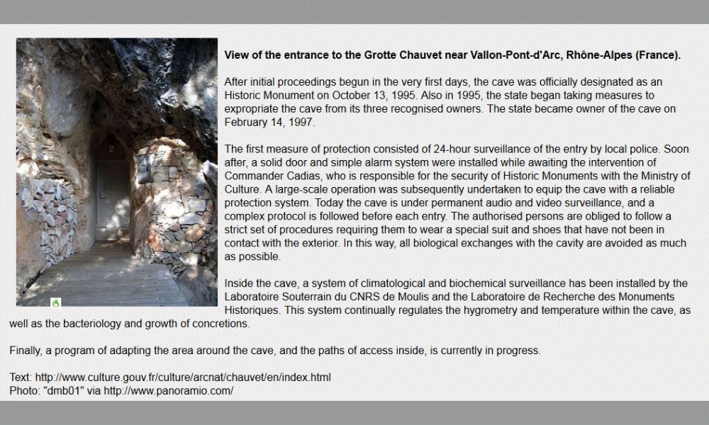
The cave, called Chauvet Cave, is located in southern France in a mountain range and has been preserved for more than 30,000 years. The cave dates from around 30,000 BCE but every 10,000 even 100,000 years later it was visited by subsequent people. It appears that the cave was in use probably up until about 20,000 years ago when a series of geographic events covered the opening of the cave. Archaeologists are fairly certain about the dates because they used radiocarbon dating and they also use modern forensic methods to date as well as figure out the order of creation of the paintings and other decorations inside the cave. There were also bones of various animals such as cave bears and Ibex and to wolves. There are also footprints found as well as handprints in the cave. There were also scratches made by cave bears and the walls that were painted over and handprints found on the walls. Other animals have been depicted throughout the cave.
Today the cave is sealed and protected and a series of walkways have been installed for scholars to walk through without touching the walls and other artifacts but still have a chance to study. The cave is well documented in a film called “Cave of Forgotten Dreams.” You could probably rent this on Netflix or Amazon.
Another major point of evidence or fact is that many caves have been found throughout the world with almost the same exact type or kind of illustrations in them. Some caves are in France and some in Spain these caves all have depictions of horses and bison as well as many of the other things found at Chauvet.
For all the videos in order with a textbook and study guides please visit:


