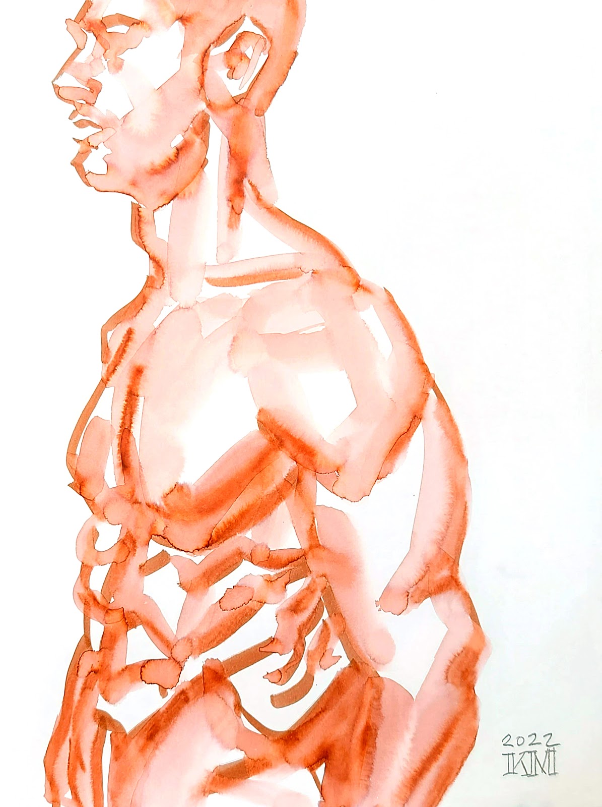
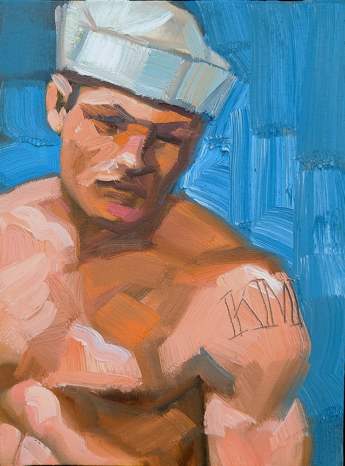
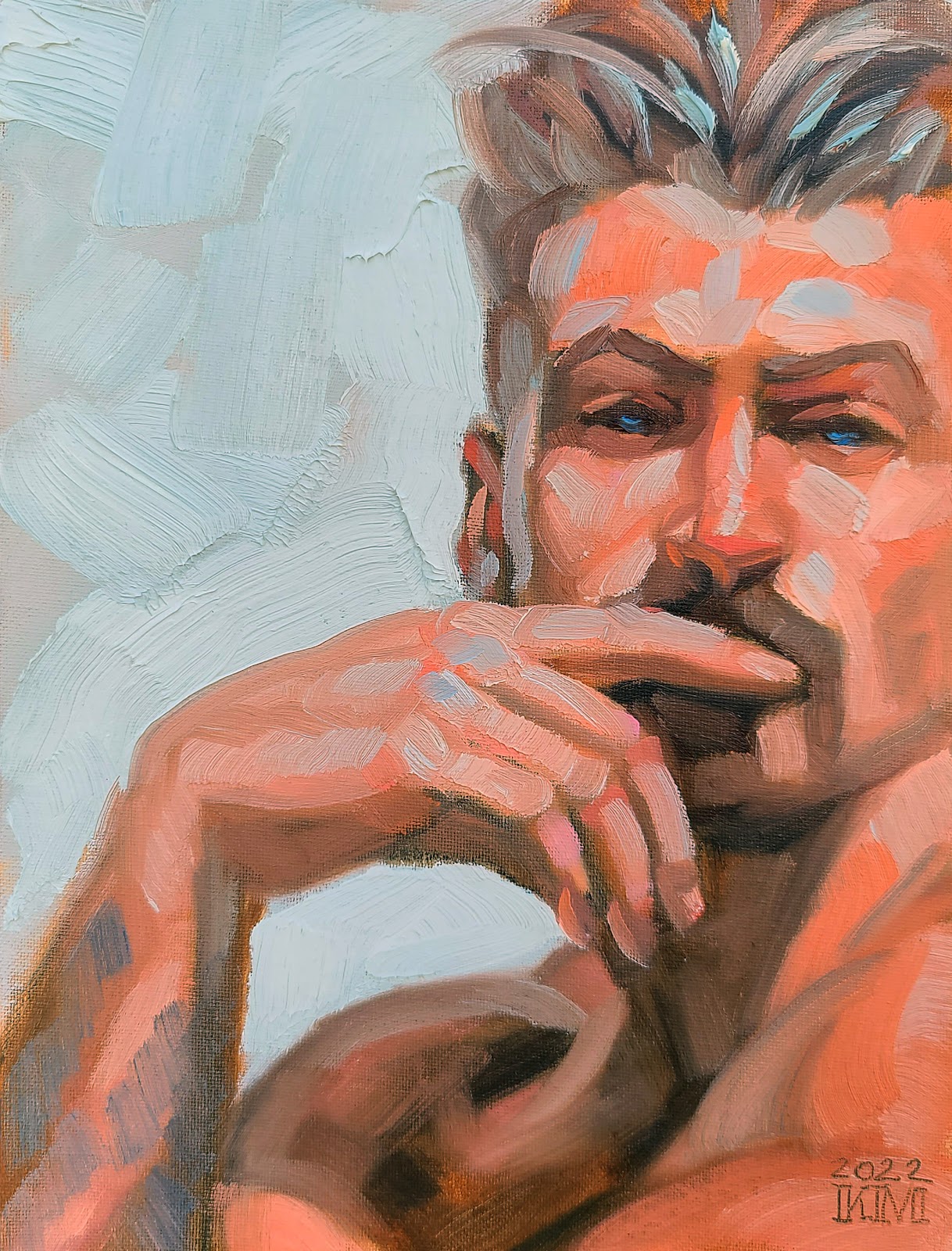
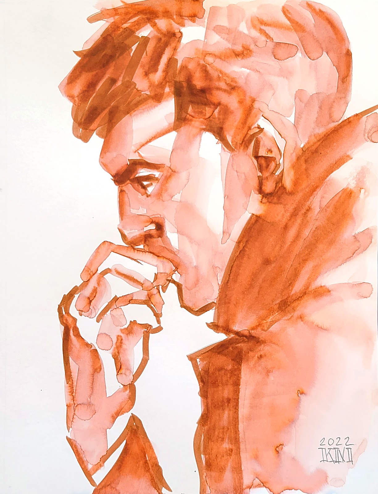
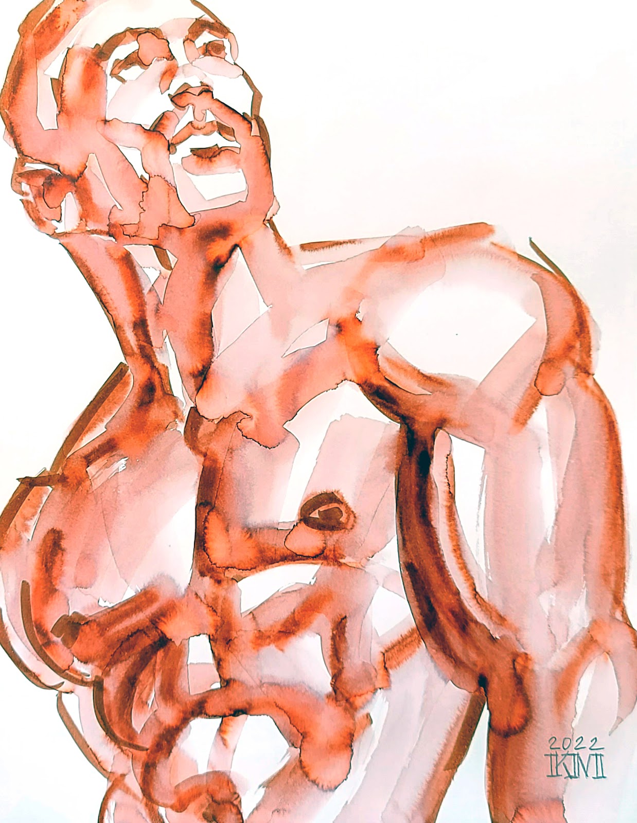
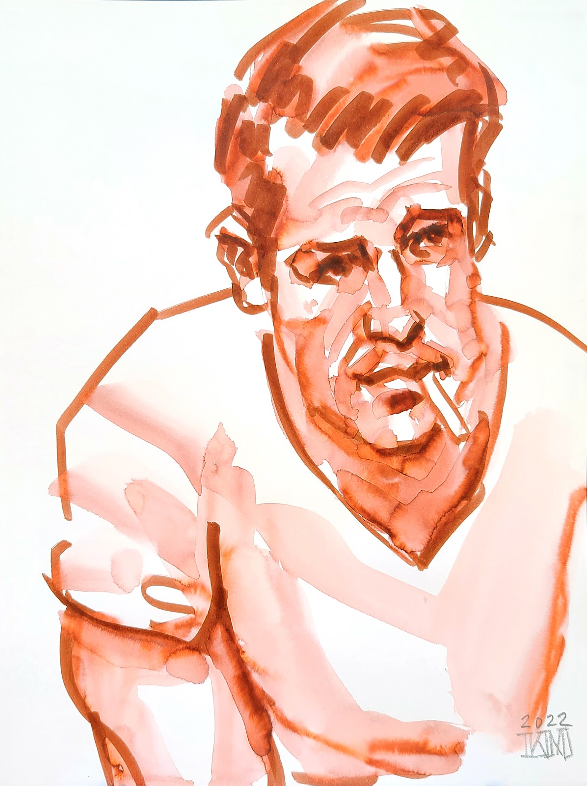
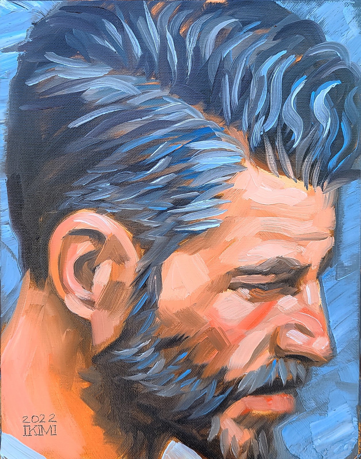
I'm Kenney Mencher. I'm an artist who left a tenured professorship in 2016 to pursue making art full time. This blog is about art, art history, with a emphasis on human rights. I make homoerotic art featuring bears, otters & other gay wildlife.
Rothko was a “color field” painter. Sometimes he is called “abstract expressionist” although this is a in terms of physical description of the paintings he made. The best way to enter a Rothko painting is to describe it physically in terms of its texture, color, and composition.
Mark Rothko’s paintings have a lot of trouble in terms of their archival qualities. When you refer to paintings archival qualities you talking about the paintings permanence and whether or not it will rot or fall apart. In the case of his large canvases, the artist used oil paintings. The thing that binds work lose the paint particles or pigment particles, literally the color, to the painting in oil paint is linseed oil which when it dries creates a kind of oil shellac in which the paint particles are suspended. In the case of think layers of oil paint, called “impastos,” there is a very large amount of pigment, probably about 75% of the paint is made of pigment and about 25% is linseed oil. Rothko would add paint thinner, either turpentine or some sort of solvent to the paint which would finish down almost until it appeared to be like watercolor. While Rothko did this gave the oil paintings a kind of thin washy appearance. It also washed away most of the linseed oil so that the paintings themselves don’t have a lot of linseed oil gluing the pigments to the painting. This allows some of the paint in the background to kind of showed through a little bit but it also means that the paint is not very well glued down to the canvases. So the end result is that the paintings themselves are very chalky and at times need to be fixed in some ways because the paint can actually rub off.
These paintings are not about texture but they are about color. In order to understand what Rothko paintings are supposed to be appreciated for you have to be familiar a little bit with color theory. Two important terms are, intensity of color, sometimes referred to as saturation, and the other term is hue. When referring to the hue your literally referring to the name of the color. Probably the most understandable painting by Rothko is called “Earth and Green.” Here are some of the reasons why it’s the most understandable.
In this painting Rothko uses three hues or colors. And intense Prussian or ultramarine blue. A muted green, which is not a very intense or saturated color. And a cadmium red which is so intense it almost leans towards being orange. In terms of color theory Rothko in his painting “Earth and Green,” uses a combination of what are referred to as warm and cool colors. Any color that is associated with water such as blue, and blue-green, are colors that are referred to as cool colors. Colors that are red or yellow or orange, look a bit like fire and are called warm colors. Some of the physical characteristics of how our eyes sees color is that cool colors look as if they are receiving or moving towards a background. Warm colors have a little bit more energy and seem to be projecting into the foreground. When you allow your eyes to rest on this painting in particular you will see that it almost appears as if the blue is a background on which you read and green squares are floating. It’s a bit illusionistic in some ways. If you look through his other paintings you’ll see that some of the other paintings he has made also have this quality of the squares floating in the middle of the canvases either projecting or falling back depending on their color temperature. This is one of the things that people appreciate about Rothko’s paintings. It’s unclear to me whether or not that was his intention because when you move into what he describes as his iconography or symbolism or content of the painting he describes it as spiritual.
Composition, is probably the next most important element in Rothko’s paintings. The overall painting is usually a vertical rectangle with horizontal rectangles floating in the middle of the picture plane. The red and green boxes or rectangles that we see floating in “Earth and Green” have the quality of almost being illusionistic floating boxes. Some historians claim that this makes them look rather like landscapes to our unconscious mind.
The main physical qualities of Rothko’s paintings are, thin washy paint, warm and cool color relationships, and geometric forms floating in a large plane of color. It’s important to understand it from these aspects because I believe that might allow us to analyze what Rothko meant his paintings to mean and how we interpret them. Some of this analysis of the artist’s intention is based on the fact that Rothko himself proposed designing a small nondenominational chapel in which his paintings would hang and allow people to meditate on the paintings. In his own words,
"It would be good if little places could be set up all over the country, like a little chapel where the traveler, or wanderer could come for an hour to meditate on a single painting hung in a small room, and by itself." Mark Rothko, 1954
Eventually his chapel was realized in 1965.
There are several essays, and even an entire book devoted to the topic of viewing Rothko’s paintings as if they are some sort of transcendent landscape similar to the spiritual or romantic paintings of 19th-century painter Caspar David Friedrich. This seems like a reasonable jump in terms of the analysis of these paintings especially given what Rothko himself has said about them. If we apply some of the ideas in analyzing Friedrich’s paintings to Mark Rothko’s one of the things that Friedrich was attempting to do was show the sublime and spiritual nature of landscapes especially in conflicts with the weather and also suffering the effects of intense atmospheric conditions. Friedrich was not isolated in this idea because other painters such as Turner dealt with similar themes such as fire, storms, and spirituality in his paintings.
We can also make the leap that Rothko was intelligent educated person who would’ve been aware of the traditions in art history from the previous century and therefore it’s probably safest to assume that this is a good interpretation of his intention, however, he is still considered an abstract painter. Which means that his pictures are nonrepresentational very much along the lines of some of his contemporaries such as Pollock and Lee Krasner. First and foremost, then, because Rothko associated with the Abstract Expressionist painters of the mid-20th century his paintings should be first considered abstracts or abstractions that are more formal than they are iconographic or chock full of meaning.
The last and also of equal importance in terms of understanding why Mark Rothko is considered an important painter of the 20th century has a lot to do with the context of his career. Like many of the other painters who make the history books Rothko was associated with a community of artists who shared the same type of thinking and beliefs about what art should be. He was strongly oriented and placed within this community which gave him a kind of validation and also in some ways increase the value of his paintings. He lived in New York during the 1950s and hung out with other artists. Another element to probably increase his paintings value both monetarily and in terms of how we see them is that he suffered from suicide at an earlier date than many of the other painters. Surrounding his “suicide” is some controversy which would make a good novel in terms of whether or not he was murdered and it was made to look like a suicide or if he was actually ill and killed himself. Subsequently, almost immediately after his death, Rothko’s gallery dealer started selling off all the paintings that they had in their collection and did not provide Rothko’s wife with any of the profits from the sales until she sued the gallery later on.
I just completed 24 new things and put them on my website and Etsy. https://www.kenney-mencher.net/ http://www.etsy.com/shop/kmencher San Francisco Pride Weekend is Saturday June 25 and 26th. I live in Palo Alto California and it's only a 30 minute train ride to my studio/home. Please let me know if you're in town and want a studio visit.
Pride Month Maker's Market Saturday, June 18 10 AM to 2 PM On the 2nd floor of Hyatt Centric Center City Philadelphia
Browse the wares of local LGBTIA+ artists and artisans, with locally made offerings such as jewelry, clothing, soaps, ceramics, stained glass and more!
Open to the public and free to attend.
Gone and For Ever, part of the Center’s HIV/AIDS memorialization project, Remembrance, includes an exhibition June 21-24and “going-home” ceremony June 25.
Conceived and directed by artist Alex Stadler, the piece brings together artists, musicians, and faith leaders to honor those lost to the AIDS epidemic in Philadelphia, and whose memories are in danger of being forgotten.
More information on the exhibition, ceremony, and name collection will appear at waygay.org/remembrance.
2022 Pride Power 100 Thursday June 2 from 6-8:30 PM at Cockatoo (208 S 13th St) Free with registration
Presented by City and State PA magazine, the Pride Power 100 list will debut in a special edition of City & State PA magazine recognizing and ranking the most influential figures in the LGBTQIA+ community in Pennsylvania.
Join in for a celebration in Philly as they acknowledge these remarkable individuals, including William Way's very own Executive Director, Christ Bartlett, and Director of Empowerment Programs and the Arcila-Adams Trans Resource Center, Darius McLean!
These are difficult times.
There's help there when you need it. Here are some useful resources:
Philadelphia Suicide and Crisis Intervention Hotline 215-686-4420