
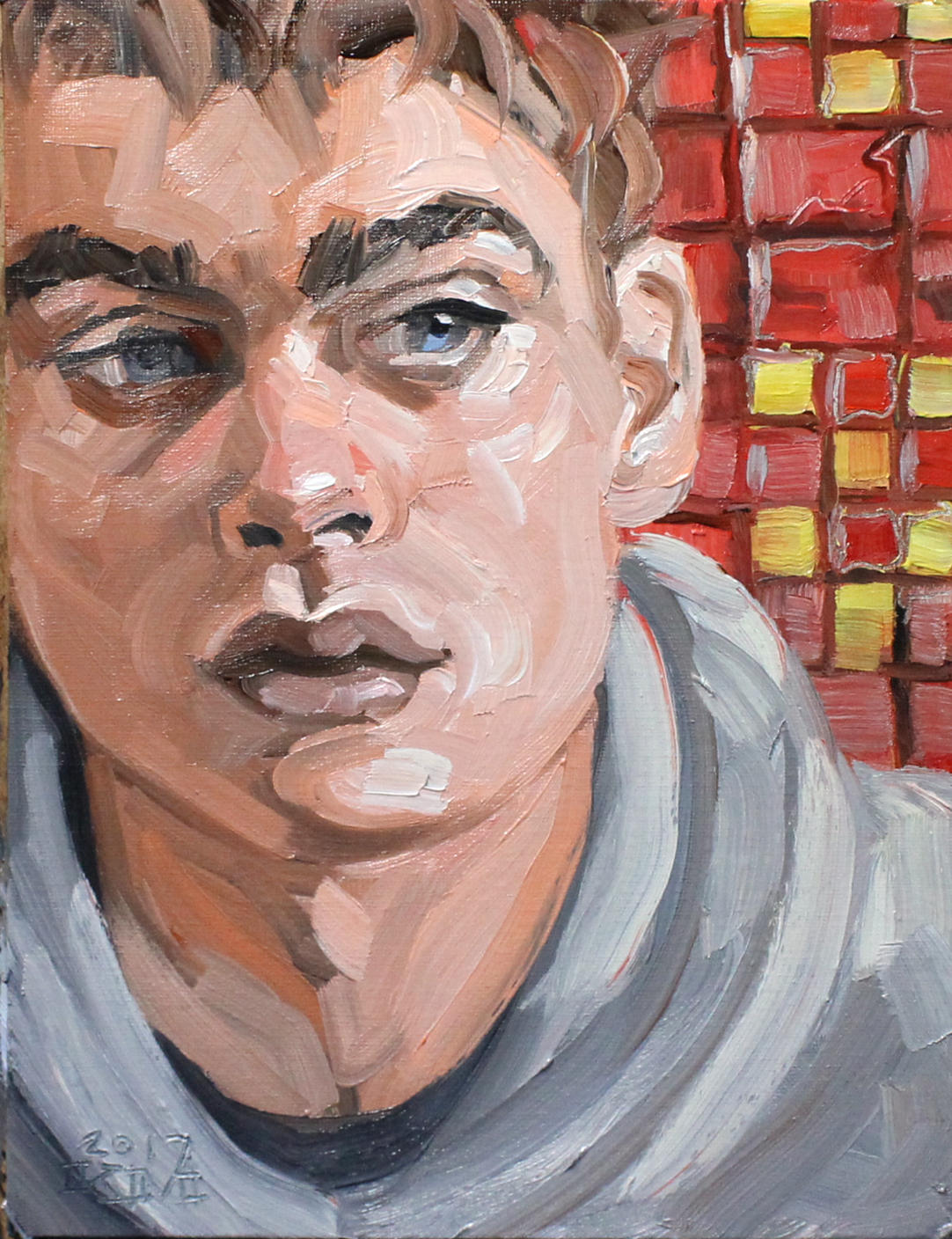
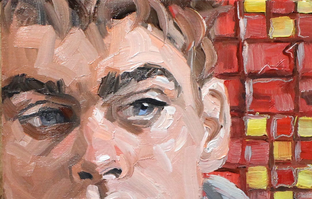
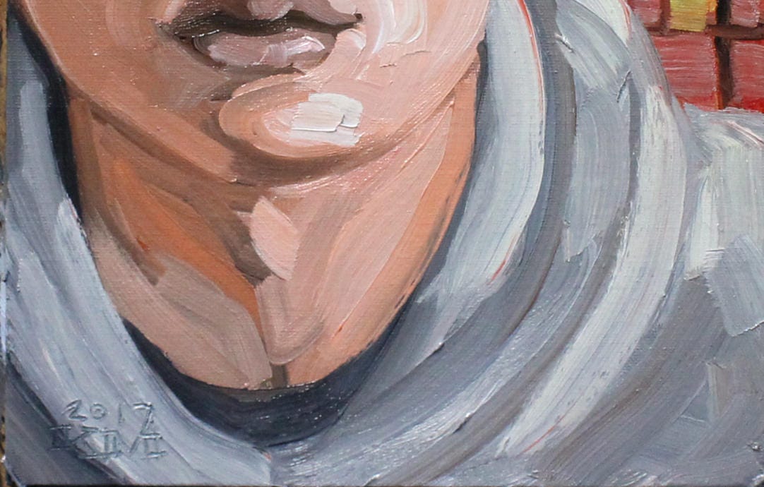
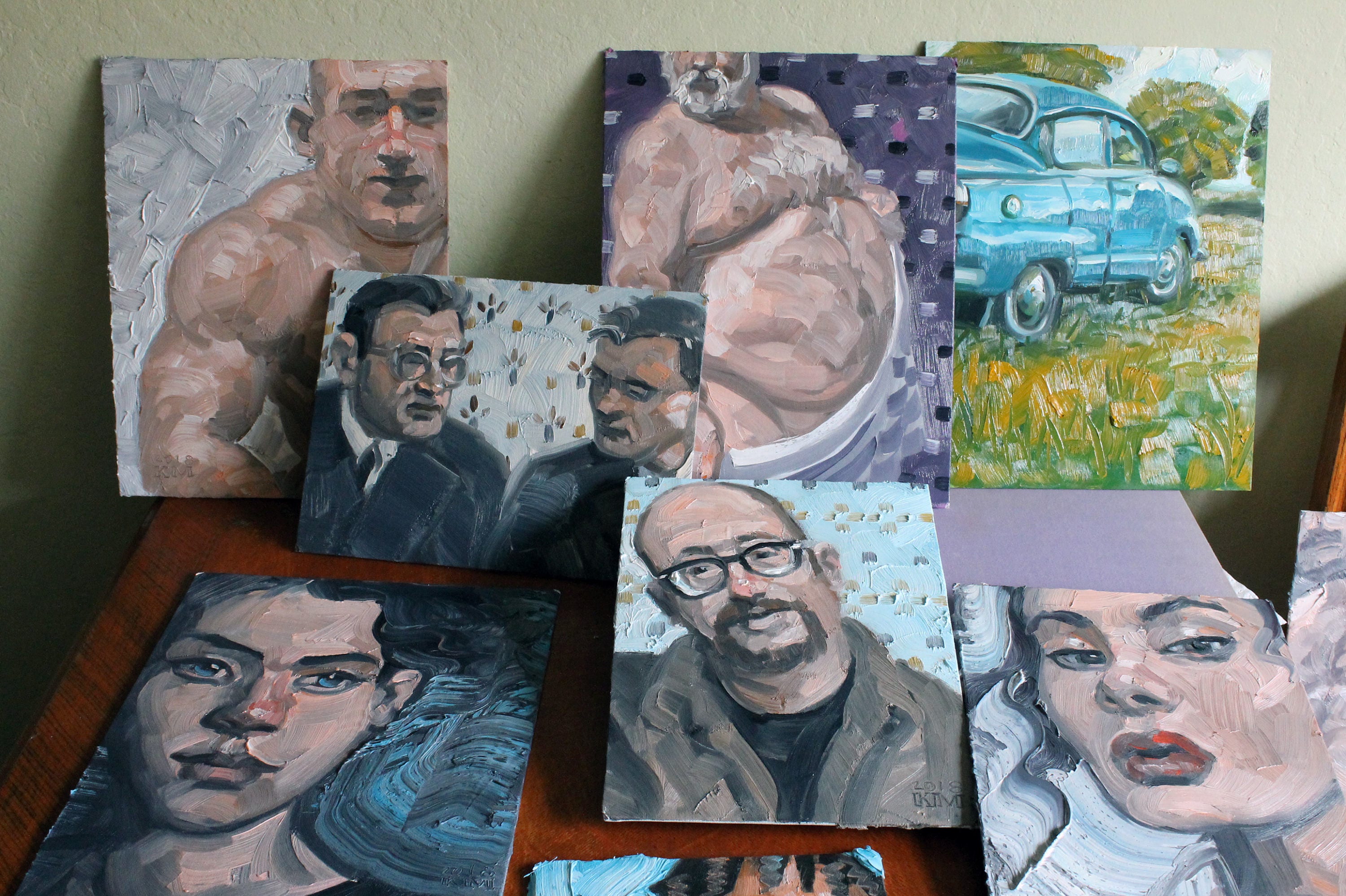
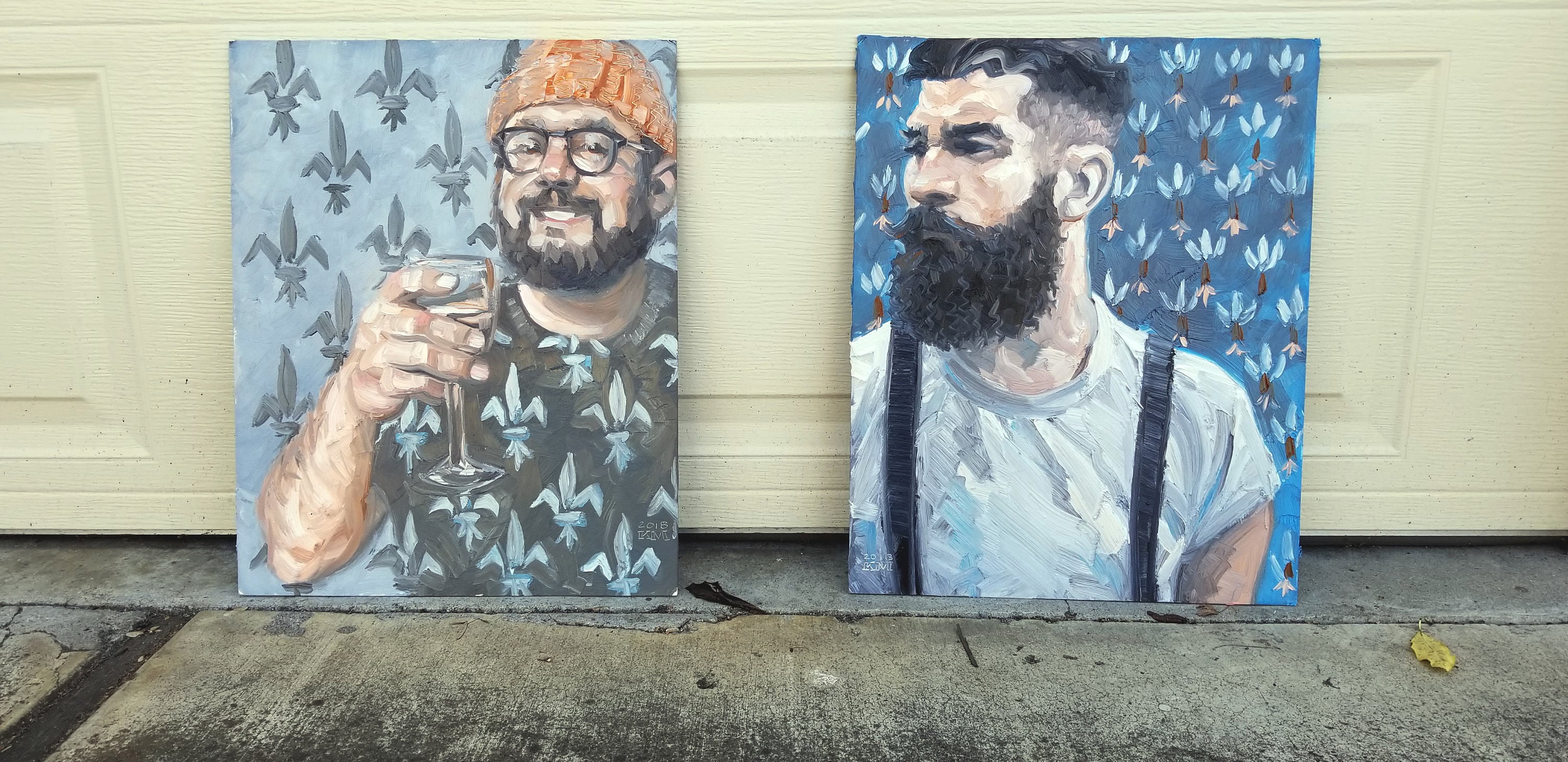
I'm Kenney Mencher. I'm an artist who left a tenured professorship in 2016 to pursue making art full time. This blog is about art, art history, with a emphasis on human rights. I make homoerotic art featuring bears, otters & other gay wildlife.
Thursday


Wednesday

Monday


Friday


Thursday
17th C Baroque Art The Gentileschi cc
https://www.udemy.com/user/kenneymencher/


Study with me here:
https://www.udemy.com/user/kenneymencher/
Wednesday


Monday


Friday
17th C Baroque Art Vermeer cc


In terms of its rendering and physical form, the style of this painting most resembles the works of Caravaggio. There’s a strong sense of light and shadow also referred to as chiaroscuro. It is a close up portrait and it is extremely realistic. It is most likely painted in something called ala prima, which basically means without it underdrawing and painted directly wet into wet. Where this work differs the most Caravaggio is in the painters use of colors that are referred to as nonlocal colors. In Caravaggio’s painting is a palette of colors that we would call earth toned, which are all there is hues of browns. If you compare the flesh color of Vermeer’s painting to Caravaggio’s you can see that Vermeer includes colors such as green and some purples in the flesh tones whereas Caravaggio paints everything as shades of browns or oranges. Caravaggio’s palette is restrained and only uses the hues that are in the brown family, but Vermeer has all of the hues (colors) such as blue, green, yellow and purple.


Study with me here: https://www.udemy.com/user/kenneymencher/
Thursday
17th C Baroque Art Velasquez cc
 This is a painting everyone should know about even though it’s not really in the top 10 of images that people know from art history. Probably Velasquez’s other paintings are more famous however, this painting possesses all of the things that a student or someone wants to learn about Baroque art should know about the style of Baroque painting that stems from the painter Caravaggio.
In terms of how the painting looks, for example its physical properties such as light, color, texture, and composition. Velasquez is pretty much unmatched in terms of his handling of light and shadow that is sometimes referred to as chiaroscuro. The term chiaroscuro literally translates from Italian into light and shadow or dark and light. If you look at the sphere that’s been shaded by a computer you can see that the qualities of light such as the highlight, transitional tones, core shadow, reflected light are all there in Velasquez is painting in several places. If you look at the jug in the foreground you can see that contains all of these elements. Most importantly it also possesses the reflected light right next to the old man’s left hand in the lower right-hand corner of the picture. Lights or wraps around the jug and transitions into that core shadow. Velasquez also has a little scuff in the pot where the highlight is.
The other thing about how Velasquez handles light is that even the heads and the features that are rounded such as fingers which you think about it are cylinders, all obey or conform to the passage of light coming from the upper left-hand corner and raking across the picture from left to right. This creates a sort of dramatic almost cinematic kind of light. This is where moviemakers get their ideas of spotlighting. He also does something with the light which is that some figures are in the background and are not hit by the spotlight. The old man and the young boy reaching for the glass of water are in the spotlight and the art historical term for this is called tenebrism which means in Italian murky or spotlight. This kind of makes the focus of attention the thing that’s in the center of the spotlight but not the center of the entire composition. The glass of water at the old man is handing to the young boy is the thing that is the center of the composition and everything seems to radiate from that. Light is what makes it the center of attention and the focus of the composition but also it seems like there’s a sort of half of jugs and light up to the little boys face and then up to the early old man’s face.
One of the other physical things about the paint is that if you can see this painting in person you would see that close to where ever the light hits the most highlights, Velasquez thickens up the paint and this is called an impasto. This kind of echoes how light feels and so the more opaque paint makes it feel like more light is actually hitting. So texture is an important part of showing how light and shadow work together and this creates more of an illusion than just leaving the paint surface on textured for the same thickness throughout.
The last thing that Velasquez does in terms of physical form is that he uses what’s called a reduced palette. If you notice there are no bright primary colors. Primary colors are red ,blue and yellow. In fact Velasquez doesn’t even include secondary colors such as orange, green, and purple. Instead he uses what are called tertiary colors which are just Browns. Sometimes because they are brown they are referred to as birth colors. Mainly because the paint was made from ground up iron oxides found in soil for example burnt sienna, comes from the Italian city of Sienna, umber is a color that comes from the city of Umbria. When she is making something look kind of like it’s blue, please be aware that your computer screen is not accurately showing color, Velasquez uses charcoal and oil mixed up to make his black and that gray is closer to blue in the spectrum than it is a warm color like an orange birth or a warm color such as burnt sienna which is reddish orange.
Probably the last important element in this painting is how well Velasquez paints a clear glass of water. I the teacher once you said that the way to paint or the way to see if the picture was a really good painter was to see how they painted a clear glass of water. In a way this is a virtuosic kind of exercise. The reflection and prism affect of how the glass in the water interact create all these abstract shapes that can sometimes make it confusing to paint. You can see that Velasquez masters this and he probably got this idea by looking at Caravaggio’s paintings.
The second most important thing about how this painting is really a fantastic example of Baroque painting is that it contains all of the messages and symbols that are Baroque painter would have to include to please his clients. Velasquez.like many of the other Baroque painters such as Rembrandt Caravaggio incorporate real people into their paintings and this is sometimes referred to as John run elements. He uses live models for the most part paint from and they are real people. He includes other elements that are considered genre elements such as everyday items from the 17th century in which he works such as the clothing, the ceramics, and even hairstyles. This makes the patron you were connect to the painting more.
The last genre element which is also a semblance often use as both in every day and possibly also a Catholic Christian religious meaning. The older man is actually kind of the street beggar who sells glasses of water that he filters in the pots that you see in the foreground. Part of this is that he goes to the wells in the center of town and then takes the water other places where it’s inconvenient to find glasses of water any charges of minimal amount, probably a quarter in today’s money, and the little boy who is somewhat wealthy, look at his collar white shirt, is doing God’s work by providing charity in the form of buying glass of water from the old beggar man. So in a way the glass of water represents purity and also charity.
There is another interpretation of this painting that it’s the three ages of man. Young boy, middle-aged man, and old man. However, I don’t think that that is really accurate I think it makes more sense that it’s just a genre scene of everyday life in which Christian teachings can be enacted.
Something you might want to look into is cool Velasquez was, the context surrounding his life because he has an interesting biography in which he sort of was connected to the right kind of society to make his career. He married bosses daughter and you can also climb the social ladder and became an advisor to the King of Spain who he was great friends with and probably this was because he sat painting portraits of the King and was able to converse with him.
For more texts and videos to help you get through art history:
Study with me here: https://www.udemy.com/user/kenneymencher/
|


Subscribe to:
Posts (Atom)