
I'm Kenney Mencher. I'm an artist who left a tenured professorship in 2016 to pursue making art full time. This blog is about art, art history, with a emphasis on human rights. I make homoerotic art featuring bears, otters & other gay wildlife.
Thursday


Rene Magritte

René Magritte was not particularly skilled at rendering. The anatomy of his figures is a little bit awkward. His rendering of light and shadow are slightly inaccurate and clearly not done from observation.

To the untrained eye, for example someone who doesn’t know all the rules having to do with traditional painting, his paintings are satisfactory but not completely realistic. Magritte’s paintings are clear and understandable representations of things that he is rendering, for example an apple looks like an apple, and a pipe looks like a pipe.


If you were to compare Magritte’s paintings to earlier artists, such as Jacques Louis David’s painting of Madame Recamier, David’s paintings are more realistic and convincing. A viewer might even think that David is a more skillful painter in his rendering of light and shadow, his handling of paint and brushwork and the accuracy of color. Even when compared to the paintings to a peer of his, Salvador Dali, René Magritte’s paintings come in a close second in terms of how believable they are.

However, compared to some other Surrealists such as Frida Kahlo, and Marcel Duchamp, René Magritte’s work appears to be more realistic than these others. The reasons why I bring this up is not to detract from René Magritte’s reputation as an artist but rather to reinforce the idea that René Magritte’s paintings are more about the content or subject matter of surrealism than they are about the traditions of making beautiful or realistic oil paintings. So why didn’t Magritte learn to paint like David and or Dali? The answer is that it wasn’t important to his art.
Here’s why:
It’s kind of important to note that artists like Marcel Duchamp and his contemporaries were not very concerned with artistic technique. These artists, which is very common at the beginning of the 20th century, were more concerned with the meanings behind their paintings than they were with the paintings being a pleasing aesthetic experience. The concepts behind artistic work were more important to many of the early 20th century artists than the actual “look” of the paintings.

In contrast to this, the Impressionists from the middle of the 19th century were very concerned with how their paintings looked but not very concerned with what the paintings represented. The Impressionists were interested in depicting optical effects of color and colored light. Their work was considered groundbreaking and broke with earlier traditions by focusing on the physical characteristics of the paintings and especially with the experience of seeing things and giving the viewer an impression of that view. In contrast to the Impressionists since they had already dealt with color and physical properties of painting as the subject matter painters of the early 20th century began to focus more on concepts and ideas expressed by their art.


René Magritte lived during the time that psychoanalytic theory was the giving to be developed. Sigmund Freud and Carl Jung developed theories of how the human mind was constructed and the importance of dreaming and the symbols that happened in the unconscious or dreaming mind. Many of the “movements” and styles of art were heavily influenced by the development of the science of psychology and artists attempted to work with these theories in their paintings. In this way, the subject matter of most surrealist art is the human mind and how it worked.
Another reason why Magritte wasn’t that interested in rendering or exacting realism is probably because he trained initially as a commercial artist and most of his work was designed to be printed rather than the one-of-a-kind original works of art. Some sources about Magritte discuss in making posters and children’s books. In every way, Magritte’s first concern with either his commercial art or his so-called “fine art” Magritte was interested in communicating ideas first and making beautiful images second. So the elements of form for most early 20th century artists are less important than the ideas that motivate making the work of art and this is especially true for René Magritte.
One of the things that comes together and probably helped agreed to focus and communicate his ideas about psychology more clearly is the use of captions and text in the commercial posters and books he designed and illustrated. In fact, even though Magritte was selling his work he wasn’t selling enough of his fine art to stop making commercial art until 1927. This probably accounts for his use of text or words in his fine art paintings.
In order to understand the subject matter of Magritte’s paintings you have to first understand one of the first concepts developed by Sigmund Freud about how the human mind works. Freud coined the term “cognitive dissonance.” A simple definition of cognitive dissonance is the ability of a person to hold to ideas in their mind that are in opposition to each other at the same moment. For example, authors sometimes referred to the “Willing suspension of disbelief.” What this means is that when were watching a play or a movie or reading a book even though we know the book is not realistic or the images are not believable we willingly believe they are in order to enjoy the work. Freud thought that this was particularly interesting that we are able to understand the difference between fiction and reality. Furthermore, Freud and Magritte probably would agree that this ability of the human mind to hold onto the idea of reality when we are engaging with the work of fiction or illusion is interesting.

In this painting, roughly translated from the French as “the treachery of images,” for us it would probably the best translated as “paintings are not the same thing as reality.” In this painting, which Magritte made over and over again throughout his life, we see the image or an illustration representing a tobacco pipe, underneath the illustration or illusion of a pipe we see the words “this is not a pipe.” In French. Basically, Magritte is captioning his picture in the picture. The caption is telling you not to believe that this is a real pipe but just a representation of a pipe. These are two opposing ideas, because a lot of times when we look at a picture we want to accept the idea that what we see in front of us is a real thing and we don’t bother with acknowledging the idea that it’s just an illusion or a fake representation of something from the real world.
 |
| Empire of Light, 1950 by Rene Magritte |
Magritte likes to do this in many of his paintings. He provides us with a premise or an idea that something is convincing or accurate and then he provides another kind of idea in the painting that’s the opposite of what we see. For example, Magritte will show us a street at night but the sky above it is a daytime sky. We know that it’s a street at night because we see a street light and lights in Windows and on lamp posts but, we couldn’t see these lights with a daytime sky like that. So basically, René Magritte is always making paintings that deal with the fact that humans are capable of understanding that what they are looking at is not the real thing but our imaginations allow us to pretend that it is.
Study with me here: https://www.udemy.com/user/kenneymencher/
Study with me here: https://www.udemy.com/user/kenneymencher/
Wednesday

Tuesday
Why is Robert Rauschenberg’s art important?
Context is probably more important than the actual work in terms of Robert Rauschenberg’s art. Like many artists who became famous in the mid-20th century, De Kooning, Pollock, Warhol, there are scores of them, all began their careers living, working, and most importantly socializing in New York City which was the center of the “Art World” in the 20th Century.
When you dig deeper into many of the biographies of artists who “made it” in the 1930’s to 1980’s, perhaps even earlier going back to the first decade of the 20th century with the Ashcan School and the Armory show, you should notice that after the Paris, New York becomes the city in which artists moved to to establish their careers.
Rauschenberg ran in many of the same circles as some of the abstract expressionists. He knew and worked with a famous choreographer, Merce Cunningham, and there is enough compelling evidence to make it reasonable to believe that his downstairs neighbor and artistic partner Jasper Johns was also his lover. The two worked together as window decorators and it’s clear that Rauschenberg introduced Johns to his gallery.
The physical or formal properties and working method that Rauschenberg, and Johns incorporated owes quite a bit to the earlier Dada movement and more importantly the reuse of found objects, often found by dumpster diving and collecting trash. Duchamp called this the “ready-made.” Picasso and other artists also used this technique quite a bit, especially in his synthetic cubist art and this validated the practice.
 Using repurposed junk and found objects became so much of a staple in terms of artists’ practices that it hard to visit any college artists’ studio without noticing something the artist has found in the street, dragged back to their studio and somehow repurposed and redecorating it to call it art.
Rauschenberg used this technique extensively in the majority of his work from the 1950’s but instead of using Duchamp’s term “ready-made,” Rauschenberg named his technique the “combine.” Yeah, he combined stuff he found to make art.
Rauschenberg’s “Canyon,” from 1959 Combine on canvas 81 3/4 x 70 x 24 inches uses layers of newspaper that have been painted over along with other found printed stuff. He combines these things with a stuffed bird, a pillow and other found things.

The work is not really a collage as is this case with Picasso’s synthetic cubist works or the earlier Dada artists’ collages such as those by Hannah Hoch. His work is not as organized as Picasso and Hoch, in fact it’s not really organized at all but rather has the appearance of being assembled in an unplanned way. When one looks at Picasso’s “Still Life with Chair Caning,” or other works, they are clearly organized in some way to represent something. To portray or make a facsimile of something that Picasso is rerepresenting. In Hoch’s work the work appears randomly organized because it doesn’t give the illusion of space but it does represent for Hoch the fragmentation of the world. Rauschenberg’s “Canyon” is harder to figure out. It’s almost like a kind of Rorschach or thematic Apperception test. Each person who looks at it and tries to figure it out will focus on different things and even the title doesn’t give us much of a clue as to how we are supposed to interpret it. We don’t know what it’s really about. I think that maybe the point.

I’ve looked through many essays and texts that are designed to “teach” or “explain” this work in particular. I’ve been looking at this “combine/artwork” for almost more than 25 years and I think it may be an instance of the artist being very similar to the tailors in the children’s story, “The Emperor’s New Clothes.” Some of the things written about it are more about the individual writers attempts to figure out what it symbolizes rather than really explaining what it really means. Even the stuff written about it is hard to understand and it makes the viewer and student, well kind of feel “stupid” because we don’t get or understanding what’s going on here and I suspect that was both Rauschenberg’s intention and the people who have written about it are buying his invisible suit. It’s probably like Duchamp’s claim in his manifesto on Dada, “Dada doesn’t mean anything.”
You decide for yourself, here are two extensive quotes from sources that are designed to explain what the work means but I’m afraid they may be flights of fancy:
 Mark Robinson, at the Baltimore Museum of Art
A work that epitomizes Rauschenberg's combine theory is Canyon. Created in 1959, this piece combines fabric, cardboard, paper, photographs, metal, paint and other elements with collage work and several striking 3D elements -- namely, a stuffed bald eagle perched on a box and a suspended pillow. The most striking elements of this work are, obviously, the eagle and the pillow. Upon first seeing the work, the viewer is immediately drawn in it, his or her curiosity sparked by this odd inclusion of "non-artistic" elements. By attaching the eagle and pillow to the piece, Rauschenberg is making a statement about the acceptance of everyday objects as possible materials for art (he was no doubt influenced by Marcel Duchamp in this respect). The incorporation of the eagle, perched and ready to attack, makes a bold statement about the often-confrontational nature of Rauschenberg's work. The bald eagle itself is an already loaded image, as it is often seen as a symbol of patriotism. This eagle, however, is by no means patriotic -- it is a fierce creature, recontextualized by its surroundings. The pillow, on the other hand, places an emphasis on the more symbolic nature of Canyon. Visually, it seems to give weight to the piece, almost pulling it down off the wall. More importantly, however, it adds a sexual symbolism to the piece. It evokes images of male and female sexuality -- namely the male genitalia and the female breasts. Because it is a pillow, it is soft and comforting, a stark contrast to the confrontational eagle. While the three-dimensional objects dominate the lower part of the piece, the top is comprised primarily of a collage of many different types of media. This collage, in fact, takes up nearly two-thirds of the canvas. Although easily overlooked because of the visual dominance of the eagle and pillow, it provides both a background and a context for the lower part of the piece. For example, the photograph of the small child reaching upward is a direct reference to the perched eagle below. Many of the elements included in the work make references to popular culture -- a magazine spread, found domestic photographs and a picture of the statue of liberty, to name a few. This further emphasizes Rauschenberg's theory about everyday objects as art. This is probably the most important theme presented in Canyon and it is shown with both subtlety and excess." (wmbc.umbc.edu)
 Collage Education, Rauschenberg’s Combines, now at the Met, are rich and dense in a way that has to be seen to be believed. By Mark Stevens Published Dec 18, 2005
Rauschenberg's Canyon (1959), at the Metropolitan Museum of Art.
Early in the twentieth century, artists began jumping out art’s window. The Russian modernists soared into the revolutionary sky. The Dadaists, arching an eyebrow, admired the cracked glass. The Cubists couldn’t stop blinking, beautifully agog. At mid-century, Robert Rauschenberg went through the window with American gusto. He had an appetite for the churning street outside, and he seemed full of jazzy slang. He was rude—vitally and impishly rude—in a way no American painter (except the de Kooning of Woman I) had ever been before him. He’d put anything in art: postcards, socks, street junk, paint, neckties, wire, cartoons, even stuffed animals. Especially stuffed animals. The absurdist taxidermy was funny as well as provocative. The goat-and-rooster shtick made wicked fun of both the macho posturing of the fifties and the holy pomposities then gathering around painting. Sometimes, art needs a good rooster squawk.
Once through the window, Rauschenberg had one of the great, decade-long runs in American art, which is now the subject of “Robert Rauschenberg: Combines” at the Metropolitan Museum of Art. Organized by Paul Schimmel of the Museum of Contemporary Art, Los Angeles—Nan Rosenthal oversaw the installation at the Met—the exhibit includes 67 works created between 1954 and 1964. Among them are both famous works (the goatish Monogram) and rarely exhibited pieces. Rauschenberg himself invented the term “Combines” to describe a pungent style of mix-and-match collage. In his oeuvre, this early decade of the Combines, especially the first five years, matters the most. It anticipates much that came later, and it raises an important question: Are the Combines less than meets the eye, a slapdash everything-but-the-kitchen-sink style that ultimately just celebrates energy for energy’s sake?
They’re more than meets the eye. My first impression of the show—before looking at the imagery—was one of a controlled, formal richness. An artist in love with the hot and messy splash of inspiration, of course, but also one who’s knotty, thoughtful, and considered. Rauschenberg mostly worked with what Rosenthal calls a “syncopated grid,” a formal structure within which he weighted and composed lights, colors, and shapes. In an image like Canyon, for example, he calculated how the weight of the hanging bag sets off the strength of the eagle’s wings as it pulls upward into the image-laden sky. Reproductions don’t convey the tactile feeling of Rauschenberg’s color. His surfaces are rich, steeped, time-marinated.
As you draw closer to a Combine, its imagery begins to come into focus, and everything starts to connect and connect and connect. You find that not only do the blacks in Canyon rhyme with the bird’s wings; so does that ribbing in the upper right, which mirrors the tips of the outstretched feathers. (And there’s wt., the abbreviation for “weight,” within the same ribbed black.) Canyon takes its inspiration in part from a Rembrandt Ganymede that depicts an eagle pulling a heavy, bawling boy into the air, one who looks rather like the child in the snapshot in the Combine; the hanging bag evokes the boy’s buttocks. Connections zigzag across mental boundaries. Weight, for example, can be literal or illusory, a matter of words, images, colors, and shapes.
There’s an argument that art should probe deeply, that it should rigorously edit experience in order to reach some bedrock essence. Nothing wrong with that. Rauschenberg’s endless connections, some lighthearted and some not, do something else. He celebrates the floating textures of consciousness—the way the mind moves, wanders, and joins together. One of my favorite Combines, Hymnal, contains (among much else) a book, a piece of paisley that looks the way hymns sound, and some ill-tempered graffiti. It can be good to concentrate on the hymn alone. It can also be good, as you pick up the hymnal, to acknowledge the message scratched on the pew.
Robert Rauschenberg: Combines
Metropolitan Museum of Art.
December 20 through april 2.
 Okay, had enough? Here’s what I think it really probably means.
Johns and Rauschenberg, like Warhol, were part of a movement more popularly known as “Pop Art.” In art school students are often taught that the movement of Pop Art was in some ways a criticism of consumer culture of the last couple of decades. By making discarded junk that was mass produced into one of a kind works of “fine art” artists were pointing out the flaws in how we perceive things as valuable. If this sounds familiar, it because Duchamp and the Dada movement had already done something like this decades earlier, but more interestingly and possibly with a bit more humor and fun thrown in. I think that Rauschenberg was sincere and was serious when he made the same kinds of artistic statements in the 1950s.
I think Rauschenberg wasn’t really making an image but rather making an object that was designed to change how art viewers thought about art. Even though earlier artists like Duchamp, Max Ernst, Picasso and others were making art that reacted against or rebelled against earlier art techniques and meanings. Rauschenberg is doing something very similar, however he has raised the stakes by making something(s) that are actually pretty ugly and therefore they are meant to challenge us and to make us think about our ideas about what art is. I think that the actual meaning or symbols in the piece might be irrelevant to the idea that his art is making us think about what art is, and what is precious about “art” even if made of junk hanging on our walls. What’s kind of funny about this is that by the time he did this, artists such as Duchamp, Hoch, Kirchner, Pollock, Franz Kline etc, had been doing this already for close to 50 years.
Study with me here:
https://www.udemy.com/courses/search/?q=mencher&src=ukw
When you dig deeper into many of the biographies of artists who “made it” in the 1930’s to 1980’s, perhaps even earlier going back to the first decade of the 20th century with the Ashcan School and the Armory show, you should notice that after the Paris, New York becomes the city in which artists moved to to establish their careers.
Rauschenberg ran in many of the same circles as some of the abstract expressionists. He knew and worked with a famous choreographer, Merce Cunningham, and there is enough compelling evidence to make it reasonable to believe that his downstairs neighbor and artistic partner Jasper Johns was also his lover. The two worked together as window decorators and it’s clear that Rauschenberg introduced Johns to his gallery.
The physical or formal properties and working method that Rauschenberg, and Johns incorporated owes quite a bit to the earlier Dada movement and more importantly the reuse of found objects, often found by dumpster diving and collecting trash. Duchamp called this the “ready-made.” Picasso and other artists also used this technique quite a bit, especially in his synthetic cubist art and this validated the practice.

Rauschenberg used this technique extensively in the majority of his work from the 1950’s but instead of using Duchamp’s term “ready-made,” Rauschenberg named his technique the “combine.” Yeah, he combined stuff he found to make art.
Rauschenberg’s “Canyon,” from 1959 Combine on canvas 81 3/4 x 70 x 24 inches uses layers of newspaper that have been painted over along with other found printed stuff. He combines these things with a stuffed bird, a pillow and other found things.

The work is not really a collage as is this case with Picasso’s synthetic cubist works or the earlier Dada artists’ collages such as those by Hannah Hoch. His work is not as organized as Picasso and Hoch, in fact it’s not really organized at all but rather has the appearance of being assembled in an unplanned way. When one looks at Picasso’s “Still Life with Chair Caning,” or other works, they are clearly organized in some way to represent something. To portray or make a facsimile of something that Picasso is rerepresenting. In Hoch’s work the work appears randomly organized because it doesn’t give the illusion of space but it does represent for Hoch the fragmentation of the world. Rauschenberg’s “Canyon” is harder to figure out. It’s almost like a kind of Rorschach or thematic Apperception test. Each person who looks at it and tries to figure it out will focus on different things and even the title doesn’t give us much of a clue as to how we are supposed to interpret it. We don’t know what it’s really about. I think that maybe the point.

I’ve looked through many essays and texts that are designed to “teach” or “explain” this work in particular. I’ve been looking at this “combine/artwork” for almost more than 25 years and I think it may be an instance of the artist being very similar to the tailors in the children’s story, “The Emperor’s New Clothes.” Some of the things written about it are more about the individual writers attempts to figure out what it symbolizes rather than really explaining what it really means. Even the stuff written about it is hard to understand and it makes the viewer and student, well kind of feel “stupid” because we don’t get or understanding what’s going on here and I suspect that was both Rauschenberg’s intention and the people who have written about it are buying his invisible suit. It’s probably like Duchamp’s claim in his manifesto on Dada, “Dada doesn’t mean anything.”
You decide for yourself, here are two extensive quotes from sources that are designed to explain what the work means but I’m afraid they may be flights of fancy:
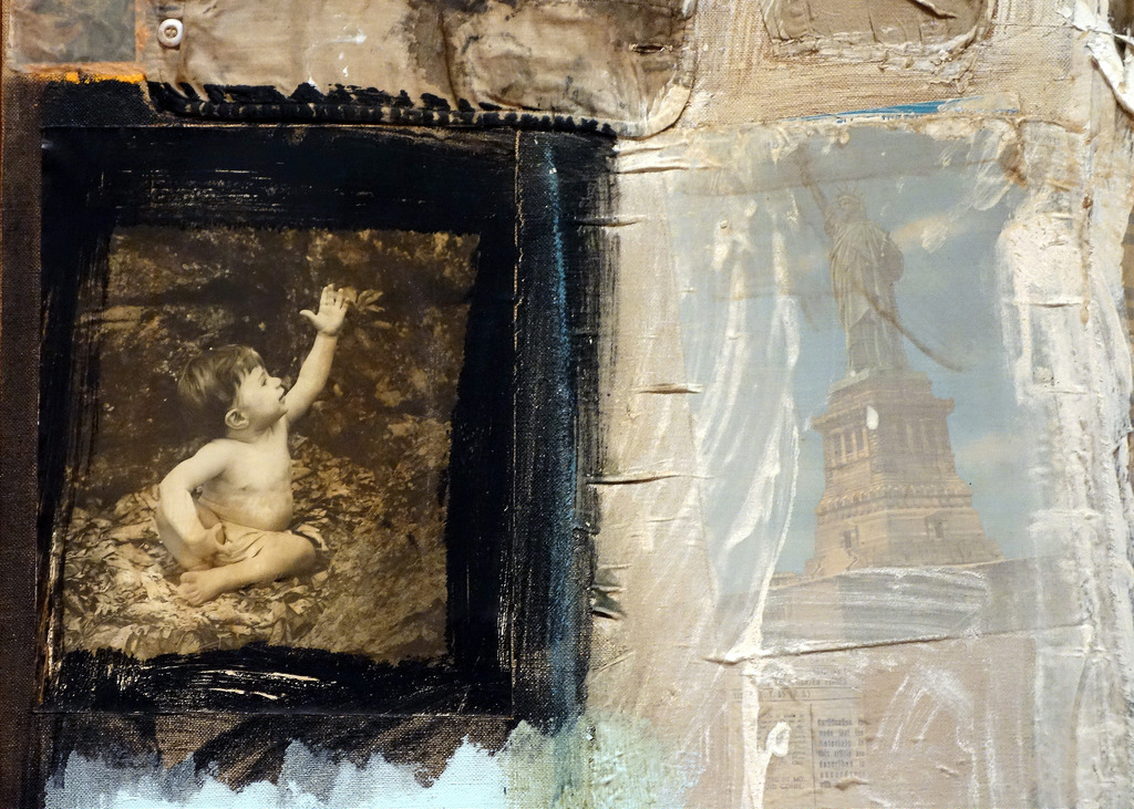
A work that epitomizes Rauschenberg's combine theory is Canyon. Created in 1959, this piece combines fabric, cardboard, paper, photographs, metal, paint and other elements with collage work and several striking 3D elements -- namely, a stuffed bald eagle perched on a box and a suspended pillow. The most striking elements of this work are, obviously, the eagle and the pillow. Upon first seeing the work, the viewer is immediately drawn in it, his or her curiosity sparked by this odd inclusion of "non-artistic" elements. By attaching the eagle and pillow to the piece, Rauschenberg is making a statement about the acceptance of everyday objects as possible materials for art (he was no doubt influenced by Marcel Duchamp in this respect). The incorporation of the eagle, perched and ready to attack, makes a bold statement about the often-confrontational nature of Rauschenberg's work. The bald eagle itself is an already loaded image, as it is often seen as a symbol of patriotism. This eagle, however, is by no means patriotic -- it is a fierce creature, recontextualized by its surroundings. The pillow, on the other hand, places an emphasis on the more symbolic nature of Canyon. Visually, it seems to give weight to the piece, almost pulling it down off the wall. More importantly, however, it adds a sexual symbolism to the piece. It evokes images of male and female sexuality -- namely the male genitalia and the female breasts. Because it is a pillow, it is soft and comforting, a stark contrast to the confrontational eagle. While the three-dimensional objects dominate the lower part of the piece, the top is comprised primarily of a collage of many different types of media. This collage, in fact, takes up nearly two-thirds of the canvas. Although easily overlooked because of the visual dominance of the eagle and pillow, it provides both a background and a context for the lower part of the piece. For example, the photograph of the small child reaching upward is a direct reference to the perched eagle below. Many of the elements included in the work make references to popular culture -- a magazine spread, found domestic photographs and a picture of the statue of liberty, to name a few. This further emphasizes Rauschenberg's theory about everyday objects as art. This is probably the most important theme presented in Canyon and it is shown with both subtlety and excess." (wmbc.umbc.edu)

Rauschenberg's Canyon (1959), at the Metropolitan Museum of Art.
Early in the twentieth century, artists began jumping out art’s window. The Russian modernists soared into the revolutionary sky. The Dadaists, arching an eyebrow, admired the cracked glass. The Cubists couldn’t stop blinking, beautifully agog. At mid-century, Robert Rauschenberg went through the window with American gusto. He had an appetite for the churning street outside, and he seemed full of jazzy slang. He was rude—vitally and impishly rude—in a way no American painter (except the de Kooning of Woman I) had ever been before him. He’d put anything in art: postcards, socks, street junk, paint, neckties, wire, cartoons, even stuffed animals. Especially stuffed animals. The absurdist taxidermy was funny as well as provocative. The goat-and-rooster shtick made wicked fun of both the macho posturing of the fifties and the holy pomposities then gathering around painting. Sometimes, art needs a good rooster squawk.
Once through the window, Rauschenberg had one of the great, decade-long runs in American art, which is now the subject of “Robert Rauschenberg: Combines” at the Metropolitan Museum of Art. Organized by Paul Schimmel of the Museum of Contemporary Art, Los Angeles—Nan Rosenthal oversaw the installation at the Met—the exhibit includes 67 works created between 1954 and 1964. Among them are both famous works (the goatish Monogram) and rarely exhibited pieces. Rauschenberg himself invented the term “Combines” to describe a pungent style of mix-and-match collage. In his oeuvre, this early decade of the Combines, especially the first five years, matters the most. It anticipates much that came later, and it raises an important question: Are the Combines less than meets the eye, a slapdash everything-but-the-kitchen-sink style that ultimately just celebrates energy for energy’s sake?
They’re more than meets the eye. My first impression of the show—before looking at the imagery—was one of a controlled, formal richness. An artist in love with the hot and messy splash of inspiration, of course, but also one who’s knotty, thoughtful, and considered. Rauschenberg mostly worked with what Rosenthal calls a “syncopated grid,” a formal structure within which he weighted and composed lights, colors, and shapes. In an image like Canyon, for example, he calculated how the weight of the hanging bag sets off the strength of the eagle’s wings as it pulls upward into the image-laden sky. Reproductions don’t convey the tactile feeling of Rauschenberg’s color. His surfaces are rich, steeped, time-marinated.
As you draw closer to a Combine, its imagery begins to come into focus, and everything starts to connect and connect and connect. You find that not only do the blacks in Canyon rhyme with the bird’s wings; so does that ribbing in the upper right, which mirrors the tips of the outstretched feathers. (And there’s wt., the abbreviation for “weight,” within the same ribbed black.) Canyon takes its inspiration in part from a Rembrandt Ganymede that depicts an eagle pulling a heavy, bawling boy into the air, one who looks rather like the child in the snapshot in the Combine; the hanging bag evokes the boy’s buttocks. Connections zigzag across mental boundaries. Weight, for example, can be literal or illusory, a matter of words, images, colors, and shapes.
There’s an argument that art should probe deeply, that it should rigorously edit experience in order to reach some bedrock essence. Nothing wrong with that. Rauschenberg’s endless connections, some lighthearted and some not, do something else. He celebrates the floating textures of consciousness—the way the mind moves, wanders, and joins together. One of my favorite Combines, Hymnal, contains (among much else) a book, a piece of paisley that looks the way hymns sound, and some ill-tempered graffiti. It can be good to concentrate on the hymn alone. It can also be good, as you pick up the hymnal, to acknowledge the message scratched on the pew.
Robert Rauschenberg: Combines
Metropolitan Museum of Art.
December 20 through april 2.

Johns and Rauschenberg, like Warhol, were part of a movement more popularly known as “Pop Art.” In art school students are often taught that the movement of Pop Art was in some ways a criticism of consumer culture of the last couple of decades. By making discarded junk that was mass produced into one of a kind works of “fine art” artists were pointing out the flaws in how we perceive things as valuable. If this sounds familiar, it because Duchamp and the Dada movement had already done something like this decades earlier, but more interestingly and possibly with a bit more humor and fun thrown in. I think that Rauschenberg was sincere and was serious when he made the same kinds of artistic statements in the 1950s.
I think Rauschenberg wasn’t really making an image but rather making an object that was designed to change how art viewers thought about art. Even though earlier artists like Duchamp, Max Ernst, Picasso and others were making art that reacted against or rebelled against earlier art techniques and meanings. Rauschenberg is doing something very similar, however he has raised the stakes by making something(s) that are actually pretty ugly and therefore they are meant to challenge us and to make us think about our ideas about what art is. I think that the actual meaning or symbols in the piece might be irrelevant to the idea that his art is making us think about what art is, and what is precious about “art” even if made of junk hanging on our walls. What’s kind of funny about this is that by the time he did this, artists such as Duchamp, Hoch, Kirchner, Pollock, Franz Kline etc, had been doing this already for close to 50 years.
Study with me here:
https://www.udemy.com/courses/search/?q=mencher&src=ukw
Thursday

Salvador Dali
Probably the best way to talk about Salvador Dali’s work is to start by looking closely at a tiny painting he made in 1931 call the “Persistence of Memory.”

Today we are pretty used to seeing airbrush and Photoshop works that have a high degree of polish and illusionist qualities. You can go to interest and type in photographic surrealism and you would find literally hundreds of images that are dreamlike, clever, but also very convincing in their realism. Dali was the first painter to make a very realistic painting of surrealistic ideas.

If you look at this painting, you’ll see that it has the illusion of deep space. The background and it’s colors clearly reference the Renaissance tradition of atmospheric perspective also called “sfumato.” There is a clear horizon line and there are vanishing points in several areas that are consistent throughout the picture which unifies the space and makes it look real. The light and the shadow or shading, also called in Italian “chiaroscuro”, are also consistent throughout the picture and finish off the picture with a sense of light and shadow that convinces us that what we see could be real.

The mountains in the background are a type of cliché of mountains on the edge of a sea. Dali describes the mountains almost as if he were a Baroque a Renaissance painter, however, he does use some warm and cool tones, which are little closer to more contemporary color theory influenced by the Impressionists.

Dali uses an abrupt tonal or shading shift between the foreground and the background which highlights or spotlights almost a form of tenebrism the weird melted clocks and semi-biological creature laying in the center of the picture plane. The clocks, the tree, and even the ants are realistically depicted even though they are not real things. For example, the small old clock in the lower left foreground in which the ants crawl on, has a very realistic shading scheme on it which includes a core shadow and reflected light. The metal edging around the other clocks are rendered or shaded in a very traditional consistent manner with what artists who paint realistically learn how to do. Even on the fleshy pink thing in the center of the picture you can see that there’s a little bit of reflected light along what you might think of as the head of it that looks like a nose and eyelashes.

So one of the things that distinguishes Salvador Dali at the beginning of his career, later on he gives up this kind of technique, is the realism in which he renders unrealistic things such as the clocks, the landscape, and the weird creature in the center. People tend to look at paintings, especially untrained people who aren’t necessarily art historians were art critics, and use the level of realism that the artist is able to accomplish as a type of value system in which to decide whether or not they think the painting is good or not.

Other Surrealists from this time, didn’t or weren’t as accomplished in terms of illusionistic painting as Salvador Dali. When you look at René Magritte’s paintings, yes they are pretty realistic but the realism really isn’t as clear and as well executed as Salvador Dali’s early paintings especially his painting of his wife.


In order to understand what the painting means, or what the symbols in the painting might me, it’s probably important to talk about Salvador Dali’s relationship to the art world and a little bit about who he was as a person and his biography.
Early in Dali’s career he allied himself with the Dada movement as well as the surrealist movement. These early painters got their ideas partially from some of the events surrounding World War I and also the birth of psychological theory advocated and developed by Sigmund Freud. Most notably one of the ideas is that there is an unconscious mind that thinks in terms of symbols and is often expressed either by catatonic people or in a dream state. Many of the artists who call themselves “Surrealists,” were very well-versed in Sigmund Freud’s ideas and also believed that there was the possibility of reaching something more universal by working with, “archetypes.” Carl Jung a colleague of Freud’s came up with several theories, such as the term gestalt, archetypes, and collective unconscious, to describe a type of database of symbols or imagery that were universal symbols for the dreaming mind. Dali and the other artists subscribe to this belief and started attempting to tap into that unconscious mind.
Early in Dali’s career he allied himself with the Dada movement as well as the surrealist movement. These early painters got their ideas partially from some of the events surrounding World War I and also the birth of psychological theory advocated and developed by Sigmund Freud. Most notably one of the ideas is that there is an unconscious mind that thinks in terms of symbols and is often expressed either by catatonic people or in a dream state. Many of the artists who call themselves “Surrealists,” were very well-versed in Sigmund Freud’s ideas and also believed that there was the possibility of reaching something more universal by working with, “archetypes.” Carl Jung a colleague of Freud’s came up with several theories, such as the term gestalt, archetypes, and collective unconscious, to describe a type of database of symbols or imagery that were universal symbols for the dreaming mind. Dali and the other artists subscribe to this belief and started attempting to tap into that unconscious mind.

Although René Magritte has a reputation that is close behind Salvador Dali’s, and many of his ideas in his paintings are types of visual puns and plays on intellectual concepts, Dali is still significantly more famous and in the 1930s and 40s I suspect that there was some professional jealousy towards him. Probably the most important fact to know is that the Surrealists shunned Salvador Dali after she started endorsing commercial products and using his reputation as a surrealistic artist to make money. Dali designed clothing, staged photographic sessions, and even endorsed pantyhose. He’s also known for making a surrealist film and even for working a little bit with Alfred Hitchcock later on. Often artists look at other artists who are successful, especially the merchandise their work, as being too commercial or even prostituting their art. In my opinion I think that’s unkind and probably just professional jealousy. You are art history teacher will probably have a knee-jerk reaction against that idea. Needless to say, Dali is often written about as being a failure after the 1940s and there are even attacks against his wife Gala, as being a shrew or a negative influence on him and his art.
A couple of important contextual things, that may or may not be completely accurate, so you may need to feel a bit more research to verify this, is that there’s a story about Dali’s father showing him a picture of or medical journal that contained images of body parts and the effects of venereal disease on the human body. Several scholars have suggested that Salvador Dali’s father was attempting to make him turned off to sex and instill fear venereal diseases in him however, some scholars have suggested that this was turned into a sort of reverse interpretation by Dali and that the images for him were somehow erotic or turned him on. I like this notion because it applies directly to looking at the iconography or the symbols used specifically in, “The Persistence of Memory.”

If you were to ask Salvador Dali, when he was alive, to explain his work, he wouldn’t do it in a way that would satisfy you. He actually used his persona as a sort of outrageous person and an artist to say outlandish things and also almost incomprehensible crazy sounding things about himself and about his work. So we’re kind of left with common sense and a little bit of factual information to figure out what his paintings might mean and specifically this one, “The Persistence of Memory.”

Here’s how I think and interpretation of this painting might work. You have a barren almost endless landscape complete with atmospheric perspective and a kind of endless backdrop behind some very clear or clearly rendered impossible things.


If you look at the history of art history, and you remember the painter Masaccio, in his painting from the early 15th century, “The Tribute Money,” you can see that there is a type of endless landscape in the left-hand side picture plane. For Masaccio it probably meant the realm of the eternal or endless world. It’s possible that he actually meant it to be representation of a religious concept called, “the city of God.” The right-hand side of Masaccio’s picture is often interpreted to be the temporary or temporal world of the secular person. Sometimes referred to as, “The City of Man.” Using Masaccio’s work as the sort of precedent, and also the fact that this is often used in cinema and photography, even in our national and from in the United States there is a reference to the landscape as being endless and a sort of eternal spiritual realm, that’s probably why Dali painted the environment he did. If you think about it relates directly to the title which is a sort of clue that this is about memory and persistence, often terms that are used to describe something eternal.

If you are a couple those themes of time, eternity, spirituality, you may start looking at the clocks in a slightly different way. Melting clocks would not be able to keep time. In fact the clocks are soft and not very hard edged the way the cubes are and some other things. Is this a representation of how we think about time? Time and memory often become less distinct and melt as one moves forward in time. Police know this because they often need to question a witness immediately after the event and sometimes months after event happens the witness’s memory changes of the event. Their memory goes “soft.”
There are also images of decay in this, for example the ants that are crawling on the pocket watch and the foreground are almost feeding on it and sometimes when filmmakers and photographers describe the passage of time they’ll actually show worms or ants crawling on something that is decaying to give a sense of time passing. In detective shows, the same thing is true and often to show the passage of time or the age of even a corpse they’ll analyze the insects crawling on it.

The theme of decay and softness might be combined with the anecdote concerning Dali seeing the book on venereal diseases that his father showed him to scare him off of illicit sex. In fact there are some really hard to understand quotes by Dali about how the fleshiness of the images he saw in that book became something that was eroticized for him or sexualized in some way. We cannot know if this is absolutely fact but I think it’s not much of a jump to think that somehow this weird biological thing in the center of the picture could represent or be linked to sexuality, decay, and even more contemporary theories about how biology works and how the brain works.
It’s possible, especially given the title and what we know about Salvador Dali’s biography and the kinds of things he talked about that this is just a dreamlike interpretation of the decay of someone’s memory or how inconstant and transitive human thought and memory are.
It’s possible, especially given the title and what we know about Salvador Dali’s biography and the kinds of things he talked about that this is just a dreamlike interpretation of the decay of someone’s memory or how inconstant and transitive human thought and memory are.
Subscribe to:
Posts (Atom)