Monday

Survey and AP Level Art History: Mark Rothko


Rothko was a “color field” painter. Sometimes he is called “abstract expressionist” although this is a in terms of physical description of the paintings he made. The best way to enter a Rothko painting is to describe it physically in terms of its texture, color, and composition.

Mark Rothko’s paintings have a lot of trouble in terms of their archival qualities. When you refer to paintings archival qualities you talking about the paintings permanence and whether or not it will rot or fall apart. In the case of his large canvases, the artist used oil paintings. The thing that binds work lose the paint particles or pigment particles, literally the color, to the painting in oil paint is linseed oil which when it dries creates a kind of oil shellac in which the paint particles are suspended. In the case of think layers of oil paint, called “impastos,” there is a very large amount of pigment, probably about 75% of the paint is made of pigment and about 25% is linseed oil. Rothko would add paint thinner, either turpentine or some sort of solvent to the paint which would finish down almost until it appeared to be like watercolor. While Rothko did this gave the oil paintings a kind of thin washy appearance. It also washed away most of the linseed oil so that the paintings themselves don’t have a lot of linseed oil gluing the pigments to the painting. This allows some of the paint in the background to kind of showed through a little bit but it also means that the paint is not very well glued down to the canvases. So the end result is that the paintings themselves are very chalky and at times need to be fixed in some ways because the paint can actually rub off.

These paintings are not about texture but they are about color. In order to understand what Rothko paintings are supposed to be appreciated for you have to be familiar a little bit with color theory. Two important terms are, intensity of color, sometimes referred to as saturation, and the other term is hue. When referring to the hue your literally referring to the name of the color. Probably the most understandable painting by Rothko is called “Earth and Green.” Here are some of the reasons why it’s the most understandable.

In this painting Rothko uses three hues or colors. And intense Prussian or ultramarine blue. A muted green, which is not a very intense or saturated color. And a cadmium red which is so intense it almost leans towards being orange. In terms of color theory Rothko in his painting “Earth and Green,” uses a combination of what are referred to as warm and cool colors. Any color that is associated with water such as blue, and blue-green, are colors that are referred to as cool colors. Colors that are red or yellow or orange, look a bit like fire and are called warm colors. Some of the physical characteristics of how our eyes sees color is that cool colors look as if they are receiving or moving towards a background. Warm colors have a little bit more energy and seem to be projecting into the foreground. When you allow your eyes to rest on this painting in particular you will see that it almost appears as if the blue is a background on which you read and green squares are floating. It’s a bit illusionistic in some ways. If you look through his other paintings you’ll see that some of the other paintings he has made also have this quality of the squares floating in the middle of the canvases either projecting or falling back depending on their color temperature. This is one of the things that people appreciate about Rothko’s paintings. It’s unclear to me whether or not that was his intention because when you move into what he describes as his iconography or symbolism or content of the painting he describes it as spiritual.

Composition, is probably the next most important element in Rothko’s paintings. The overall painting is usually a vertical rectangle with horizontal rectangles floating in the middle of the picture plane. The red and green boxes or rectangles that we see floating in “Earth and Green” have the quality of almost being illusionistic floating boxes. Some historians claim that this makes them look rather like landscapes to our unconscious mind.

The main physical qualities of Rothko’s paintings are, thin washy paint, warm and cool color relationships, and geometric forms floating in a large plane of color. It’s important to understand it from these aspects because I believe that might allow us to analyze what Rothko meant his paintings to mean and how we interpret them. Some of this analysis of the artist’s intention is based on the fact that Rothko himself proposed designing a small nondenominational chapel in which his paintings would hang and allow people to meditate on the paintings. In his own words,

"It would be good if little places could be set up all over the country, like a little chapel where the traveler, or wanderer could come for an hour to meditate on a single painting hung in a small room, and by itself."
Mark Rothko, 1954

Eventually his chapel was realized in 1965.


There are several essays, and even an entire book devoted to the topic of viewing Rothko’s paintings as if they are some sort of transcendent landscape similar to the spiritual or romantic paintings of 19th-century painter Caspar David Friedrich. This seems like a reasonable jump in terms of the analysis of these paintings especially given what Rothko himself has said about them. If we apply some of the ideas in analyzing Friedrich’s paintings to Mark Rothko’s one of the things that Friedrich was attempting to do was show the sublime and spiritual nature of landscapes especially in conflicts with the weather and also suffering the effects of intense atmospheric conditions. Friedrich was not isolated in this idea because other painters such as Turner dealt with similar themes such as fire, storms, and spirituality in his paintings.


We can also make the leap that Rothko was intelligent educated person who would’ve been aware of the traditions in art history from the previous century and therefore it’s probably safest to assume that this is a good interpretation of his intention, however, he is still considered an abstract painter. Which means that his pictures are nonrepresentational very much along the lines of some of his contemporaries such as Pollock and Lee Krasner. First and foremost, then, because Rothko associated with the Abstract Expressionist painters of the mid-20th century his paintings should be first considered abstracts or abstractions that are more formal than they are iconographic or chock full of meaning.

The last and also of equal importance in terms of understanding why Mark Rothko is considered an important painter of the 20th century has a lot to do with the context of his career. Like many of the other painters who make the history books Rothko was associated with a community of artists who shared the same type of thinking and beliefs about what art should be. He was strongly oriented and placed within this community which gave him a kind of validation and also in some ways increase the value of his paintings. He lived in New York during the 1950s and hung out with other artists. Another element to probably increase his paintings value both monetarily and in terms of how we see them is that he suffered from suicide at an earlier date than many of the other painters. Surrounding his “suicide” is some controversy which would make a good novel in terms of whether or not he was murdered and it was made to look like a suicide or if he was actually ill and killed himself. Subsequently, almost immediately after his death, Rothko’s gallery dealer started selling off all the paintings that they had in their collection and did not provide Rothko’s wife with any of the profits from the sales until she sued the gallery later on.

Survey and AP Level Art History: Hieronymus Bosch. "Death and the Miser," c. 1490 Oil on wood, 93 x 31 cm National Gallery of Art, Washington

Form and Iconography: The use of oil paint to create an incredible level of realism is quite evident in this image. Here, the artist shows off again by showing how well he is able to paint the textures and surfaces but he is also demonstrating his ability to create space.

In some ways, this scene is a genre scene. It takes place in what looks to be a domestic setting and the central character is one that the viewer would be expected to identify with.

Bosch often worked with almost incomprehensible or bizarre iconography. It seems, like the submerged symbolism of Robert Campin's Merode Altarpiece c. 1425 he is inventing or using a now lost lexicon of iconography.

The interior of this composition is formed to look almost as if the scene is taking place within the nave of a vaulted cathedral. This is probably done almost as a sarcastic reference to the Gothic style Church. To the left of the doorway in which a skeleton is entering is a Romanesque or Gothic capital and column.

This image seems to be a sarcastic play on the iconography associated with annunciation scenes such as those by Robert Campin's Merode Altarpiece c. 1425. Almost as in Charles Dickens's A Christmas Carol, in this scene, a miser is being visited on his death bed by a variety of fantastic creatures. Death stands ready in the door to fling his last arrow and take the man to his fate while his soul is wrestled over. God is represented by the apparition of the crucifixion in the window. The light that shines through the window is represented similarly to the soul of Jesus being delivered to Mary in the Merode Altarpiece c. 1425. Above the bed, on a canopy, a demon shines a fake sparking lamp to misguide him.

At the misers back is an angel. Again the angel is similar to representations of Gabriel in annunciation scenes but the miser pays no attention and seems torn, even on his deathbed, between the glory of god and the vain gloria of his avarice represented by the evil frog like demon tempting him with the money bag.

Overall the composition is a vertical one and this plays into the iconography. God is represented at the top of the image and as we descend through the image we can also see that the iconography descends into the common world of man.

Beneath the deathbed is a rather red nosed and almost drunken looking man who has a key and a rosary hanging from his robes. According to the the National Gallery's website, "At the foot of the bed a younger man, possibly the miser at an earlier age, hypocritically throws coins into a chest with one hand as he fingers a rosary with the other." 

I think they may have it wrong though, to me it looks like he is placing money into an alm's bowl held by a demon while another demon passes up what looks to be a letter or a papal indulgence. Could this be St. Peter and the chest represent the holdings of the Catholic Church? Perhaps then, the letter is an indulgence that is an attempt to pay his way into heaven.

Beneath the chest and at the very bottom of the picture plane lies a suit of discarded armor. Perhaps a representation of the miser's discarded faith. Notice that the sword is rusted. He is no longer the good Christian soldier depicted in Durer's print.

Here's another point of view but I'm not sure if it's correct: 


Bosch's depiction of a dying miser lying in his high narrow bedchamber features a number of details pointing out the consequences of a life devoted to avarice. The figure of death stands in the doorway indicating that the miser's end is rapidly approaching. And while the miser's guardian angel vainly tries to draw his attention to the crucifix in the window at the upper left, the demonic influence is overpowering.
Many commentators have noted that Bosch's work here seems to be of a type which may have been influenced by the Fifteen Century devotional work Ars Moriendi (Craft of Dying) which describes how a dying man is exposed to a series of temptations by demons surrounding his deathbed. At each temptation an angel comforts him and strengthens him and in the end the angel is successful, the soul is carried to heaven and the devil's howl in despair. Here, however, the outcome is much less certain.

The fact that the miser's path was established long before his death is apparent with the inclusion of an image of his younger self placing a coin into a bag held by a demon. Underneath the chest other demons await. in the forefront a winged demon handles the red robes which indicate the miser's earthly rank. While at bedside another creature offers a bag of gold which provides a final distraction to the dying man. The message appears to be that despite God's willingness to provide salvation most people will persist in their sins until the point of death.

http://www.artdamage.com/bosch/miser.htm

Here's the National Gallery of Art, Washington point of view: 


Of all fifteenth-century artists, Hieronymus Bosch is the most mysterious. His puzzling, sometimes bizarre imagery has prompted a number of false assertions that he was, for example, the member of a heretical sect, a sexual libertine, or a forerunner of the surrealists. What can be said is that he was a moralist, profoundly pessimistic about man's inevitable descent into sin and damnation.
In this slender panel, probably a wing from a larger altarpiece, a dying man seems torn between salvation and his own avarice. At the foot of the bed a younger man, possibly the miser at an earlier age, hypocritically throws coins into a chest with one hand as he fingers a rosary with the other. In his last hour, with death literally at the door, the miser still hesitates; will he reach for the demon's bag of gold or will he follow the angel's gesture and direct his final thoughts to the crucifix in the window?

Avarice was one of the seven deadly sins and among the final temptations described in the Ars moriendi (Art of Dying), a religious treatise probably written about 1400 and later popularized in printed books. Bosch's painting is similar to illustrations in these books, but his introduction of ambiguity and suspense is unique.

This panel is thinly painted. In several areas it is possible to see in the underdrawing where Bosch changed his mind about the composition. His thin paint and unblended brushstrokes differ markedly from the enamellike polish of other works in this gallery.


Sunday

THOSE TOP 37 THINGS YOU’LL REGRET WHEN YOU’RE OLD.

1. Not traveling when you had the chance.

Traveling becomes infinitely harder the older you get, especially if you have a family and need to pay the way for three-plus people instead of just yourself.

2. Not learning another language.

You’ll kick yourself when you realize you took three years of language in high school and remember none of it.

3. Staying in a bad relationship.

No one who ever gets out of a bad relationship looks back without wishing they made the move sooner.

4. Forgoing sunscreen.

Wrinkles, moles, and skin cancer can largely be avoided if you protect yourself. You can use Coconut oil!

5. Missing the chance to see your favorite musicians.

“Nah, dude, I’ll catch Nirvana next time they come through town.” Facepalm.

6. Being scared to do things.

Looking back you’ll think, What was I so afraid of, comfort zone?


7. Failing to make physical fitness a priority.

Too many of us spend the physical peak of our lives on the couch. When you hit 40, 50, 60, and beyond, you’ll dream of what you could have done.

8. Letting yourself be defined by gender roles.

Few things are as sad as an old person saying, “Well, it just wasn’t done back then.”

9. Not quitting a terrible job.

Look, you gotta pay the bills. But if you don’t make a plan to improve your situation, you might wake up one day having spent 40 years in hell.

10. Not trying harder in school.

It’s not just that your grades play a role in determining where you end up in life. Eventually you’ll realize how neat it was to get to spend all day learning, and wish you’d paid more attention.

11. Not realizing how beautiful you were.

Too many of us spend our youth unhappy with the way we look, but the reality is, that’s when we’re our most beautiful.

12. Being afraid to say “I love you.”

When you’re old, you won’t care if your love wasn’t returned — only that you made it known how you felt.

13. Not listening to your parents’ advice.

You don’t want to hear it when you’re young, but the infuriating truth is that most of what your parents say about life is true.

14. Spending your youth self-absorbed.

You’ll be embarrassed about it, frankly.


15. Caring too much about what other people think.

In 20 years you won’t give a darn about any of those people you once worried so much about.

16. Supporting others’ dreams over your own.

Supporting others is a beautiful thing, but not when it means you never get to shine.

17. Not moving on fast enough.

Old people look back at the long periods spent picking themselves off the ground as nothing but wasted time.

18. Holding grudges, especially with those you love.

What’s the point of re-living the anger over and over?

19. Not standing up for yourself.

Old people don’t take sh*t from anyone. Neither should you.

20. Not volunteering enough.

OK, so you probably won’t regret not volunteering Hunger Games style, but nearing the end of one’s life without having helped to make the world a better place is a great source of sadness for many.

21. Neglecting your teeth.

Neglecting your teeth.

Brush. Floss. Get regular checkups. It will all seem so maddeningly easy when you have dentures.

22. Missing the chance to ask your grandparents questions before they die.

Most of us realize too late what an awesome resource grandparents are. They can explain everything you’ll ever wonder about where you came from, but only if you ask them in time.

23. Working too much.

No one looks back from their deathbed and wishes they spent more time at the office, but they do wish they spent more time with family, friends, and hobbies.

24. Not learning how to cook one awesome meal.

Knowing one drool-worthy meal will make all those dinner parties and celebrations that much more special.

25. Not stopping enough to appreciate the moment.

Young people are constantly on the go, but stopping to take it all in now and again is a good thing.

26. Failing to finish what you start.

Failing to finish what you start.

“I had big dreams of becoming a nurse. I even signed up for the classes, but then…”


27. Never mastering one awesome party trick.

You will go to hundreds, if not thousands, of parties in your life. Wouldn’t it be cool to be the life of them all?

28. Letting yourself be defined by cultural expectations.

Letting yourself be defined by cultural expectations.

Don’t let them tell you, “We don’t do that.”

29. Refusing to let friendships run their course.

People grow apart. Clinging to what was, instead of acknowledging that things have changed, can be a source of ongoing agitation and sadness.

30. Not playing with your kids enough.

When you’re old, you’ll realize your kid went from wanting to play with you to wanting you out of their room in the blink of an eye.

31. Never taking a big risk (especially in love).

Knowing that you took a leap of faith at least once — even if you fell flat on your face — will be a great comfort when you’re old.

32. Not taking the time to develop contacts and network.

Networking may seem like a bunch of crap when you’re young, but later on it becomes clear that it’s how so many jobs are won.

33. Worrying too much.

As Tom Petty sang, “Most things I worry about never happen anyway.”

34. Getting caught up in needless drama.

Who needs it?

35. Not spending enough time with loved ones.

Not spending enough time with loved ones.

Our time with our loved ones is finite. Make it count.

36. Never performing in front of others.

This isn’t a regret for everyone, but many elderly people wish they knew — just once — what it was like to stand in front of a crowd and show off their talents.

37. Not being grateful sooner.

It can be hard to see in the beginning, but eventually it becomes clear that every moment on this earth — from the mundane to the amazing — is a gift that we’re all so incredibly lucky to share.

"HUMANNESS" Curated by Marc Dennis

GROUP SHOW

 "HUMANNESS" 
Curated by Marc Dennis

Noah Becker, Steve Cope, Jeanette Hayes, John LaMacchia, Zorawar Sidhu, 
Robert Telenick, Renelle White Buffalo

Exhibition Dates: July 13 - August 12, 2017

Opening Reception: Thursday, July 13th6-8pm


Noah Becker, Blue Boy, 2017, Oil on canvas, 36 x 24 in / 91 x 61 cm

Lyons Wier Gallery is pleased to announce the group exhibition "HUMANNESS" independently curated by artist Marc Dennis. The exhibition is comprised of seven emerging artists of varying techniques whose depiction of the complexities of emotion explore the concept of the essential and distinguishing attributes of being human.
 
Noah Becker uses collage, paint and image appropriation to convey the symbiotic imbalance between art historical narratives and contemporary contexts.
 
Steve Cope paints with a virtuosity of a modern-day miniaturist, hinting at the contradictory emotions connected to states of aloneness and overcrowding in a wide range of suburban and rural environments.
 
Jeanette Hayes cleverly paints imaginary situations where pop culture and high art collide.
 
John LaMacchia's hand-made pristine porcelain vessels explore and expose (somewhat literally) 
a hidden general curiosity and likely fascination with sexual identities.
 
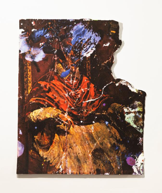
Zorawar Sidhu creates visceral work about the possibilities of transformative dialogues between the past and present, as well as the technologically reproduced and handmade art objects.
 
Robert Telenick's figurative paintings signify the personal belief that science is at the core of our contemporary psyche just as religion was at the center of human consciousness in the 16th century.

Renelle White Buffalo's paintings intersect the varying relationships between color and form and Lakota culture and identity.
  
Curator Marc Dennis is an American artist known for his hyper-realistic paintings that celebrate the subversive potential of beauty and identity. He received his BFA from Tyler School of Art of Temple University, Philadelphia, PA, and his MFA from The University of Texas at Austin. His works have been included in numerous solo and group exhibitions in New York, London, Los Angeles, Chicago, Dallas, Miami, and Boston among others. His works are in numerous private and public collections, including those of John and Amy Phelan, Glenn and Amanda Fuhrman, Bill and Maria Bell, Beth DeWoody, and Larry Gagosian. This is his New York curatorial debut.
 
"HUMANNESS" will run through August 12, 2017

For more information & preview images, please contact:
 
Lyons Wier Gallery
542 West 24th Street
New York, NY 10011

Gallery Hours: Tues - Sat, 11am-6pm


Steve Cope, Cruise (detail), 2017, Oil on panel 9 x 36 in / 23 x 91 cm


Jeanette Hayes, Never Trust a Smiling Cat, 2017, Oil on wood panel
12 x 12 in / 30 x 30 cm

John LaMacchia, Mr.Thick Dick, 2015, Ceramic vase, transfer over glaze
14 x 8 x 8 in / 36 x 20 x 20 cm
Zorawar Sidhu, Portrait of Pope Innocent X, After Velásquez and Bacon, 2017 

Robert Telenick, Iridium, 2015 Oil on canvas 50 x 40 in  / 127 x 102 cm

Renelle White Buffalo, Chokecherry, 2017, Acrylic and mixed media on canvas
40 x 30 in / 102 x 76 cm
For more information & preview images, please contact:
 
Lyons Wier Gallery
542 West 24th Street
New York, NY 10011

Gallery Hours: Tues - Sat, 11am-6pm

Vintage Polaroids Capture Fire Island's Historic Queer Haven
This forgotten history has been chronicled in Fire Island Pines, Throckmorton Fine Art's new exhibit featuring photography by Tom Bianchi, who ...


A Weekend of Hot Art on the Streets and Cool Flicks on the Screen at the Grand!